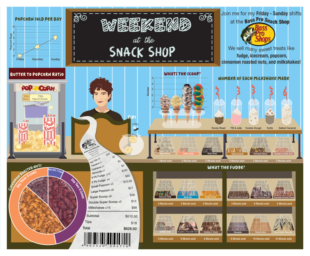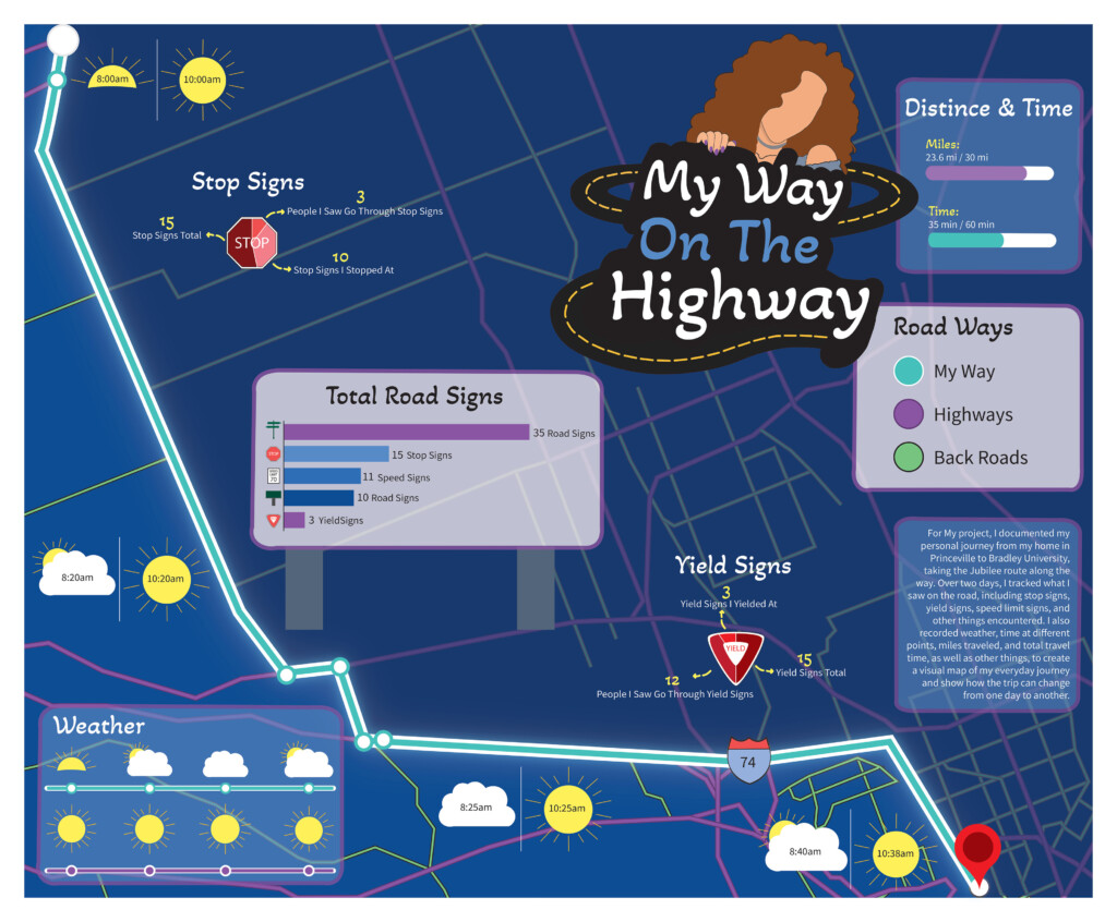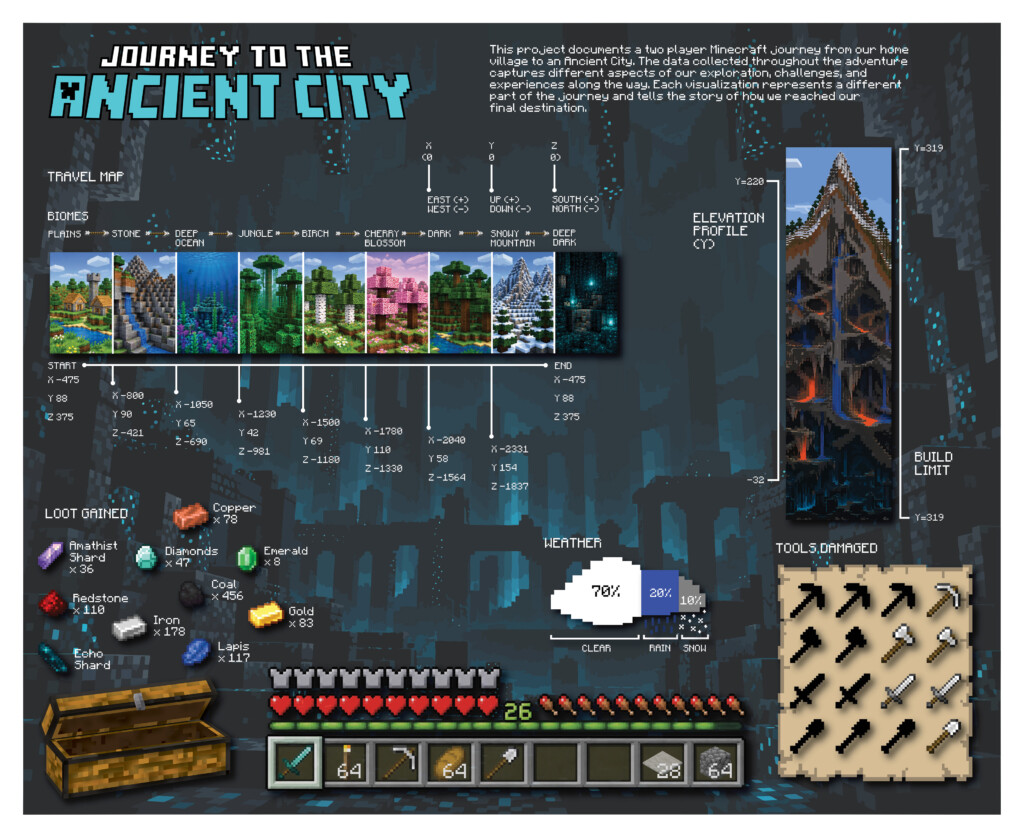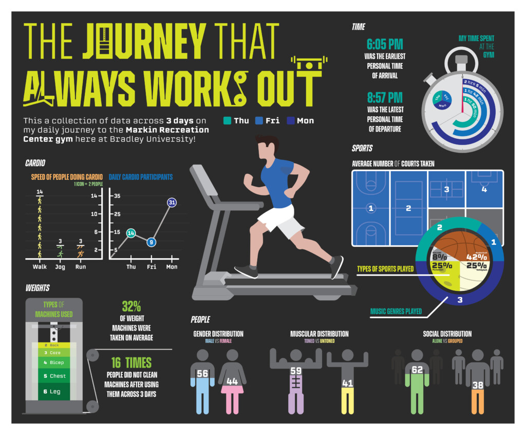

Although this assignment has been done multiple times, it is still a really good entry into Information Design – specifically turning data/statistics into a clear and accurate visual representation. The brief was to choose a ‘Personal Journey’ and collect as much data/statistics as possible for it. This information had to then be presented as a wallchart that was visually engaging, appropriate, and most importantly – accurate and clear to understand.
Here are a few of the students interpretations of their own individual ‘Personal Journey’…