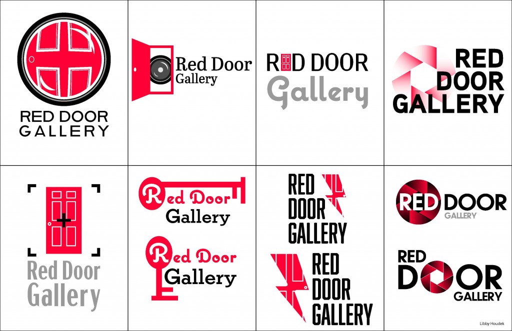
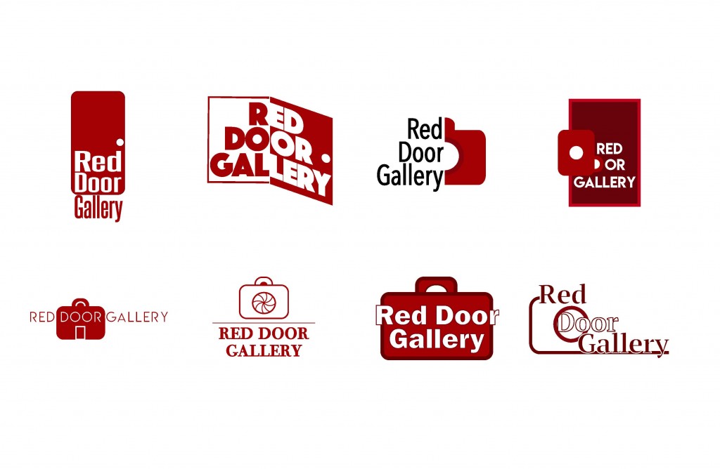
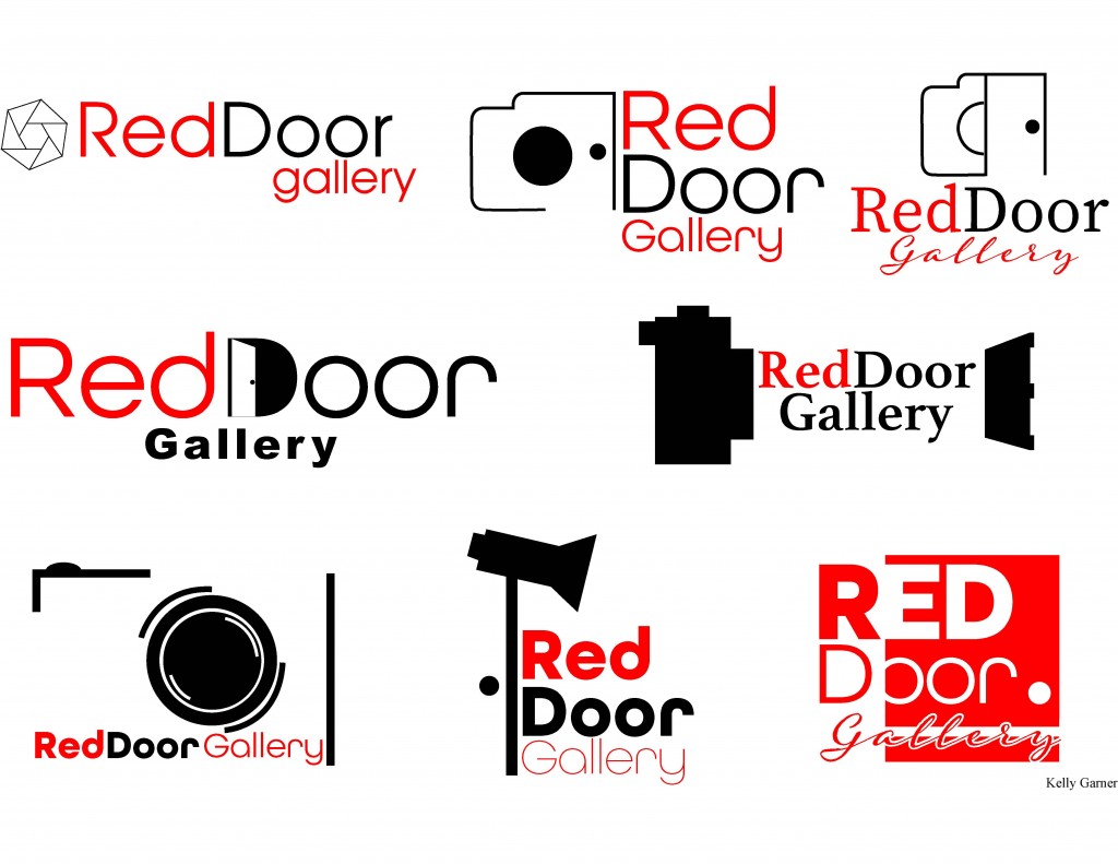
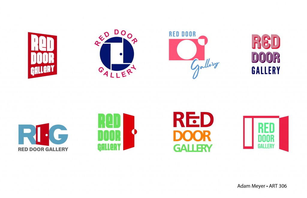
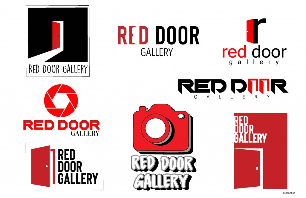
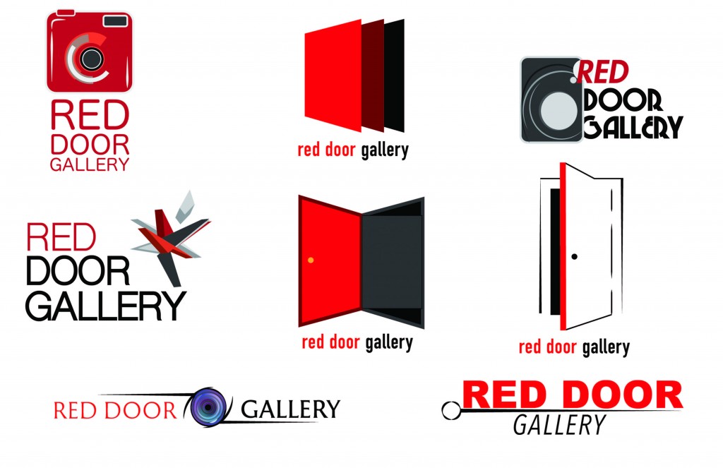
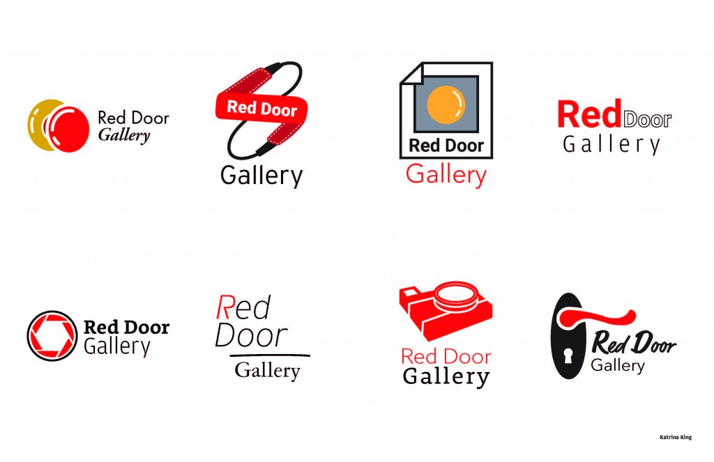
Really fun, short, sharp, logo exercise. We typically frown upon creating a brand mark void of the bigger Brand Strategy/Architecture picture. However, it is a nice opportunity to work to a much tighter deadline than the usual briefs. In this case, a new gallery has been added to the departments existing two main galleries. Focused on Photography exhibitions, this small space needed a stand alone brand identity which could be used both digitally and on print pieces.
Each student was required to submit eight alternative (not simply variations of) logo designs. Here are a few:
