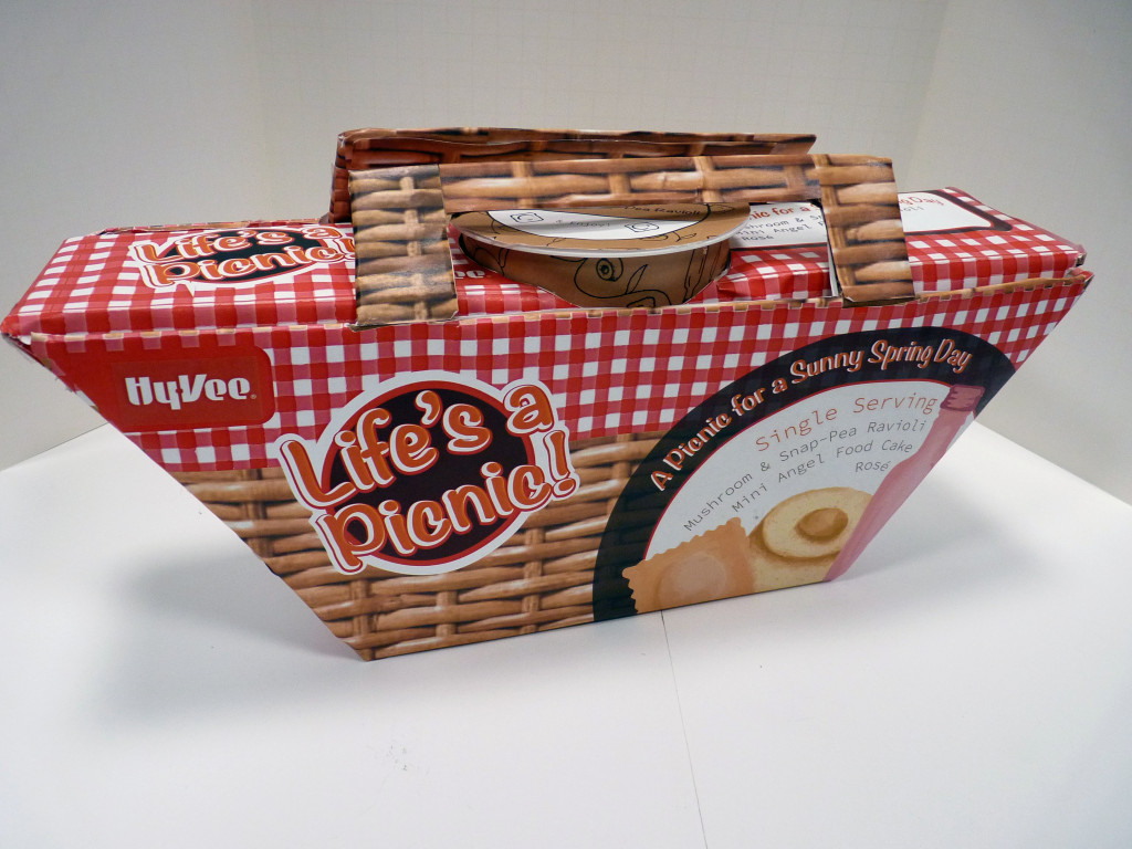
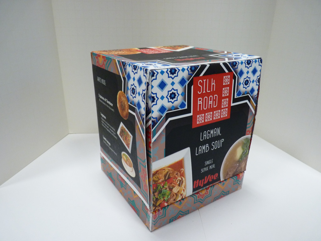
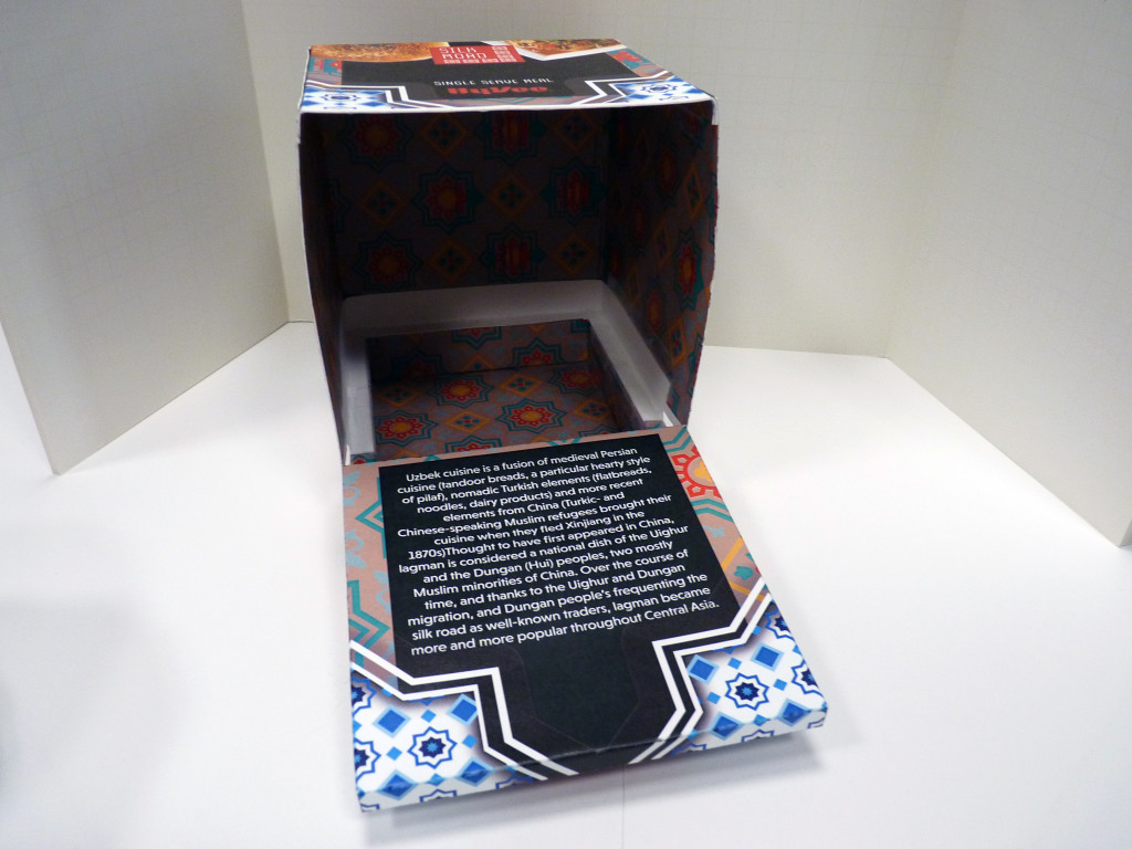
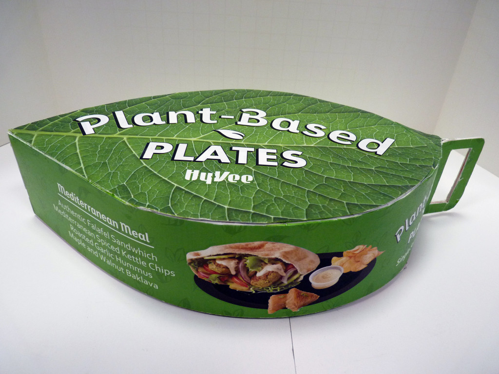
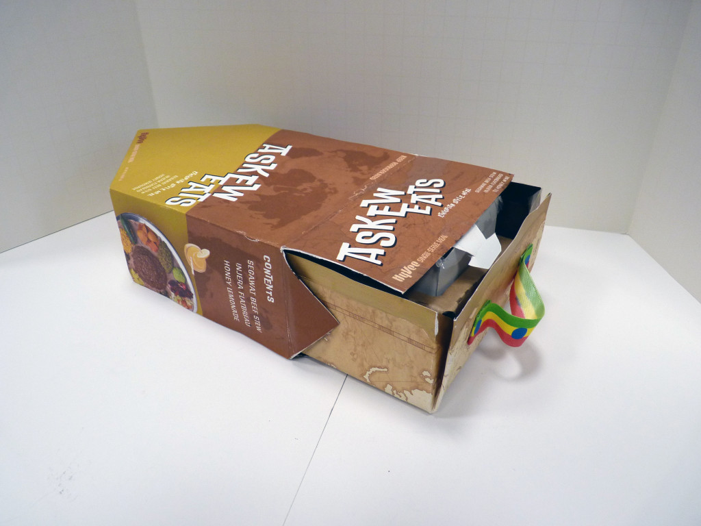
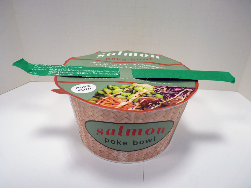
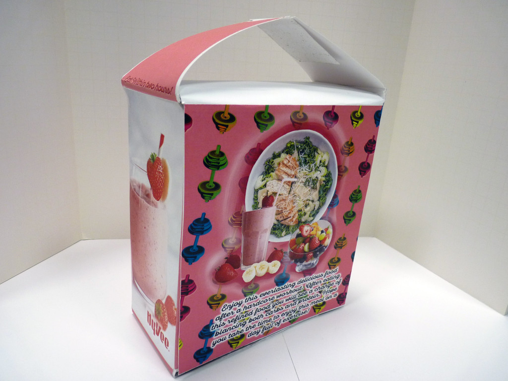
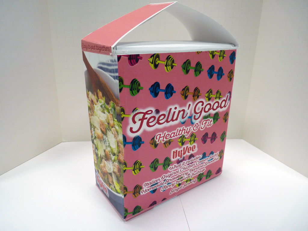
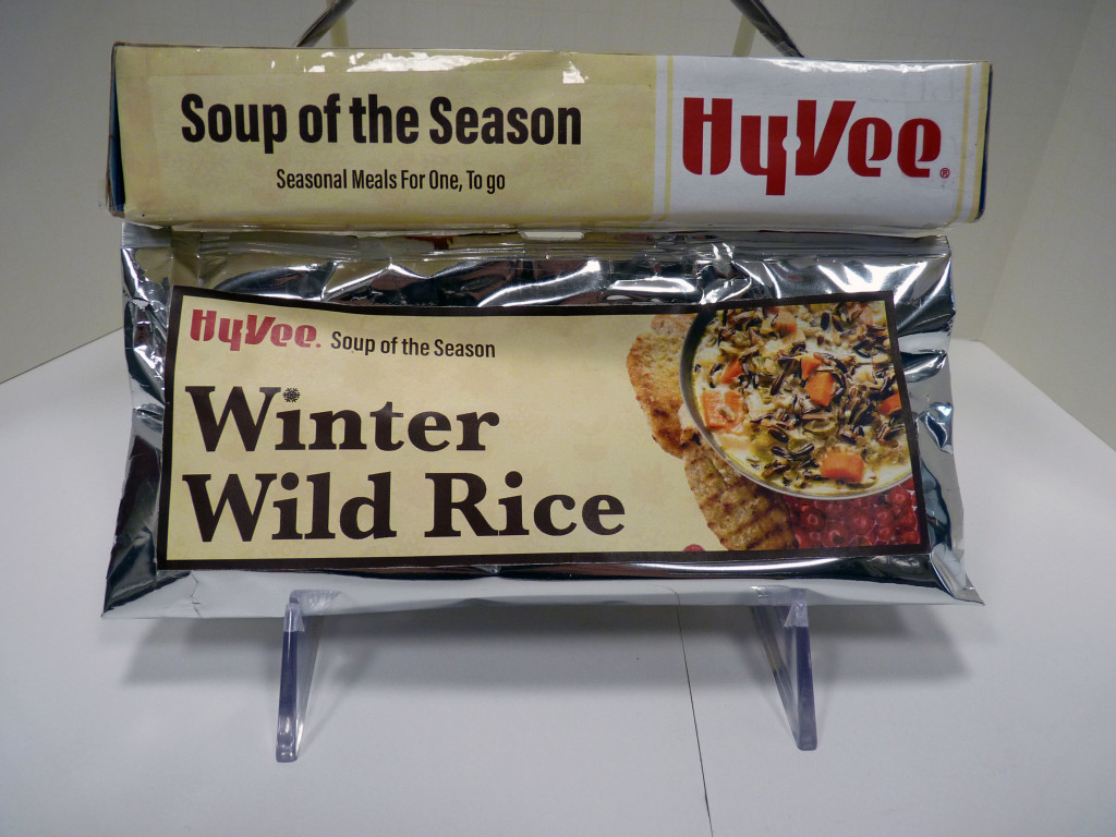
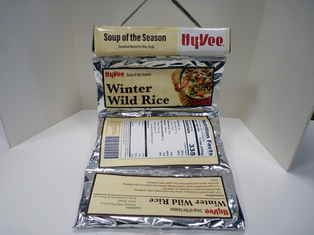
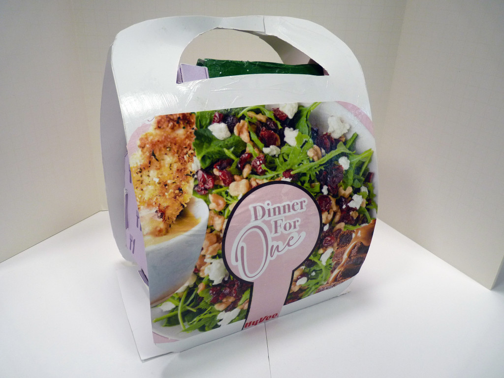
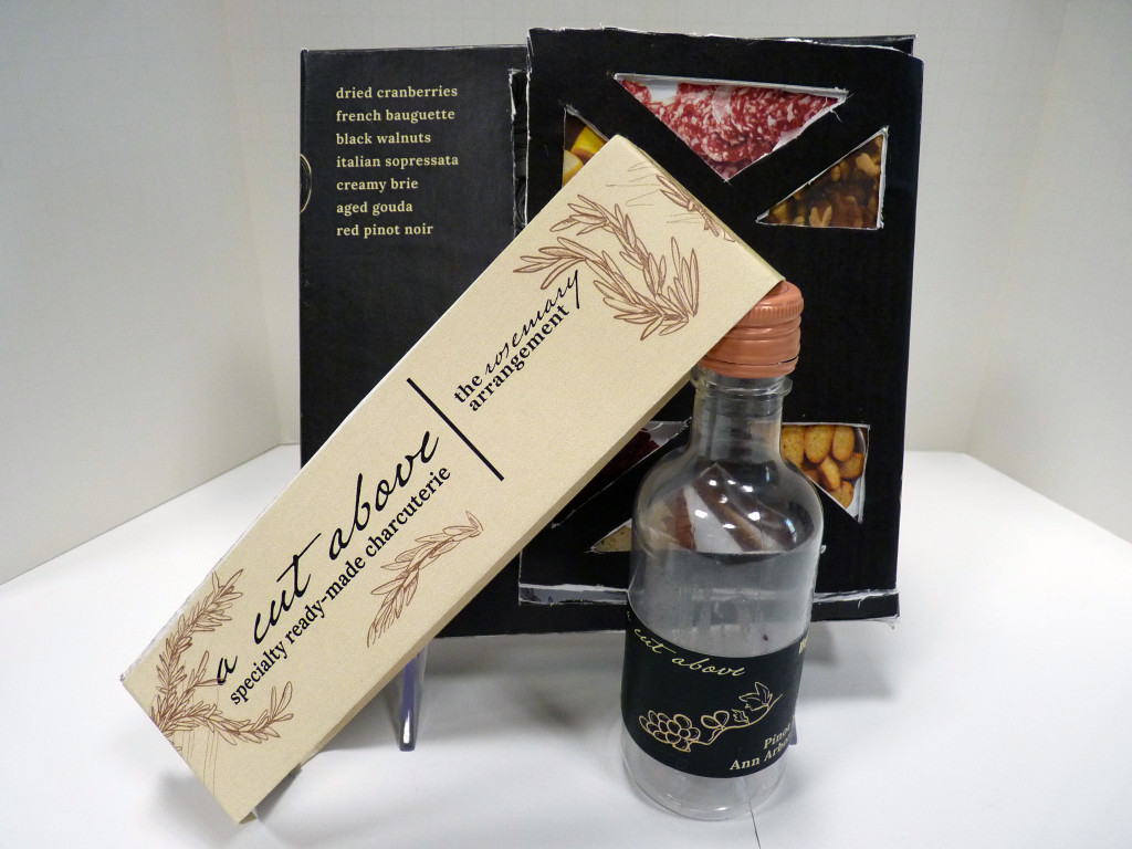
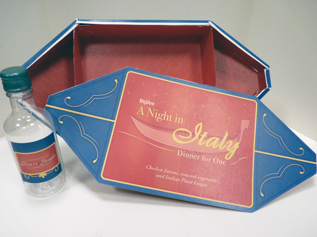
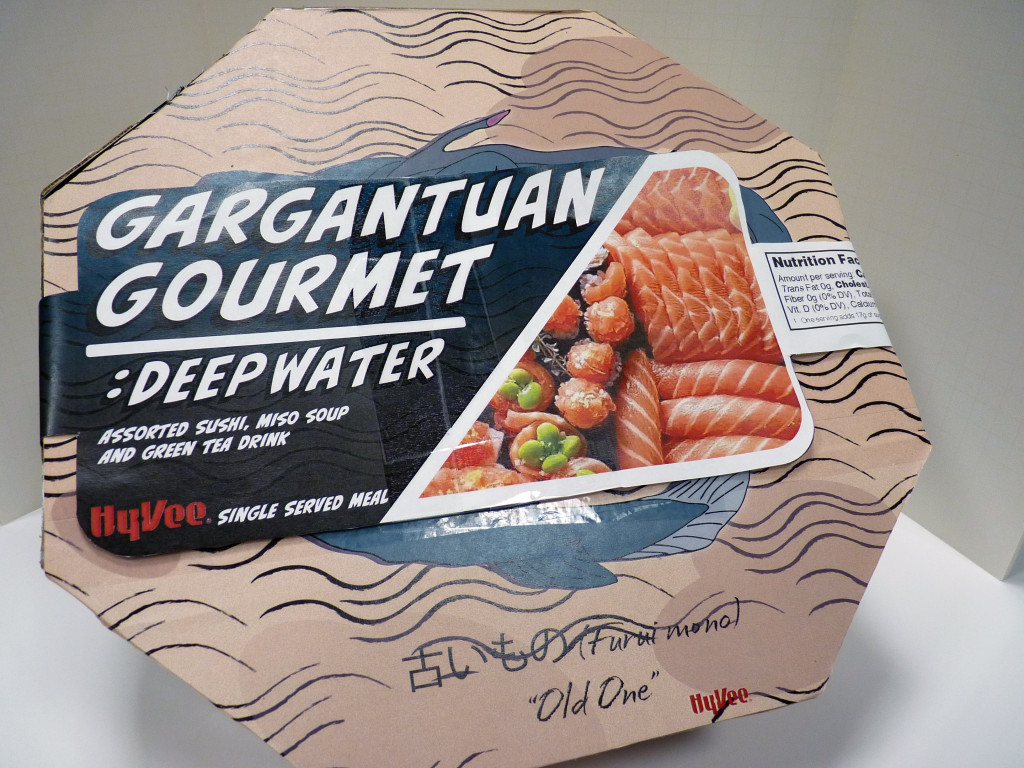
You can choose any single serving meal of your choice, but it must include at least three food items to constitute a ‘meal’. It doesn’t necessarily need to be healthy, however neither should it be considered fast food. Consider its nutritional value and obviously – its appeal – It shouldn’t look out of place on the table of a restaurant. It can be a meal that can be eaten cold, or requires some basic preparation, and is most likely part of a wider brand ‘range’ on offer. I would recommend you walk around some grocery stores and look at what they have to offer as the initial part of your research (yes, this involves stepping away from Google!). This doesn’t necessarily mean you are looking for an existing single serve meal already out there – You are creating a new one here, with ultimately the legs to spread across a range.

Observe where in the store the single serve meals etc. are placed. They are made to ‘shop and go’ in many cases – Individuals grabbing one on their lunch break, or rushing home after work. They may buy several of them as part of a larger shop or just by itself. Research recipe websites for this type of meal and use those as your single serve choice instead – remember – gourmet, quality… not fast food.

Once you have decided on a meal (and initially you should have several options to choose from), your challenge is to create visually appealing and accurate (name, description, ingredients, logo’s etc.) surface graphics and in particular to create packaging that is in keeping with the brand, innovative, easy to carry, easy to stack on a shelf or hang in multiples. Your packaging must contain EVERYTHING required to prepare and eat that specific meal.
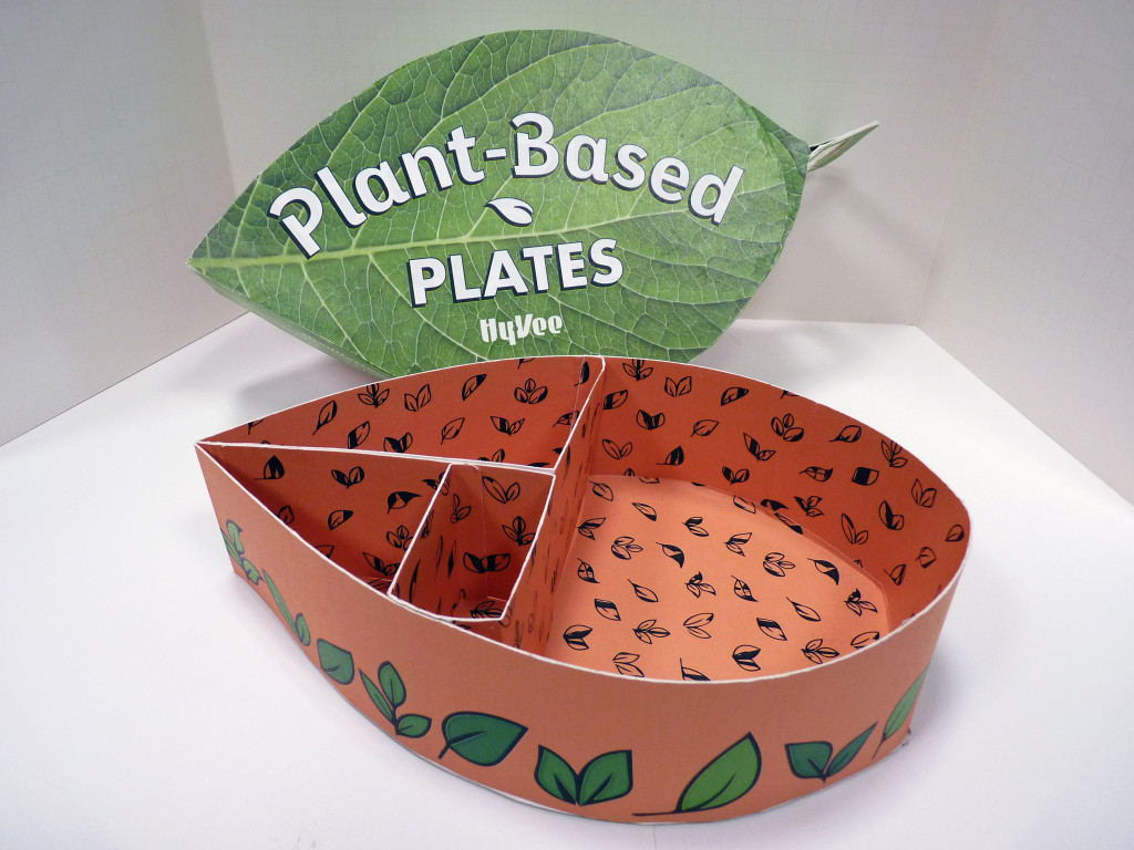
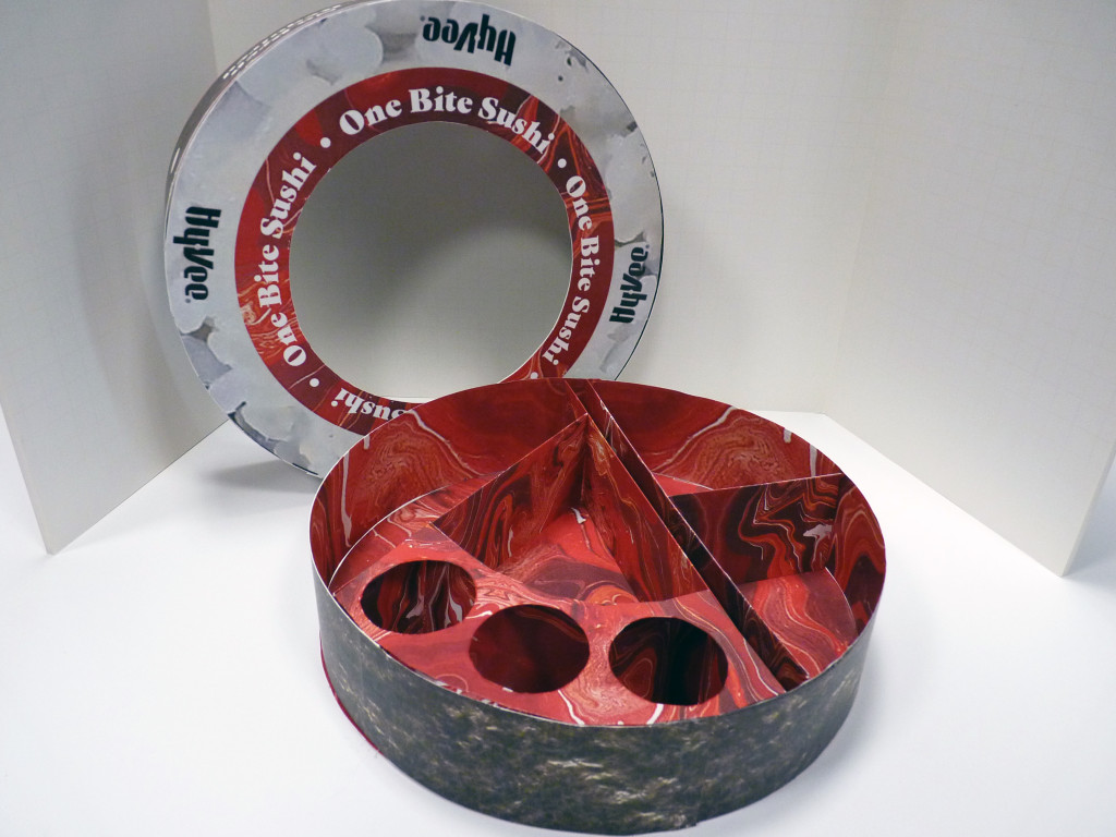
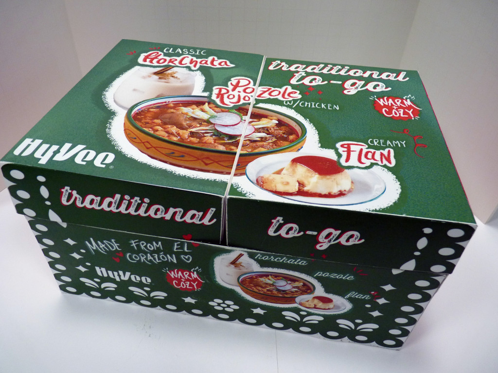
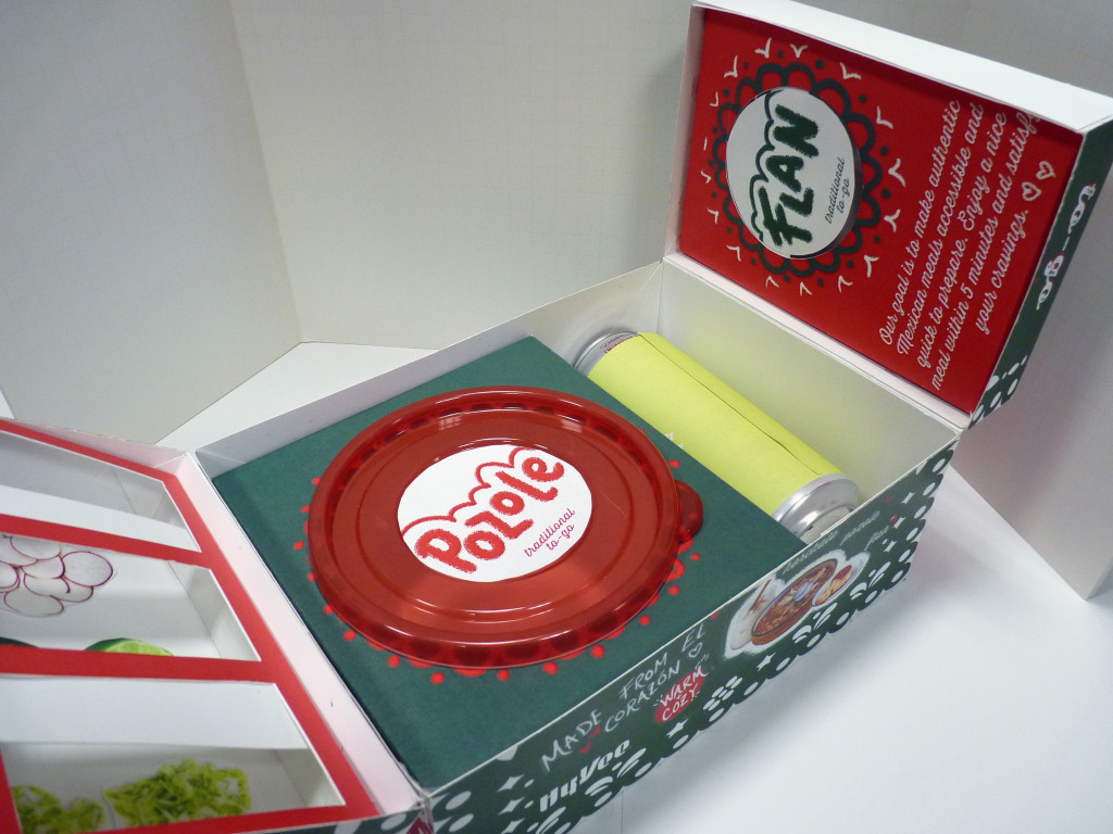
And perhaps most important of all – while visually appealing on the shelves, alongside the competition – it should be constructed, in a way, using materials and resources, that will have little or no impact on the environment. Research recyclable, biodegradable materials (including inks, glues etc.) and look at innovative existing packaging such as the examples below. Don’t be afraid to look ‘outside the box’ (haha, get it?) by researching non-related packaging directions, such as origami.

Deliverables: A fully mocked up final single serving meal packaging. With all surface graphics, images, including all the necessary text required for your particular meal, such as meal name, subtitle (perhaps?), description, ingredients, bar code, required food association logos, if applicable and the *Hyvee logo. While you may not necessarily be able to find/use all the specific materials you want to, try to present your mocked-up concept as accurate to the final packaging as possible and ensure you describe the materials that would actually be used in your evaluation report.
*This would actually be a Hyvee own brand. They are trying to promote an ‘up market’ tone of voice with this particular product and your design should reflect this.
