Creative Process Journey

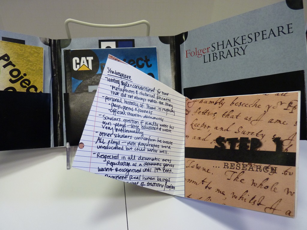
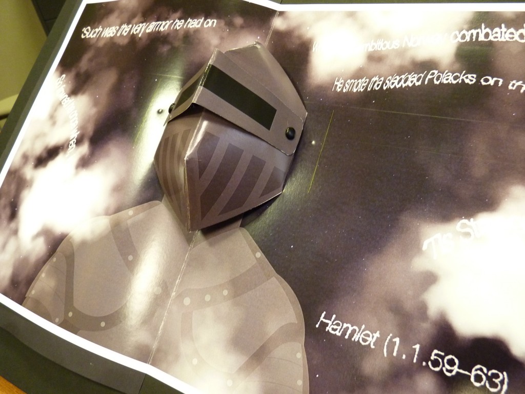
Product: Present your ART 305 creative process journey for the previous three projects) in a beautiful, original editorial design piece.

P1020019

Requirements: Return to your previous three Art 305 projects and narrate the process you used to create them (yep, that lack of process has come back to bite you now!) through a unique and personal editorial design piece.  This is not a simple brochure, but a very personal insight into your journey from brief to finished piece with the previous three Art 305 projects. Present the stages of your thought process for all three projects. Include text from your evaluation reports to back up the images and help visually/verbally explain your creative ‘journey’.

Continue reading “Creative Process Journey”

Final Information Design Project

Last brief with this particular group of students. Been a pleasure teaching them over the past two years or so.

Art405_Group

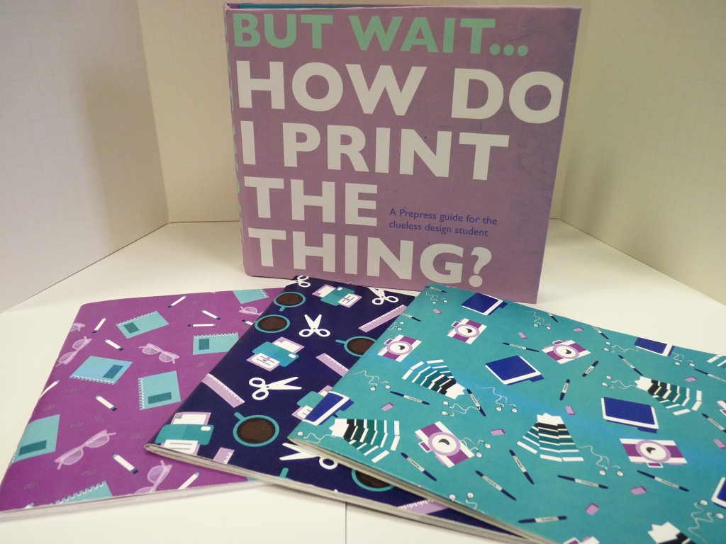
Working in teams, the objective was to create a pre-press ‘quick guide’ quality give away piece at a printing trade show that would give an accurate, easy to understand overview of pre press, file preparation, paper, printing tips and techniques etc.

Here are the three final pieces…

ThreePrePress_Dec15

…followed by more examples of each one:

Continue reading “Final Information Design Project”

Wayfinding Phone App for Children’s Museum


Client: Local Children’s Museum

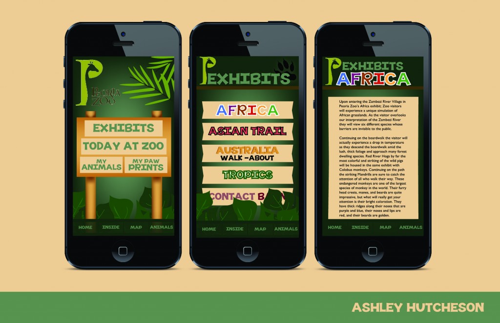
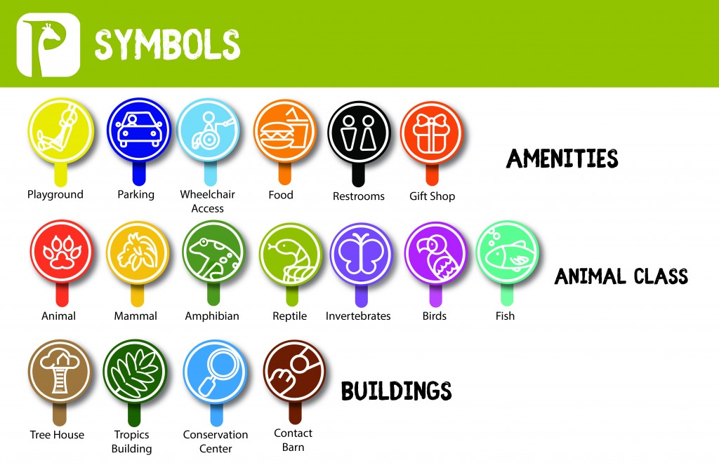
Product: A UX/UI friendly smartphone app that maps the buildings three floors, serves as an exhibit guide (including theme-specific symbols). and connects the user to the museum and it’s activities in a way that develops and encourages a long term brand loyalty.

Brad_Wayfinding(1)_Page_5Erin_cameron_museum_app_Page_6

See all the students app designs here…

Continue reading “Wayfinding Phone App for Children’s Museum”

Print and Digital Magazine Brief – SweatFree Communities

Client:
 SweatFree Communities

Product:
 Twice yearly (spring and fall) brand magazine (print and digital).

Background: Founded in 2003, SweatFree Communities works for a democratic and just global economy, focusing on improving working conditions in apparel and other labor-intensive global industries. Across the United States, sweatfree campaigns advocate for “sweatfree” procurement policies primarily for states, counties, cities, and public school districts.

Objectives: As part of their brand relaunch you are to design a brand magazine that is predominantly focused around SweatFree Communities and their philosophy, history, mission, events, people, affiliated services, products/merchandise etc.

Although the magazine should be a mix of ‘infotainment’, it should not simply be a fast, disposable read. Anyone picking it up, should want to keep reading and also get something ‘useful’ out of the experience rather than simply knowing that Kylie Jenner has named her rabbit ‘Bruce’! It’s more than simply getting the reader to want to buy SweatFree Communities endorsed merchandise (although that helps!). It’s about informing, education, encouraging them to become pro active – but not by presenting it all in a ‘forced fed’ way – you must have a mix of direct and indirect editorial content throughout your magazine.

Layout-Spreads 4

Requirements:
 To design a twice a year style magazine (print and digital) that compliments the SweatFree Communities web presence, social media and other marketing tools – but needs in no way to follow those existing design and layout models in their present forms as the organization is undergoing a complete re-branding, and, if anything, may well follow the style you develop for this project for the rest of their print and digital presence.

….. and here are a few of my students projects:

Continue reading “Print and Digital Magazine Brief – SweatFree Communities”

Ostrich Meat at Schnucks

Ostrich meat – 98% lean and 50% less fat than chicken. Super healthy alternative to the traditional competition. And all farmed completely free range in the US. A little more expensive, but worth it for the taste alone. Seems like an easy sell? But try to get past the idea of one of these gangly giant birds on your barbecue instead of roaming the  African plaines – not so  easy now, right? Well this was the challenge for the students this time around. Ostrich meat was featuring at Schnucks and the brief was to design a marketing/promotional piece that would work as direct mail and also as an end of aisle pick up piece in the store itself.

A fun (and difficult) first step into Editorial Design. Understanding layout, grids, synergy of image and typography… and trying to push Ostrich meat as a lifestyle food choice!

Here are a handful of the more successful (and unique) creative solutions:

Peoria Ballet 50th Anniversary Brand Mark

To celebrate Peoria Ballet’s 50th anniversary, Ian Poulis,
Artistic Director, and his committee, were looking for a fresh brand mark that would work with, and later without, the reference to the anniversary. After a lot of back and forth collaborating, they finally decided on several designs by student Jeff Wagnaar, and ultimately arrived at the definitive logo shown in the photographs below.


Congratulations to Jeff on a great design for such a prestigious client.


IMG_0050

Ian Poulis. Gary Will. Dr Sodestrom.