Congratulations Tom and Nicole. Great job. Go Far. Go Bradley. 
Optomap Team Brief
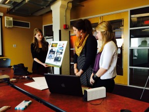
End of semester team brief. Six teams pitching for an account brief set by the wonderful people at Hult Marketing. Short version – piece of equipment that can view 200% as opposed to the 30% of a general eye exam. Capable of identifying a number of diseases at a very early preventative stage. Full campaign needed to promote awareness of this procedure/equipment to both the patient/care giver and Optometrists etc. Here are some of the presentations:
A Celebration of the B-Movie
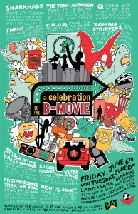
A five night movie festival at a unique local drive-in theater, celebrating the B-Movie. Multiple promotional pieces included a brand mark/logo for the event, a poster, micro-site, and a Private Screening ‘keepsake’. Here are two or three of my favorites plus a selection of the rest. Good introduction exercise in developing a brand across multiple touch points.
The Coffee Company with ‘Attitude’
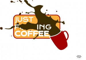 Background: Are you a coffee drinker? No, I don’t mean a Tall, Non-Fat Latte With Caramel Drizzle, or a Grande, Iced, Sugar-Free, Vanilla Latte With Soy Milk, and especially not a Grande, Quad, Nonfat, One-Pump, No-Whip, Mocha! I mean a cup of good old – perhaps with a drop of milk and maybe throw in a sugar – coffee?
Do you get in the line at your regular caffeine haunt only to find out the person ahead of you is basically talking a different language with the Barista and their drink takes a team of three people 15 minutes just to order.
JF Coffee Company is a coffee shop. It serves coffee, no pour overs, no lattes, no iced drinks, no tea, no espresso…. just f***ing coffee.
Tone of Voice: No fuss. ATTITUDE.
Requirements/Deliverables: Depending on your approach and audience you are to try to identify as many touch points as possible that connect the brand with the customer. Loyalty is a BIG part of the success of this type of venture. Think returning customers, not just because they like the product but because they LOVE the brand image of the place and like to identify with it – again, think ‘attitude’. What can you do to ensure this loyalty – that’s the key.
Some nice ideas….
Branding a specialist cake company with no physical presence (Art 306)
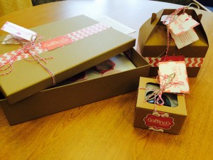 A new brand. specializing in luxury handmade cakes, including alcohol infused cupcakes (heck yes!) No store front. Most transactions primarily carried out via their website or a smart phone app. The only physical touchpoint experience between brand and consumer will be the packaging when the product arrives in the mail or is delivered.
Deliverables_ Brand mark. Smart phone app. Packaging.
Here are some of the solutions
Continue reading “Branding a specialist cake company with no physical presence (Art 306)”
Poster Series Challenge
Draw a designer out of the hat. Draw a local company, attraction or organization out of the hat. Present a series of posters that both promotes the latter as a success story in the region and encourages other businesses to consider relocating to Peoria, but in the style of the selected designer (without ripping off any particular piece/body of their work). Always a challenge. Always fun to see the outcomes. Here are a few to share 🙂
