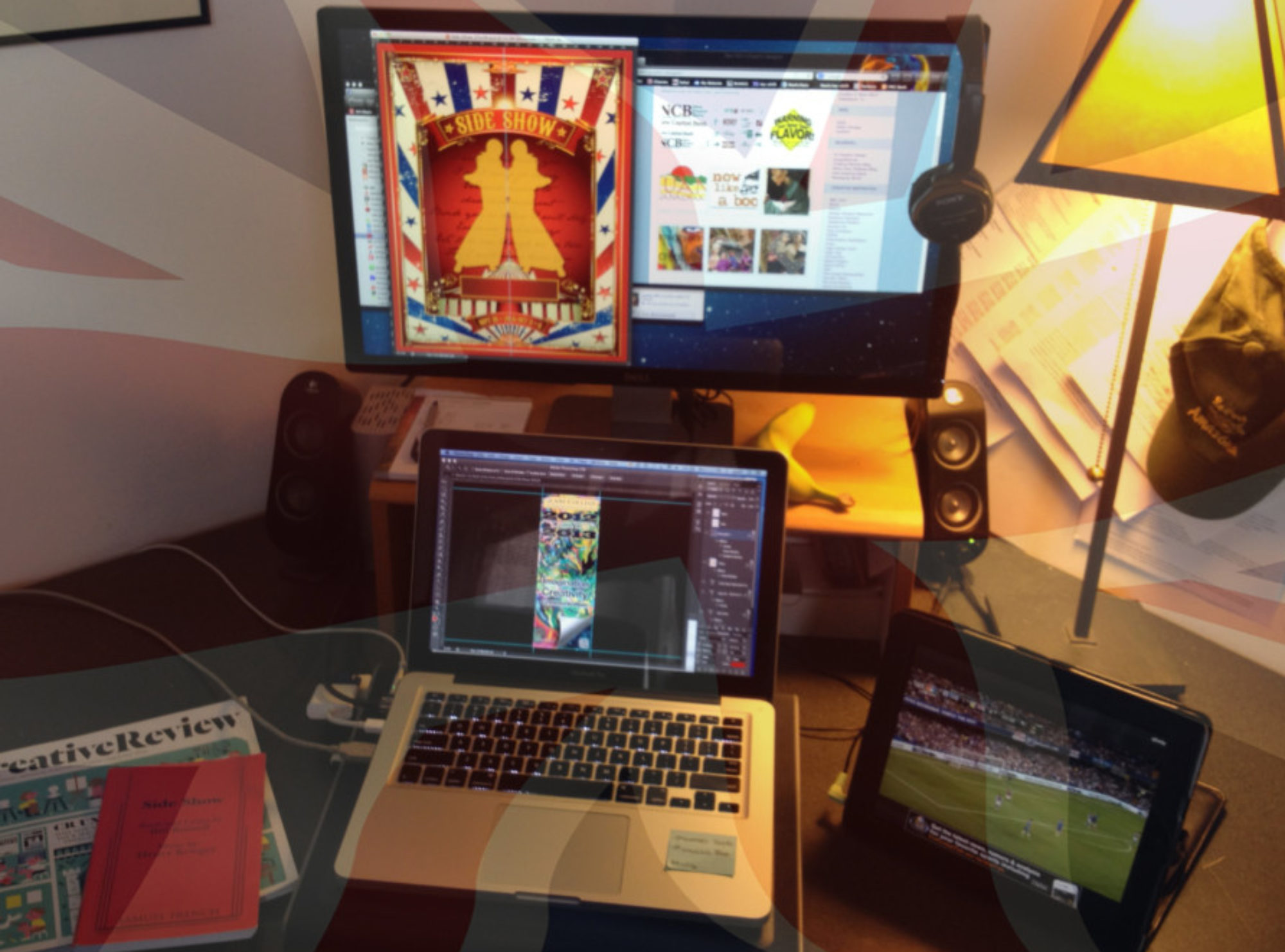
I love the process of creativity. Here’s an example of an idea developing and refining as the tone of voice and audience is gradually interpreted through conversations and collaborations with the designer and the client:
Client: I’d like to rethink our approach to this design. This is no refection on what you sent; your response to my initial thoughts was great. but I’m thinking that to have impact on our audience we’ll need to do a real in-your-face, rock and roll poster.
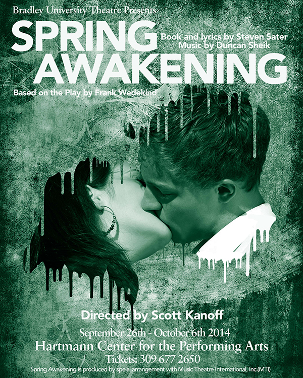
On reflection I’m less concerned with evoking the intimacy of our young lovers than I am with the explosive head-banging angst (and music) that fuels much of the show. There’s a lot of leaping, flailing, and climbing going on; the dancing is often stylized and spasmodic. The ad design for original B’way production employed a variety of looks,almost all photography-based, including frenzied rock-star-flailing and tortured close-ups of howling faces– all that sort of thing. I’m not wedded to photography by any stretch, though.

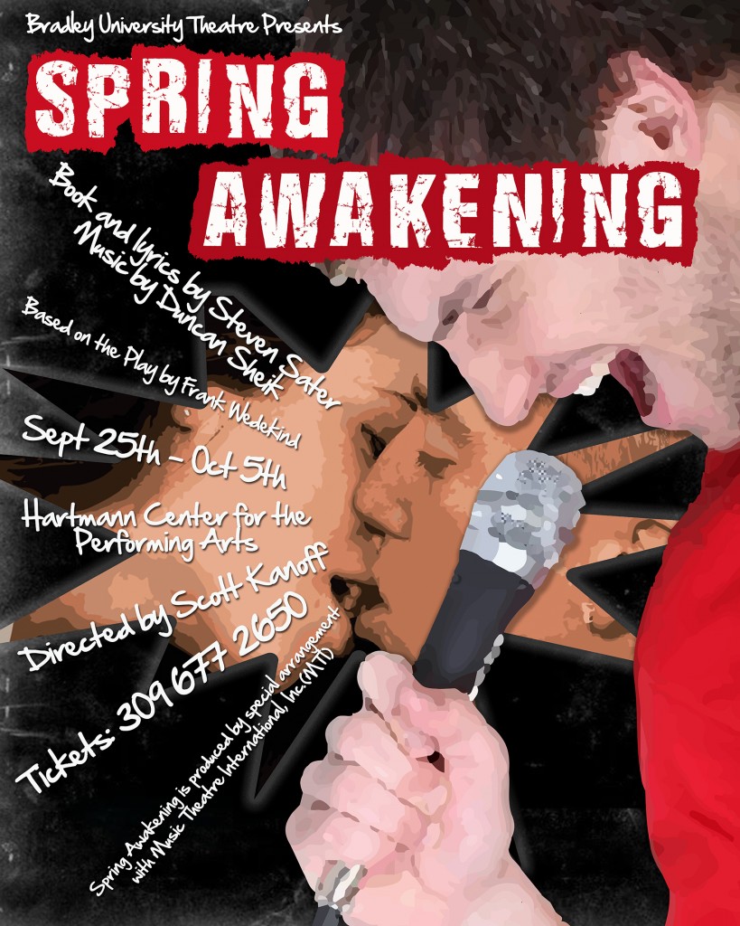
Client: Closer in tone, yes.. The guy is too old, but I like your treatment of the image a lot. What I’m missing is the fact that this is a musical, which is why I liked the images of singers at/with the microphone. More/different text will help clarify that, too, once we get the imagery straight.

Client: That’s fantastic.
So:
–Can I see 1 or 2 other color options?
–Pls move the “Directed by Scott Kanoff” line down between “Hartmann Ctr” line and the phone number line and shift up accordingly.
— Enlarge the dates a little if possible.
— Pls correct dates to September 25-October 5 (My bad)
–Try different font for BU Theatre Presents line? Perhaps the same one as the info lines?
This is super close. Thanks!
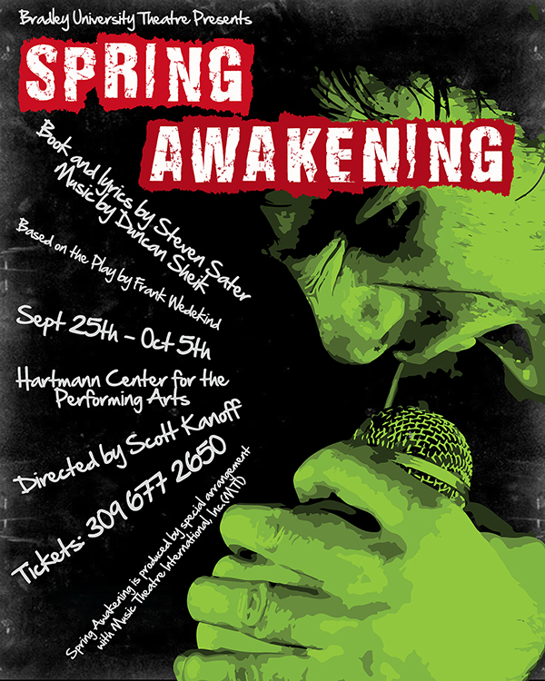
Designer: I tried a couple of other colors for the face but the toxic green really works best. So I decided to distress the black background and pull out the title in red/white more.
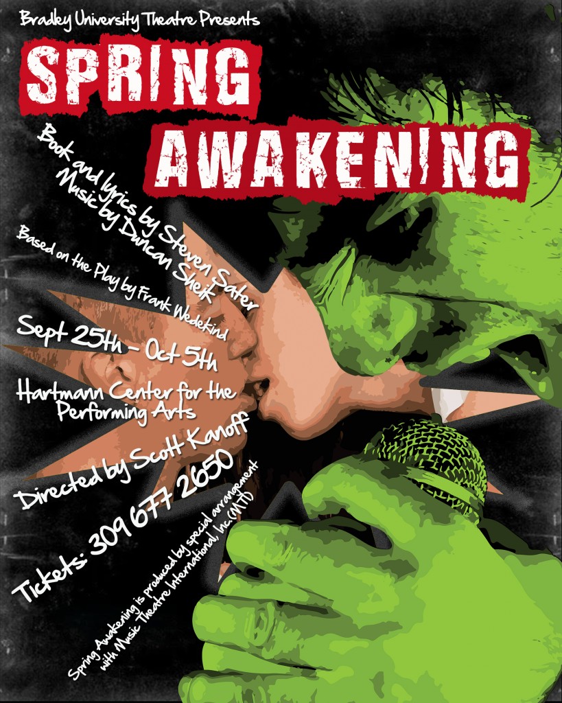
Client: Sorry to be so long in replying. This is really grand, and with a couple of changes, mostly to help the text be more legible at a quick glance, and the addition of a review quote, I could go with it, or something very close. I showed the design to a bunch of my students and while they get and like the whole rock and roll thing, the girls especially feel that the intensity of the love story is what would really draw them to the show. This got me thinking about whether I was right to abandon that quite so completely, and I found myself wanting to give that one more try, just to see. I’m sorry to vacillate so; it’s just a very complex show to represent. I do love our grunge boy (although some think he looks like the Hulk!); I just want to cover all the bases.
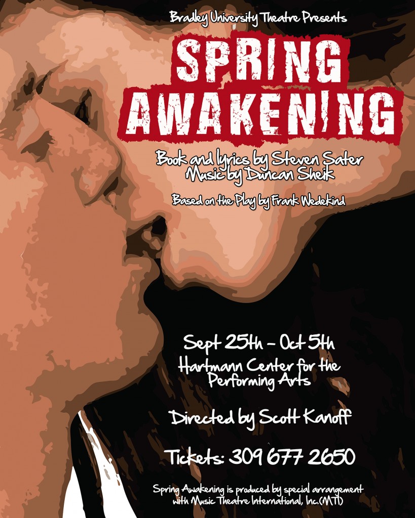
And, on reflection, the near-contact of the kissers’ lips in the last complete version you sent (the one were I remarked on the girl’s teeth!) really is kind of perfect. We really get their youth, too, more so than any of the others. I could go with them if you could shift the image a tad down and to the left so it’s possible to see a little more of her. I know I said they weren’t attractive enough, but I’m impossible so forget that. Let’s try to make them work after all. Sorry.
Designer: So just to be clear before I rework tomorrow 😉
• I’m going to keep with the guy and girl (with the teeth!) but show more girl.
• Maybe experiment with one or two of those guys with the mic you showed preference to.
And then again, maybe we change direction 🙂
And finally… the chosen one. A long journey (and that doesn’t even include the research and initial sketches before getting it into Photoshop.
The creative thought process – always a challenge. (Almost) always fun 🙂
