Graphic Design Exhibit: August 24th to September 24th 2015

ShowcardFront

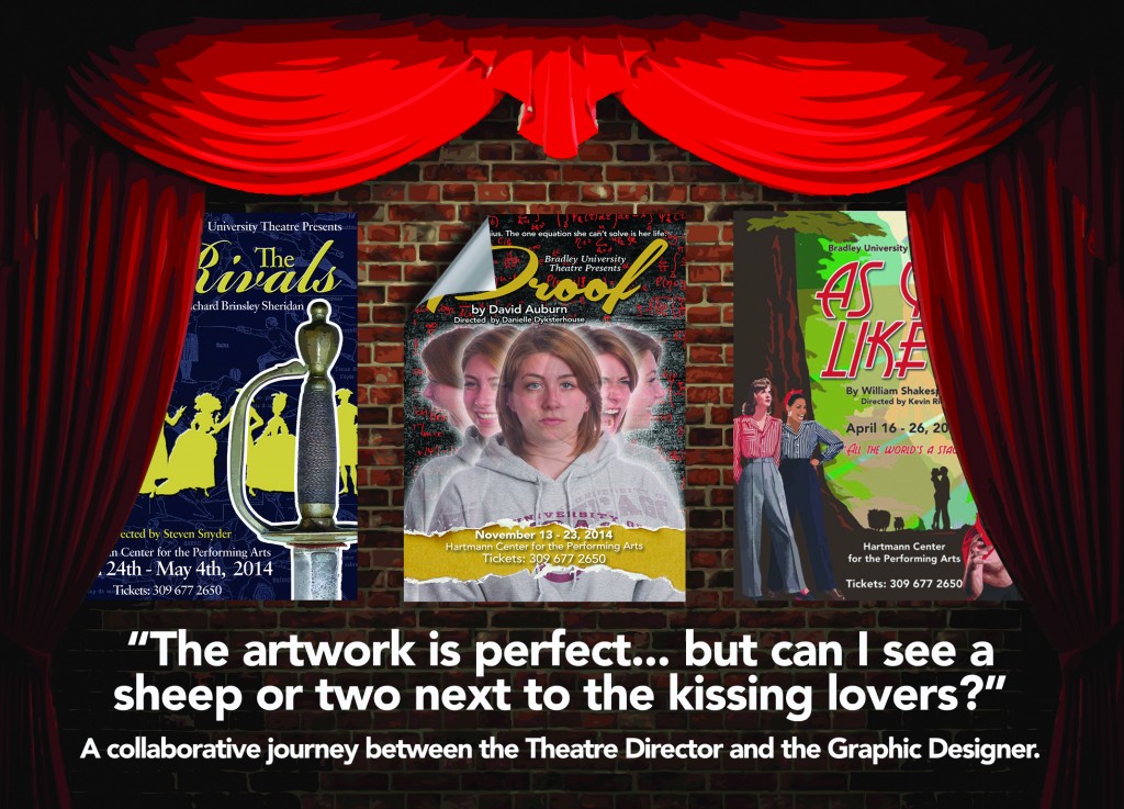
“The artwork is perfect… but can I see a sheep or two next to the kissing lovers?”

A collaborative journey between the Theatre Director and the Graphic Designer.

By Gary Will

Although the relationship between the graphic designer and the client should invariably be a collaborative experience, the opportunity occasionally arises for this creative interaction to connect at a different level. In this case, the client was a Theatre Director and the ongoing brief was to visually promote two seasons of productions.

There was no ‘one size fits all’ with these eleven plays and musicals. Some required a more direct approach to visually explain the clients unique interpretation for each script, while others could be more abstract, leaving the viewer, intrigued and wanting to know more.

What each promotional piece had in common was a creative journey shared by both the graphic designer and the theatre director. Each time, dialogue and creative thought process continually passed between the two as each poster gradually transitioned and metamorphosed into its final rendition.

This exhibit is an opportunity to view and enjoy the final versions of those playbill posters, presented collectively, rather than one at a time – the end of that collaborative journey.

Final Project of the Semester


After a pretty busy semester,  I wanted a conceptual brief to round off the ‘Designing for a Brand Experience’ course. In other words, more focus on taking a chance and pushing beyond the obvious.

In this case, it involved one of the food industries fastest growing options – the single serving meal. Not the fast food, unhealthy ‘grab-n-go’ but quality food combinations that could grace a restaurant table. The emphasis was on the package design itself (the 3D element if you like). Obviously, the surface graphics/branding was important too, but I was really pushing for my students to ‘play’ with the form. Did it protect, the contents? This had to be their choice of three food items that made up their particular single serving. Was it easy to carry away? And would it stand out visually from the rest of the competition on the shelves (unique shape, interesting graphics, strong brand presence etc.)?

Varying levels of success, but from my own point of view I would rather grade up for the more adventurous attempts.

Here is probably my favorite, followed by the best of the rest…

P1010908 P1010910

Continue reading “Final Project of the Semester”