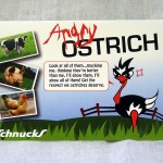
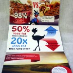
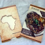
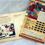
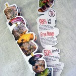
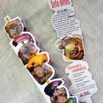
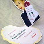
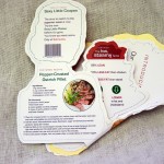
Ostrich meat – 98% lean and 50% less fat than chicken. Super healthy alternative to the traditional competition. And all farmed completely free range in the US. A little more expensive, but worth it for the taste alone. Seems like an easy sell? But try to get past the idea of one of these gangly giant birds on your barbecue instead of roaming the African plaines – not so easy now, right? Well this was the challenge for the students this time around. Ostrich meat was featuring at Schnucks and the brief was to design a marketing/promotional piece that would work as direct mail and also as an end of aisle pick up piece in the store itself.
A fun (and difficult) first step into Editorial Design. Understanding layout, grids, synergy of image and typography… and trying to push Ostrich meat as a lifestyle food choice!
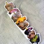
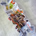
Here are a handful of the more successful (and unique) creative solutions:
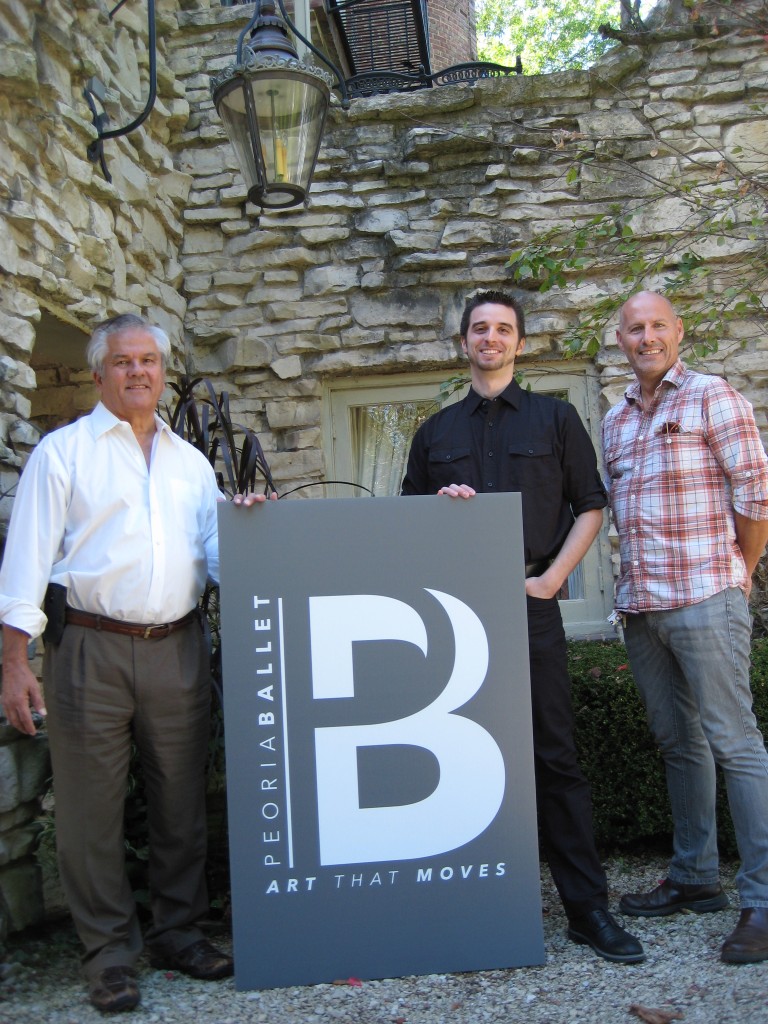
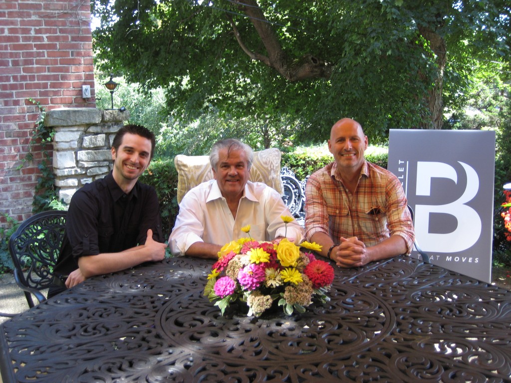
To celebrate Peoria Ballet’s 50th anniversary, Ian Poulis,
Artistic Director, and his committee, were looking for a fresh brand mark that would work with, and later without, the reference to the anniversary. After a lot of back and forth collaborating, they finally decided on several designs by student Jeff Wagnaar, and ultimately arrived at the definitive logo shown in the photographs below.
Congratulations to Jeff on a great design for such a prestigious client.
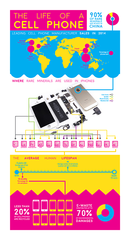
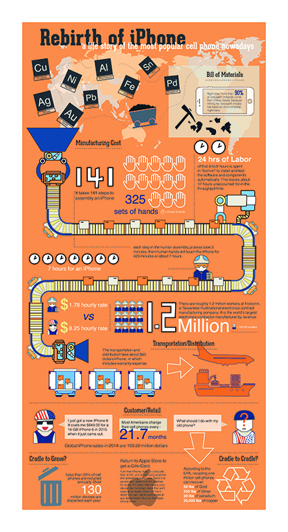
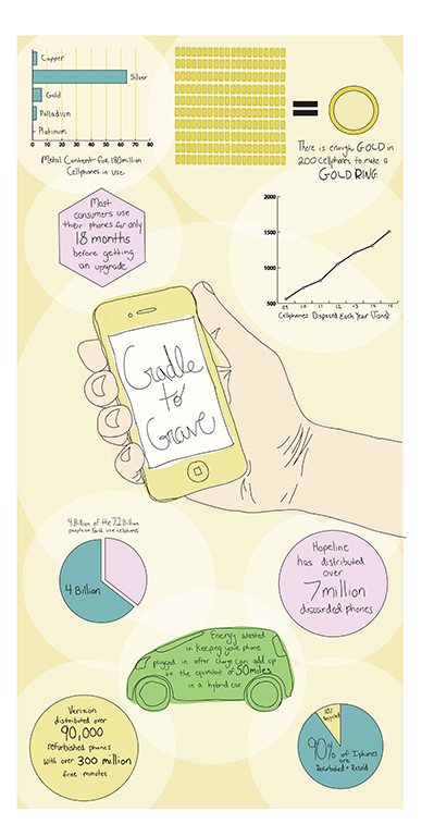
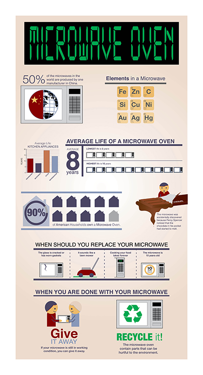
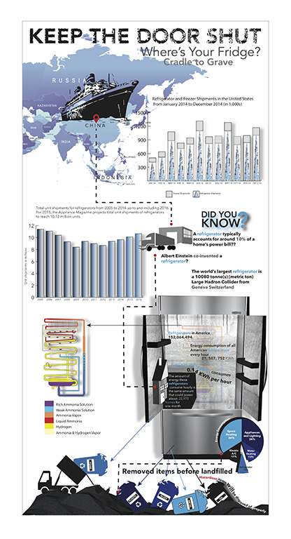
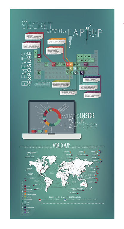
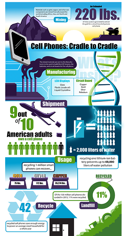
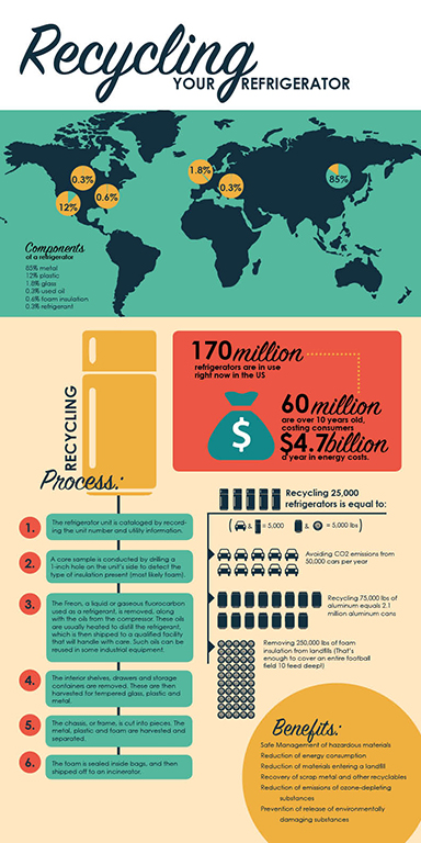
A good introduction to Information Design. This first assignment has the students selecting one of five everyday household electronics, and then present facts, information and data for that that inform the viewer about the items life cycle.
Here are some of the results:
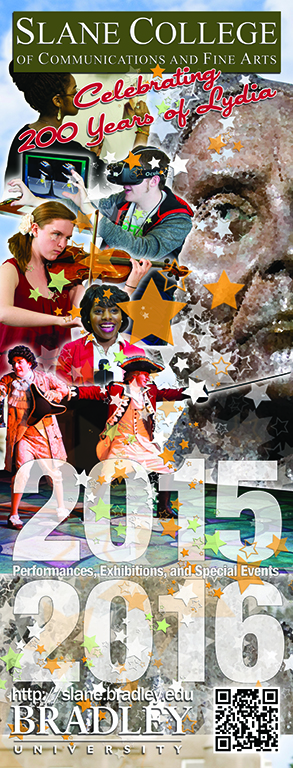
Always a pleasure designing this piece. Also more and more of a challenge each year to ‘top’ the previous one. We decided on a theme (of sorts) with this one – the anniversary of Lydia Moss Bradley. So the aim was to include her in the piece but not at the expense of emphasizing the strengths of our own college.
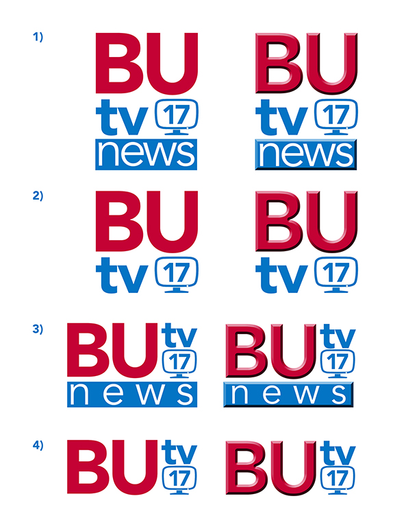
Interesting challenge – rebranding the university tv station. Formerly “Midstate Magazine”.
BUTV logo for non-news programming; used as a corner “bug” (so it needs to be easily readable when small) the mos,t but will also be used for full-screen station ID’s. 1:1 shape ratio.
BUTV News logo for our newscast, related to the main logo. Either square or round form factor but it will be seen the most on a 16:9 monitor on the news set.
Here’s what I arrived at:
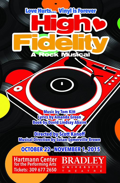
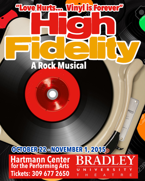
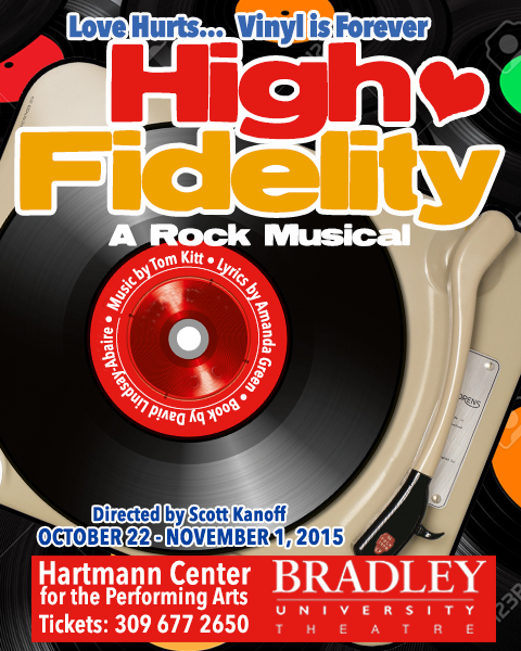
A new season, and exciting new theatre productions for 2015-2016. First up High Fidelity. As always, I wanted to try push beyond the obvious visual interpretations.
Here are some of the ideas along the way…
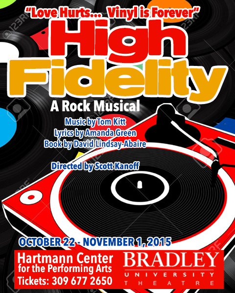
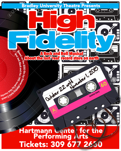
And the final one…