Client: The Peoria Zoo
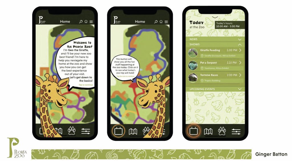
Product: A *UI/UX friendly phone app that maps the grounds and buildings, serves as an exhibit guide (including theme-specific symbols), and (importantly) connects the user to the zoo and it’s activities in a way that develops and encourages a long term brand loyalty.
Requirements: The *wayfinding system part of your app design should be the most visually communicative and experiential part of your phone app as it will ultimately help guide foot traffic throughout the exhibits and around the entire zoo environment. However, the wider purpose of the app is far more than simply a map around the zoo. It should also serve as an interactive guide once the user reaches a specific exhibit or activity. In addition, it also needs to create an ongoing connection with the user far beyond that single visit to the zoo. How can you retain this (brand) loyalty so that the visitor engages with the zoo and it’s exhibits during their visit but also continues to connect, interact etc. with them long afterwards, away from the venue? There are obvious ways through social media links etc. But consider other ideas too that make the app something so much more than simply an on-site way finding system. What additional content does it require to retain this ‘two-way connection?
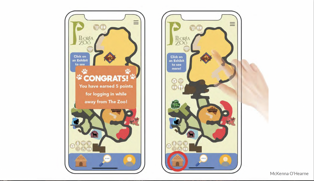
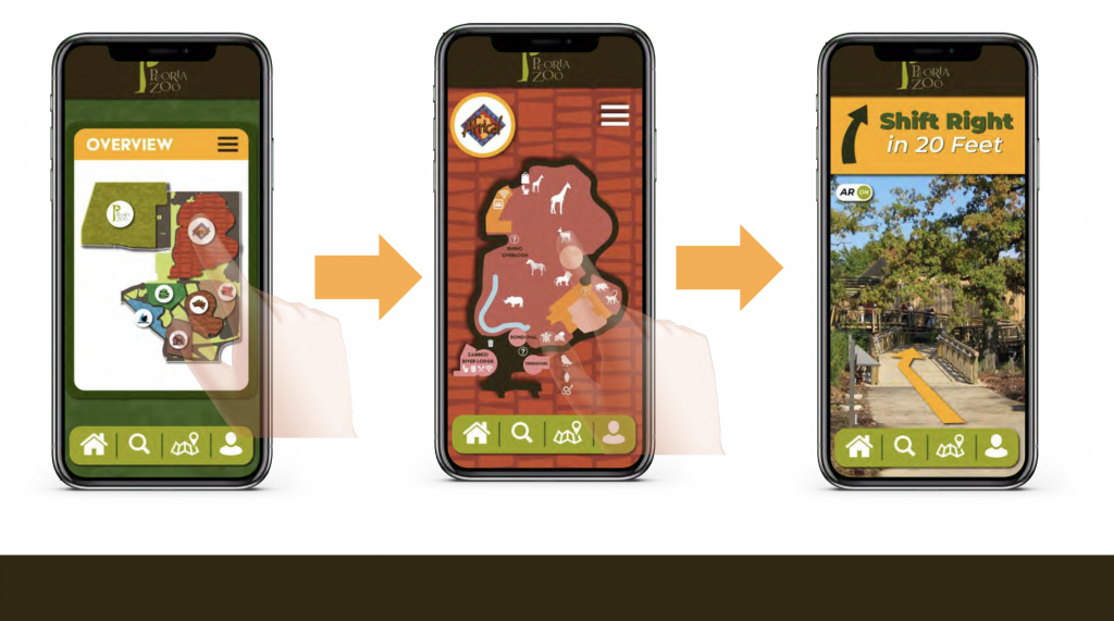
1) Design a smartphone app that delivers a very ‘friendly’ and fun user experience throughout its screens. Primarily it needs to navigate the user/guest throughout the exhibits and activities. Your wayfinding system should be clear, accurate and, although aimed at the parents, easy for all ages to navigate through. The zoos existing map/guide is downloadable below, however, this is merely for you to use as a starting point, for information and assistance in your overall UI/UX. Consider recreating the zoo environment in a more dynamic way to work with your app layout and navigation (however, ensure you retain the graphic integrity and accuracy/scale of the real zoo, (their existing guide may be inaccurate on several levels). Remember the smart phone screen size – how do you need to present these large plans within this format without the need for constant scrolling or pinching/expanding to be able to view clearly?
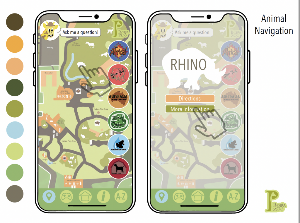
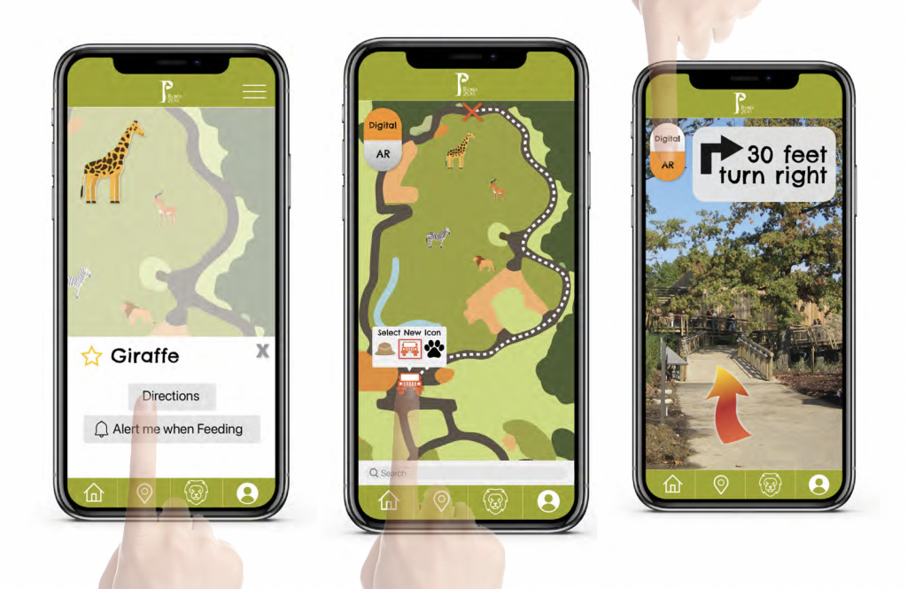
2) Symbol/pictogram/icon designs for each of the main exhibits or activities should be created if they don’t already exist (listed below). However, do not redesign them if they are already established parts of the zoos overall brand image. These are a big part of your overall way finding system. What you see on the app should match up to what you see in the physical environment. They need to be clearly identifiable, flexible to view large and small, on signage in the zoo and on a phone screen etc.
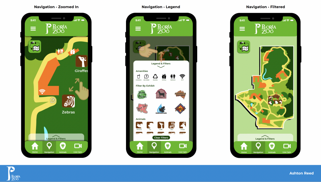
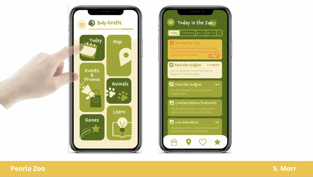
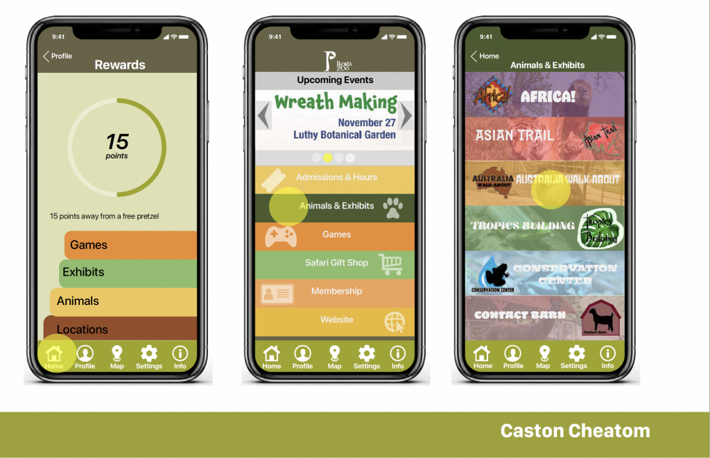
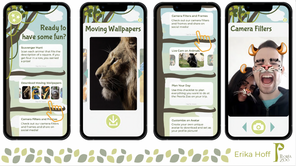
3) Additional phone screens above and beyond the wayfinding, demonstrating the additional zoo activities, information, individual exhibit information/links. Plus, additional content you feel would make the app far more than simply a wayfinding aid after the user has left the zoo. What will prevent it from being next in line for being deleted because the user requires more memory space on their phone so needs to ‘cut’ some lesser used apps on their home screen.
Audience/User: Primarily – Adults/Parents etc. However, if a child was using the app, it should be clear enough for them to navigate through the basic screens.
Tone: Fun and vibrant. Try to retain the house style of the zoo (http://www.peoriazoo.org), however this is not a branding assignment. The focus is how you present your wayfinding system within the potentially challenging format of a smart phone screen.
