Team Brief (section two)

IVPmagboardThe second team brief was also set by one of the leading regional design and marketing companies. This particular challenge required the students to (re)brand a plastics company with an awareness campaign aimed at ultimately increasing their customer base and triple sales over the next couple of years.


Here is the campaign from the team who  ‘won’ the account:

Continue reading “Team Brief (section two)”

Team Brief (section one)

Smart Phone App
Smart Phone App

Always a favorite way to conclude my Brand Experience course as it has the students split into teams and pitching against each other for a hypothetical client/account. This particular wonderful brief, set by one of the leading regional design and marketing companies, required the students to (re)brand the Birthing Center of a particular hospital with an awareness campaign that also considered sustainable exposure beyond the initial promotion.

Here is the complete campaign from the team who   ‘won’ the account:

Continue reading “Team Brief (section one)”

Poster project

Kara4Always a fun assignment because of the permutations it always throws up. My sophomore students where given (out of an envelope) an attraction, company or organization from the area, then a relatively well known graphic designer from the past 50 years. Simple brief – to design a series of posters to promote Peoria (through the Chamber of Commerce) as a place for businesses to relocate to, using the attraction, company or organization given as an example of a successful business… in the style(s) of the given graphic designer. Some great solutions. Here are a few:

Continue reading “Poster project”

Twinkies at Walmart – A challenge!

Twinkie websiteFun, but challenging brief. Assuming that Walmart had bought Twinkie’s (none of the other Hostess products though – just Twinkie’s) to ultimately roll into their own ‘Great Value’ brand range, it was the task of the students in teams/pairs to attempt to re-brand/re-position Twinkies as a viable option snack. To make it a serious contender alongside all the healthy (and un-healthy) alternatives. Identifying brand touch-points with the audience, establishing a new tag line (no connection/equity with Hostess), and presenting a campaign-able ‘big idea’ – tough, right 😉

Here are some of their solutions (some showing quite a few elements of a campaign, while others just a board or two):

Continue reading “Twinkies at Walmart – A challenge!”

Malaria Awareness in South Sudan

My awesome buddy, Justin Ahrens set my Information Design students a really testing brief to create posters promoting awareness and educate about Malaria in South Sudan.

Sth. Sudan malaria logo
O. Moore. Part of poster.


Objective: Without using words, the goal would be to illustrate how malaria is passed and how it can be prevented. It would also be useful for the graphic to illustrate the symptoms of malaria (i.e. headaches etc.) and how it can be treated, plus infographics on how to understand malaria pill dosage. Consider the absolute clearest way to visually explain all the levels of information while avoiding any language, educational and cultural discrepancies.

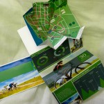
The predominant audience would be the Dinka tribe which is a fairly illiterate culture. This infographic piece would be located in our clinics and other community-based locations in rural South Sudan to begin. Ideally, it should perhaps communicate as a foldable piece that also expands to be presentable as a poster/wallchart within the specified locations.

Here are just a handful of students solutions:

Continue reading “Malaria Awareness in South Sudan”

The resumé experience

I’m a big fan of my junior graphic design students designing a résumé package aimed at one specific person at one specific company. Leapfrog HR. Land something so wonderfully crafted on the desk of the CD that they can’t help but respond. Here are a few of this years wonderfully varied results with hopefully a good few heading out for possible summer and fall internship positions as we speak:

[showtime]

Creative Thinking… Quantity of ideas. Quality of execution.

IMG_2314I always like to start off with this exercise. Choose 15 from 30 simple creative problems and answer them as creatively as possible and as well executed as possible. Simple premise – the ability to sell your initial ideas visually and verbally to the client, creative director etc. without the luxury of a computer to overly rely on.

Hopefully the students will take the level creativity and execution for these exercises and maintain/apply it to their upcoming briefs and assignments… and beyond.

Just a few 🙂

Continue reading “Creative Thinking… Quantity of ideas. Quality of execution.”

A new semester. Lets get creative!

Spring semester. Art 206 Methods and Process, a great chance to focus students on pushing their creativity and ALSO raising their level of pre-computer execution. No point having a great idea if they cant visualize it with a Sharpie pen and piece of paper.

The other course I’m teaching is one of my favorites – Art 306 Designing for a Brand Experience. I’ll post work for this one later.