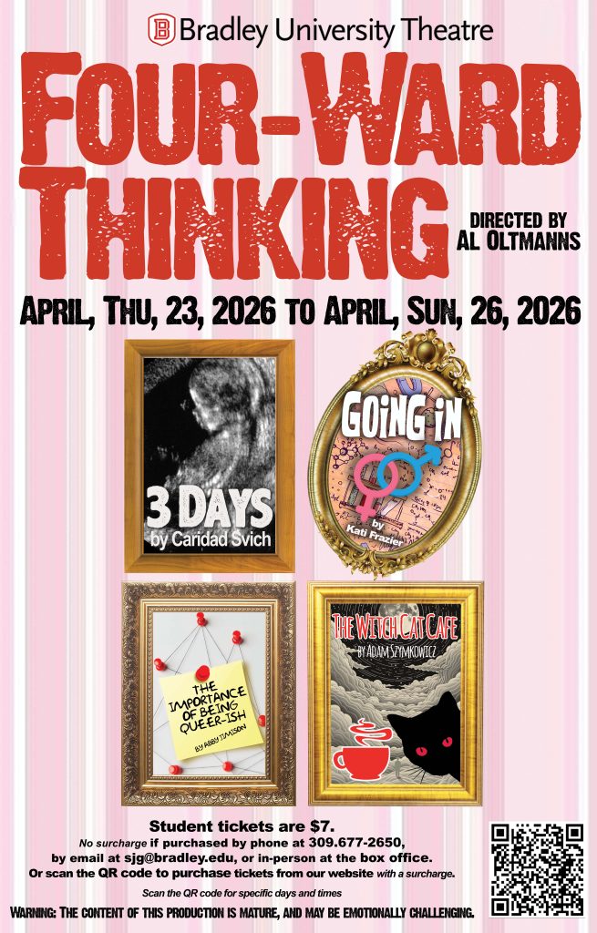
We’ll end our season with an evening of evocative and entertaining new one-act plays from four celebrated new voices in playwriting: Kati Frazier, Abby Jimison, Caridad Svich, and Adam Szymkowicz. These four brilliant short plays cover contemporary topics and themes that speak to our modern world. They will surely challenge, excite, amuse, and inspire you!
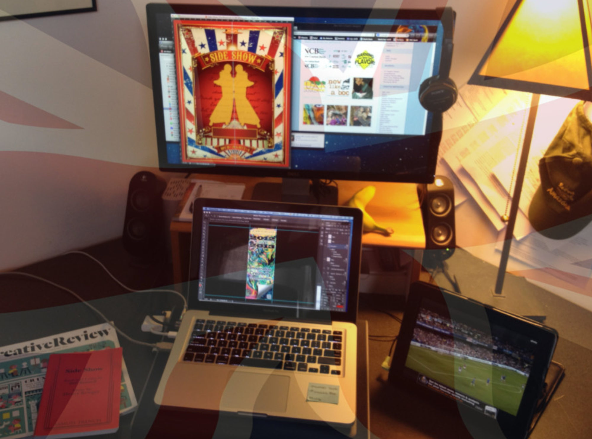
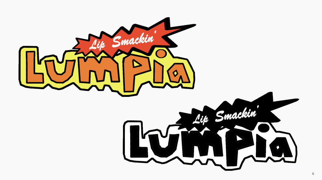
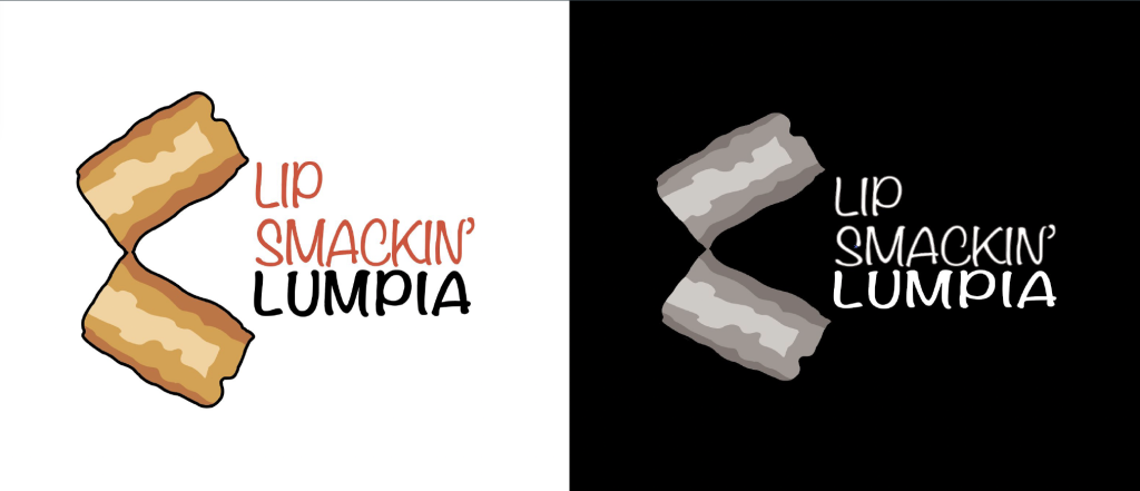
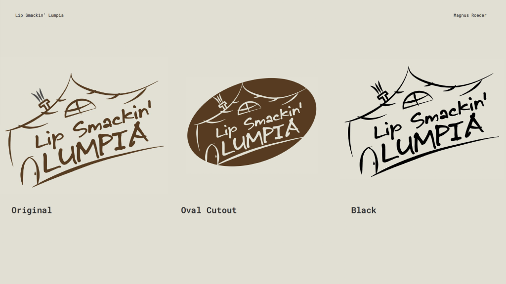
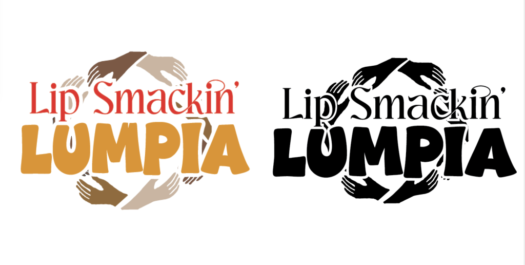
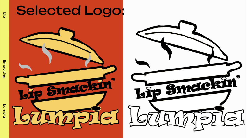
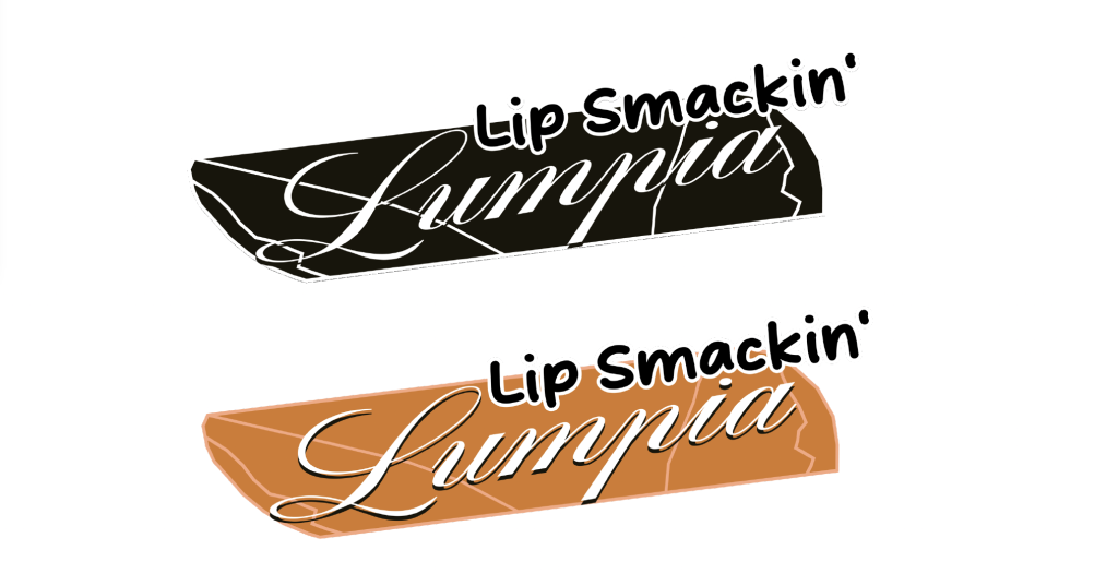
These multi production pieces are always a great challenge. I think we ended up with a great promotion for this particular one!
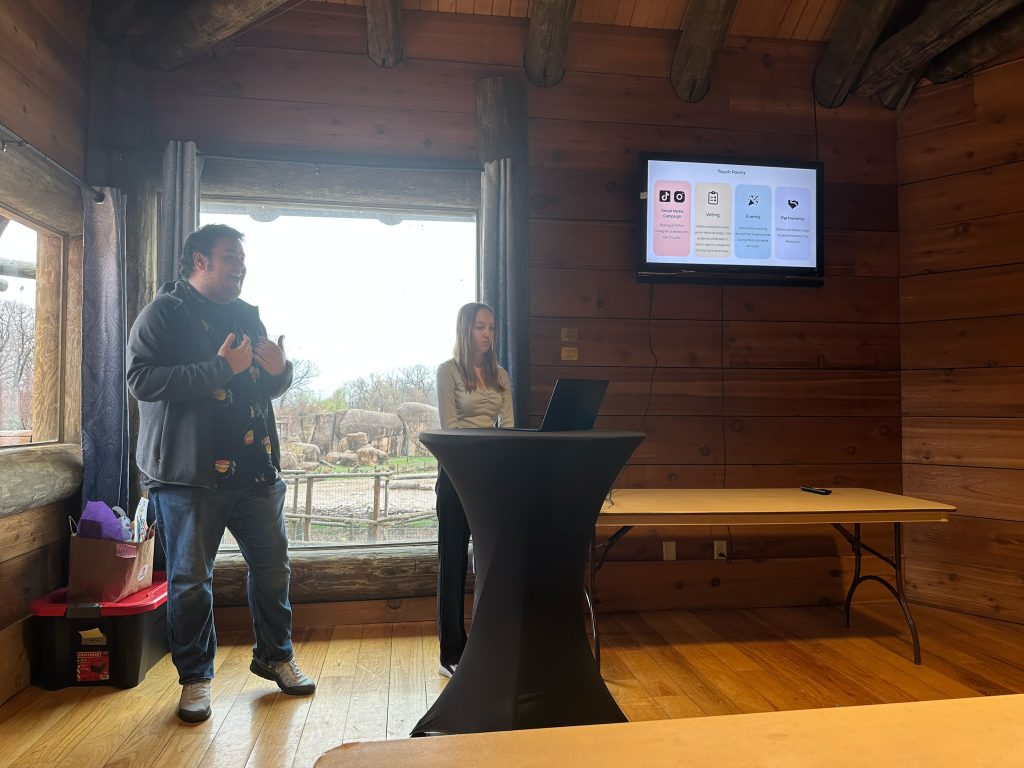
A great challenge for the Brand Experience class to tackle. The venue isn’t difficult to promote, it’s the audience that’s the difficult part of the brief!
Position Peoria Zoo as a relevant, exciting, and values-driven destination for ages 16–21, increasing engagement, repeat visits, and long-term brand loyalty while inspiring conservation awareness and participation.
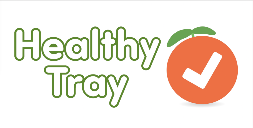
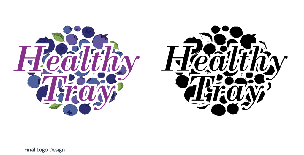
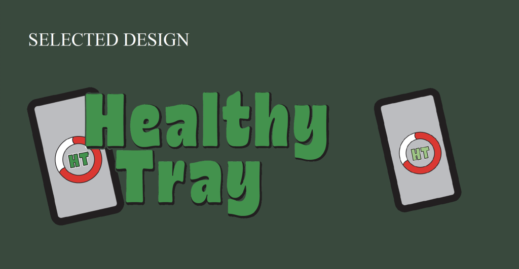
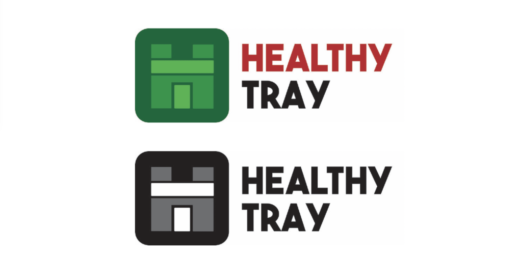
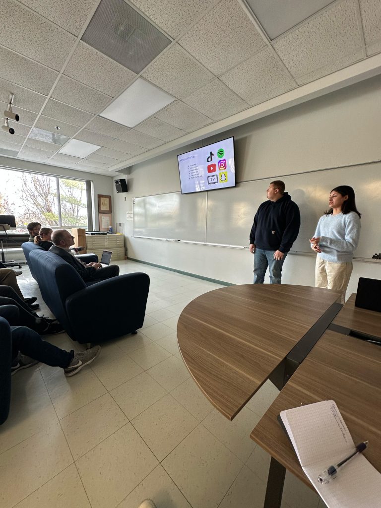
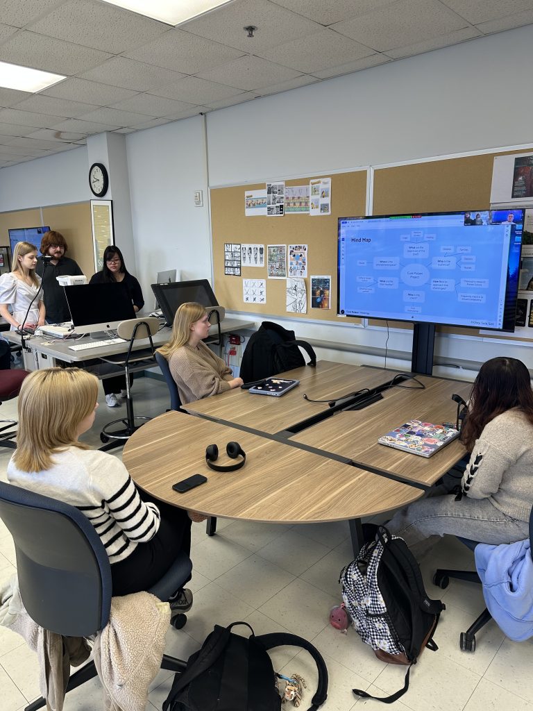
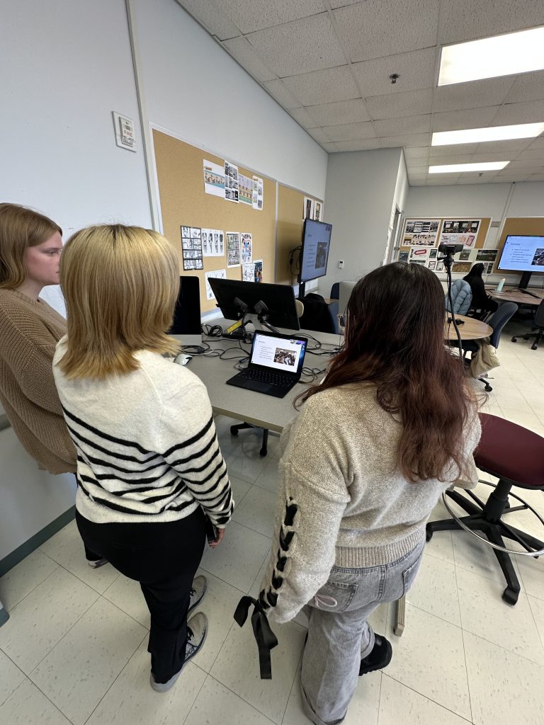
A wonderful opportunity for the Brand Experience class to work with a ‘real’ client. In this case an app titled ‘Healthy Tray’.
Healthy Tray is a food imaging nutrition platform that captures real-time inpatient intake and calculates pertinent values and needs into accurate, actionable nutrition data. This enables dietitians to quickly monitor what an inpatient eats, personalize dietary plans, and improve patient outcomes throughout the hospital stay.
Healthy Tray’s primary target market is U.S. hospitals and health systems, with an initial focus on acute care inpatient settings where accurate nutrition intake data is critical to clinical decision-making.
Hospitals: For hospitals, Healthy Tray improves quality of care, efficiency, and outcomes while helping reduce nutrition related complications.
Dietitians: For dietitians, it enables fast, informed assessments and personalized nutrition plans without manual estimation or documentation burden.
Physicians: For physicians, it offers clear, actionable nutrition data to support clinical decision making and coordinated care.
Together, Healthy Tray turns nutrition into a measurable, actionable part of patient care.
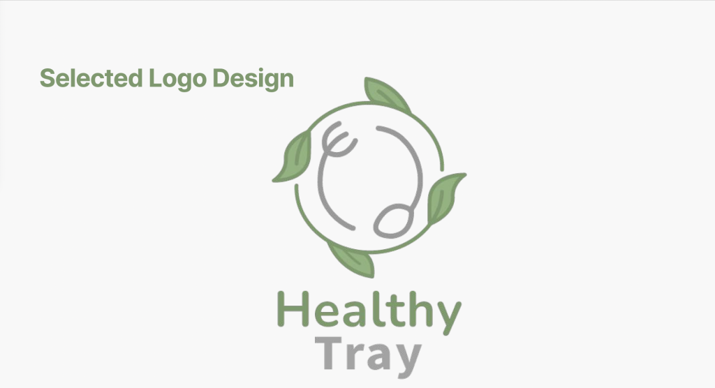
Here are the students interpretations of the brand identity for Healthy Tray. The first three are the clients favorites:
A great, and challenging, first production of the spring season.
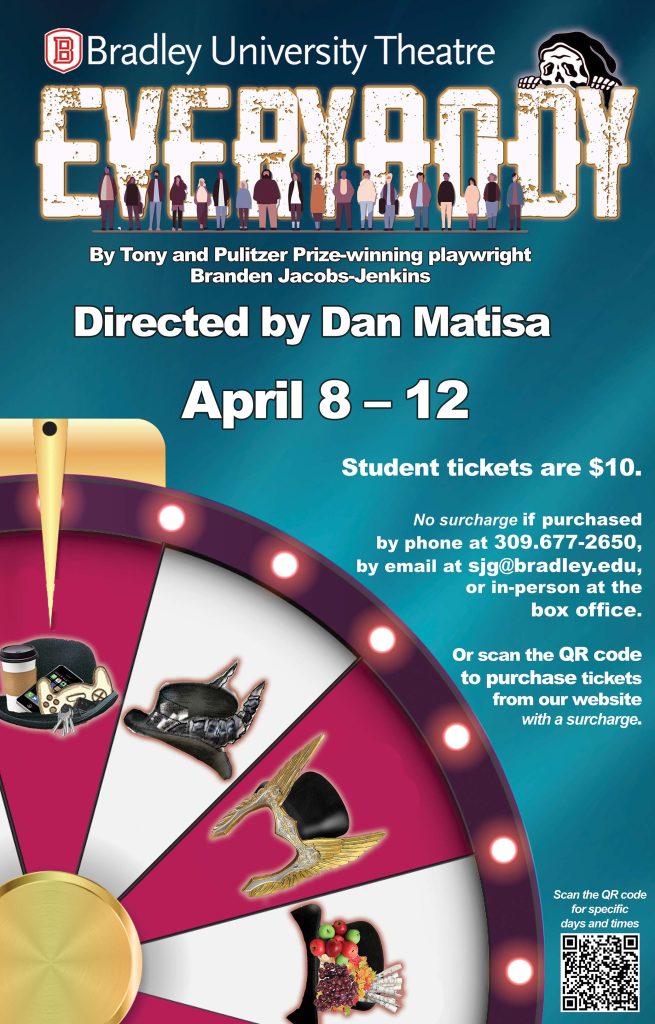
April 8 – 12, 2026 (in the Meyer Jacobs Theatre) Directed by Dan Matisa
This humorous, poignant, extraordinary play is a modern retelling of the 15th-century Medieval morality play Everyman, and is written by one of the most vibrant and exciting voices in theatre today, Tony- and Pulitzer-winner Branden Jacobs-Jenkins. It’s about…well…everybody! What’s more, five of the performers are cast by random lottery every night, so no two performances are ever the same! We are truly looking forward to doing this superb play, which was nominated for the 2018 Pulitzer Prize for Drama. With direction by Dan Matisa (The Three Musketeers, Men On Boats, The Mousetrap), Everybody is sure to be a thought-provoking and surprising night at the theatre! Contains some adult language.
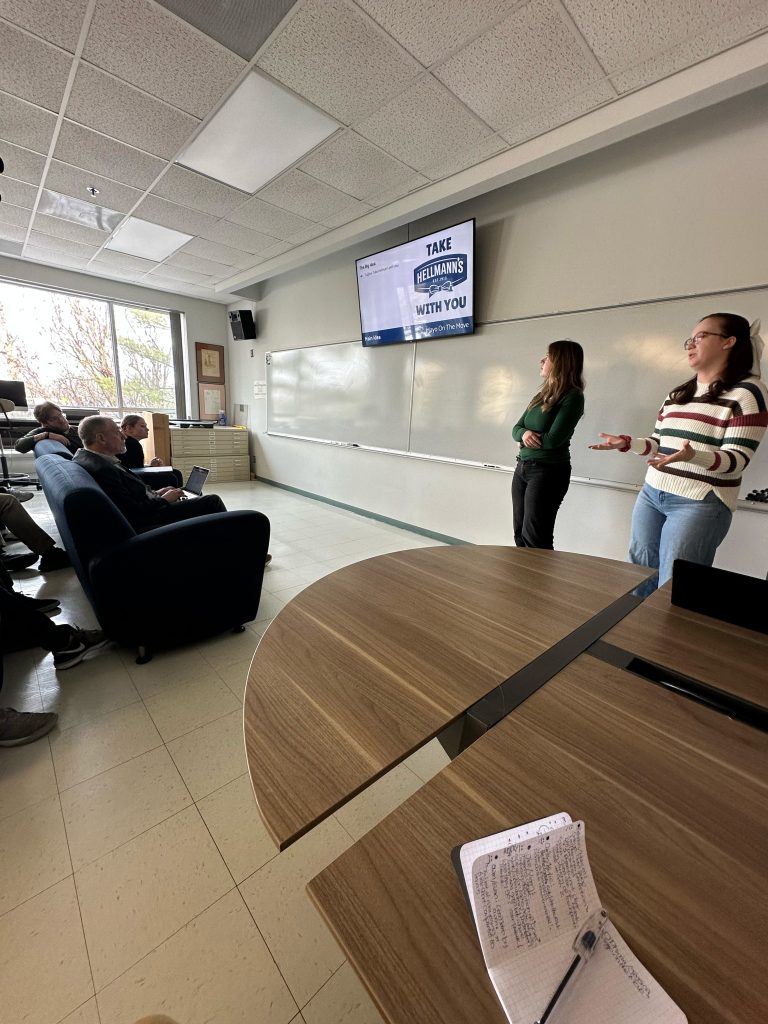
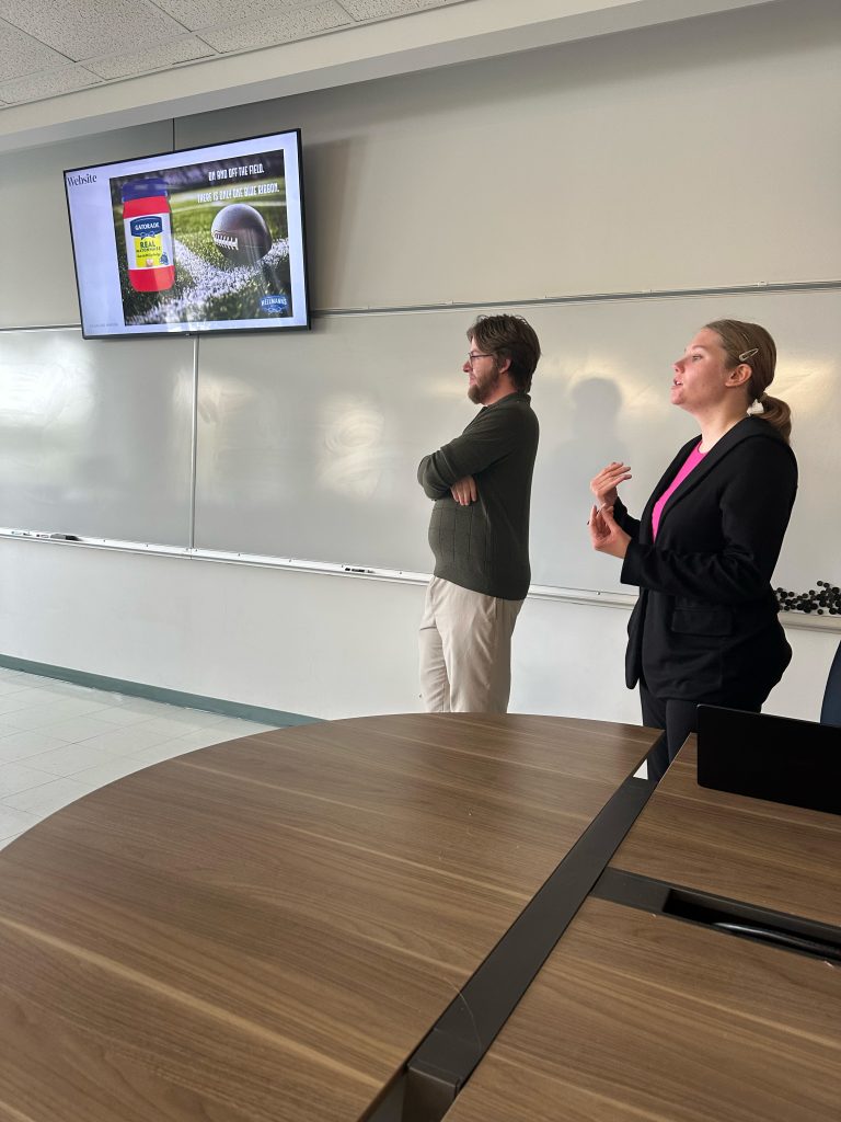
What’s the challenge? Develop an innovative idea that truly shows Hellmann’s is the G.O.A.T (Greatest of All Time) when it comes to mayonnaise. I mean, after all, it isn’t the World’s No. 1 mayonnaise for nothing!
But what does it actually mean to be the G.O.A.T? How can Hellmann’s show that it is ALL about transforming everyday dishes, about bringing rich and creamy flavor and texture to recipes, about elevating food to make it truly delicious? We know the food scene is always changing so how can Hellmann’s resonate best in the food world of today and show everyday dishes can be exciting? How does Hellmann’s show food lovers they are the G.O.A.T? What you create is up to you, as long as it feels authentic to Hellmann’s.
Hellmann’s is looking for big, impactful ideas so best to focus your efforts on creativity that will really make a difference and stand out.
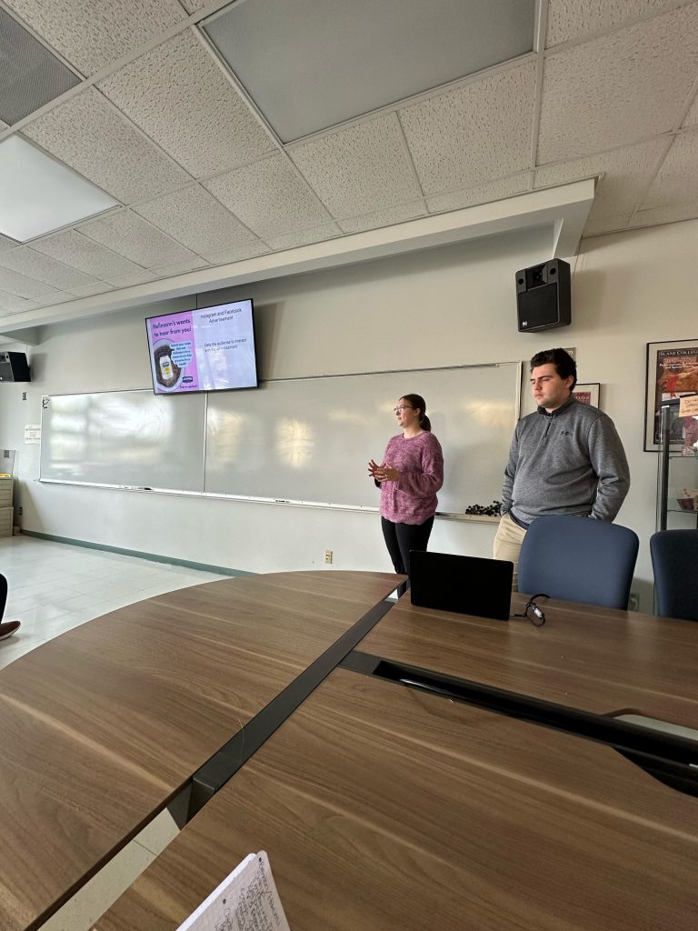
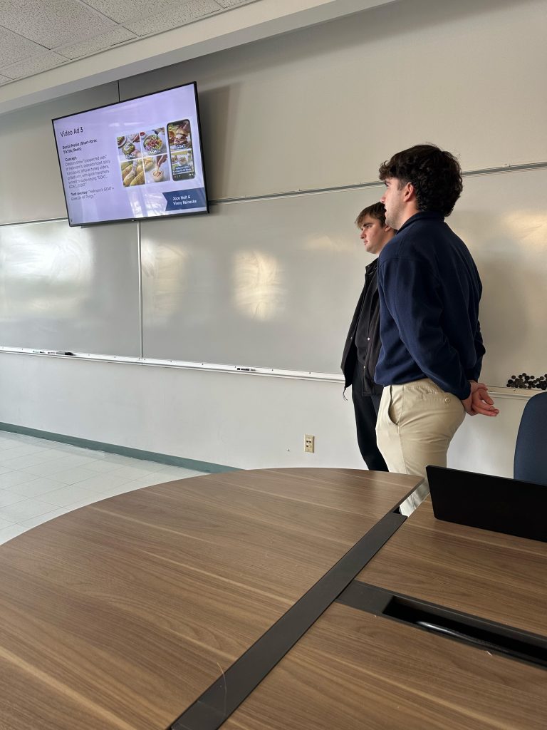
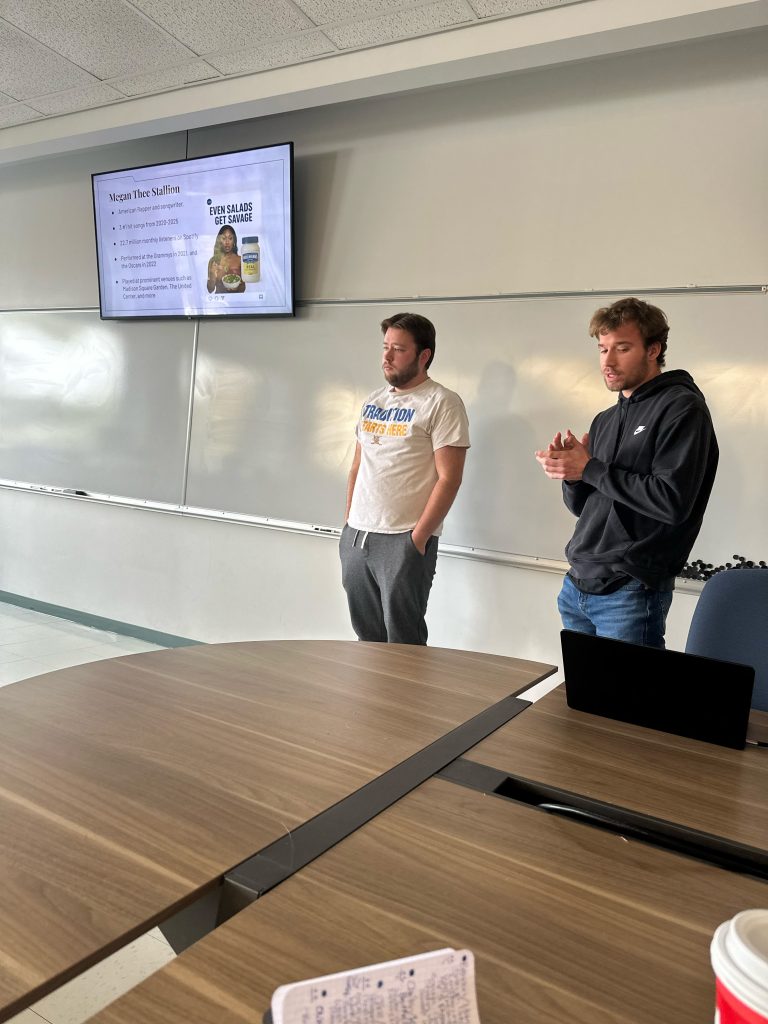
Another great challenge to round of the semester. The Art 306 students, in teams/pairs, had to come up with their ‘Big Idea’ for a successful campaign to reposition Hellmann’s as ‘the mayonnaise GOAT’.
Click on to the photographs of each team to see their presentations:
A wonderful Wayfinding challenge for the Information Design students to finish off the semester.
In collaboration with Justin Ahrens/Rule 29
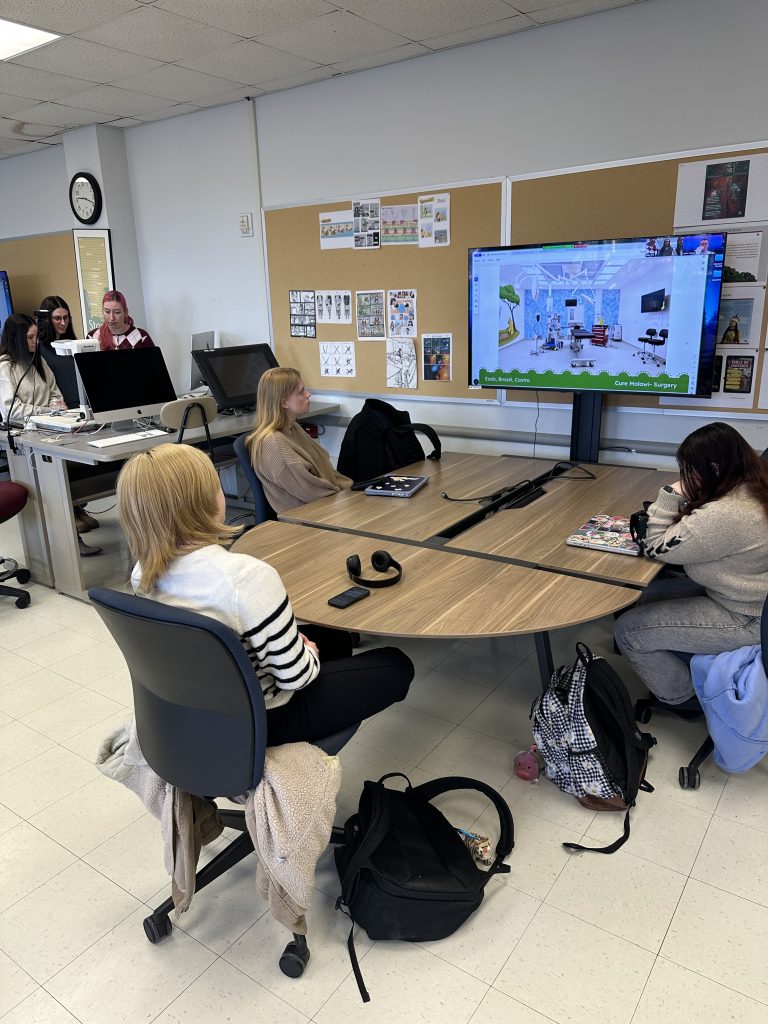
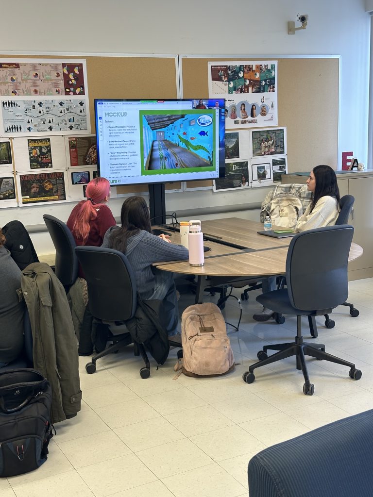
Designing Spaces for Healing In every hospital, the environment is more than a backdrop — it is part of the healing process itself. Studies show that thoughtfully designed spaces can significantly reduce stress, shorten recovery times, and even improve clinical outcomes. Environments infused with natural imagery, culturally resonant artwork, and calming color palettes have been proven to lower patient anxiety and boost emotional resilience .
The Malawi Surgical Center offers an incredible opportunity to bring this research to life in a tangible, meaningful way.
Through the Designing Spaces for Healing initiative, we aim to transform the common spaces of the surgical center into sanctuaries of hope, healing, and humanity. Using intentional color choices, culturally appropriate graphics, inspiring storytelling elements, and spatial design, we will help patients, families, and staff feel safer, calmer, and more supported.
Project Objective To design, produce, and help implement environmental graphics, and complimentary wayfinding/signage that transform designated common spaces within the Malawi Surgical Center into culturally resonant, healing-focused environments — ultimately improving patient and family experiences while supporting hospital staff wellbeing.
Scope of Work ● Environmental Design: ○ Develop a cohesive visual system, including culturally appropriate colors, graphic elements, and storytelling components for the selected spaces.
● Wayfinding/Signage: ○ Upgrade hospital wayfinding/signage, refining existing materials where applicable and ensuring clarity and cultural sensitivity.
● Campus Maps: ○ Integrate into the wayfinding/signage system ○ Designed for easy orientation by reception staff and patients.
Here are images of the students presenting their wayfinding decks remotely. Click on each photograph to go to each teams presentation:
Product:Twice yearly (spring and fall) brand magazine in print and digital versions.
Background: The purpose of Rainforest Foundation US is to support Indigenous peoples and forest communities in their efforts to secure their lands, protect their environment, and uphold their rights.
Requirements: To design a twice a year style magazine (print and digital) that compliments their successful, well established web presence, social media and other marketing tools – but needs in no way to follow their design and layout models.
The magazine should be a mix of hardcore relevant content and also ‘infotainment’ to attract your target audience. However, it should not simply be a fast, disposable read. Anyone picking it up, should want to keep reading and also get something ‘useful’ out of the experience. It’s about informing, educating, and ultimately encouraging the reader to at least consider becoming pro active – you should try to have a good mix of direct and indirect editorial content throughout your magazine. Consider/research stories of individual success and empowerment alongside articles about re/deforestation, carbon footprints etc. Include information graphics alongside the imagery and stories in your page layouts.
Create a COVER with original name/masthead/logotype. Ideally, The words “Rainforest Foundation US” shouldn’t be the main title, although their logo will appear somewhere on the cover. It probably requires a subtitle to substantiate your main title (especially if it is quite symbolic/iconic), plus date/season and several content/story indicators. No barcode required for this first issue.
Design THREE double page spreads for ONE story that runs within the magazine’s editorial well. Make one spread an IMAGE HEAVY opening one, and the other two spreads TEXT HEAVY (but definitely not void of imagery). Ensure the story you select is long enough to run over and beyond the three spreads (it is likely that your story would actually run to maybe six pages or more, however, you only need to show a portion of it.)
Here is a selection of the students work. Click on the images below to see their full presentations…