My Personal Journey

Nice introduction assignment into presentation of qualitative and quantitative data in a visual but clear and accurate way, retaining graphic integrity and truthful representation throughout. Each student had to research a personal journey of their choice and collate as much primary and secondary data as possible from that journey. Everything from the number of stop signs, to the breeds of dogs out walking. From the information collected, they then had to create a wallchart presenting it as a visual interpretation.

JensenPersonalJourney

Continue reading “My Personal Journey”

CAT ‘Specalog’ Presentation

A really good first brief on the Editorial Design course. The Caterpillar ‘Specalog’ has been in its present form for some considerable time. This was a wonderful opportunity for the students to develop their knowledge and execution of grids while at the same time working on a ‘live’ brief with one of the globes largest corporations.

IMG_9763

The brief called for a front and back cover, three inside spreads, plus examples of the printed piece working in a digital format for tablets.

Many thanks  to Joshua Pierson, Don Johnson, Michelle Himegarner and Chris Bosley.

And a really great job by all the students involved.

Continue reading “CAT ‘Specalog’ Presentation”

Mr Burns: A Post-Electric Play

So nothing like starting the new season of theatre productions with a challenge! Totally about America’s most famous tv family, but without directly showing them.

Here is the brief plot: Shortly after an unspecified apocalyptic event, a group of survivors gather together and begin to attempt to recount the episode “Cape Feare” of the television show The Simpsons. The second act picks up with the same group seven years later, who have now formed a theatrical troupe that specializes in performing Simpsons episodes, with commercials and all. The final act is set an additional 75 years in the future. The same episode of the Simpsons, now a familiar mythos, has been reworked into a musical pageant, with the story, characters, and morals repurposed to fit the artistic and dramatic needs of a culture still reeling from destruction of civilization and the near-extinction of humanity decades earlier.

Some of my creative process:

27.5x43_Student_Center 27.5x43_Student_Center#2

And here is the final design for Mr Burns: A Post-Electric Play:

MrBurnsPoster

Celluloid Chicago Film Festival

Brief: Create a promotional campaign for a five night film festival titled ‘Celluloid Chicago’ at The Apollo Theater, Peoria, IL 61604.

Objectives: The Apollo Theater will be launching it’s 2016 fall/winter season with a five night Celebration of movies filmed in Chicago. Admission per night is $10 for two movies, or $40 for a full festival pass. It is your challenge to promote the festival across a variety of media. Although it is a film festival, the emphasis is on the fact that they were all filmed in/around the city of Chicago – this should come across at the forefront of your creative thinking – NOT the attributes of each movie shown at the festival.

celluloidposter_grady

1. Logotype/Brand: ‘Celluloid Chicago’ and a subheading ‘A festival of movies from the windy city’.

2. The Promotional Poster:  17″ x 11″ portrait, full color poster.

3. Microsite link page off the main Apollo Theater website

4. Private Screening Invitation: this should be a real collectible keepsake aimed at a limited number of influential ‘special guests’ invited to the pre-public screening a few nights before the festival officially opens to the public.

Good fun final brief. Continuing the Art 206 mission of presenting problems and avoiding cliché design solutions. Here is a selection of student projects from the brief:

Continue reading “Celluloid Chicago Film Festival”

Promotion/Awareness campaign for ER department

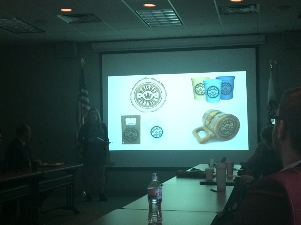
Final team brief of the semester had the students pitching against each other for a regional ER department. They had to take into consideration the equity of an already existing campaign direction and also the faith based element of this particular client. All were good deadline campaign presentations with the one below coming out as the winning team based on their overall campaign ‘spread’ as well as their actual presentation skills on the day.

OSFSA Presentation-11

Thank you so much Jim and Rachel for setting the brief and offering your time to sit in on the presentations.

Continue reading “Promotion/Awareness campaign for ER department”