Get On Your Bike – Peoria

Nice brief to introduce the students to Editorial Design and in particular, the use of grids. Basically, a direct mail piece to encourage the local community to consider riding a bike either for leisure or to work. Priorities: A strong call to action and focus on ‘local’ rather than generic bike riding.


Here are a few nice outcomes:

Creative Thought Process


I love the process of creativity. Here’s an example of an idea developing and refining as the tone of voice and audience is gradually interpreted through conversations and collaborations with the designer and the client:

SpringAwakeningv1

Client: I’d like to rethink our approach to this design. This is no refection on what you sent; your response to my initial thoughts was great. but I’m thinking that to have impact on our audience  we’ll need to do a real in-your-face, rock and roll poster.

On reflection I’m less concerned with evoking the intimacy of our young lovers than I am with the explosive head-banging angst (and music) that fuels much of the show. There’s a lot of leaping, flailing, and climbing going on; the dancing is often stylized and spasmodic.  The ad design for original B’way production employed a variety of looks,almost all photography-based, including frenzied rock-star-flailing and tortured close-ups of howling faces– all that sort of thing. I’m not wedded to photography by any stretch, though.

Continue reading “Creative Thought Process”

Optomap Team Brief

Photo May 05, 9 04 36 AM


End of semester team brief. Six teams pitching for an account brief set by the wonderful people at Hult Marketing. Short version – piece of equipment that can view 200% as opposed to the 30% of a general eye exam. Capable of identifying a number of diseases at a very early preventative stage. Full campaign needed to promote awareness of this procedure/equipment to both the patient/care giver and Optometrists etc. Here are some of the presentations:

Continue reading “Optomap Team Brief”

A Celebration of the B-Movie

Chelsie-Bmovie-poster


A five night movie festival at a unique local drive-in theater, celebrating the B-Movie. Multiple promotional pieces included a brand mark/logo for the event, a poster, micro-site, and a Private Screening ‘keepsake’. Here are two or three of my favorites plus a selection of the rest. Good introduction exercise in developing a brand across multiple touch points.


Continue reading “A Celebration of the B-Movie”

The Coffee Company with ‘Attitude’


Long-Business_Logo_FINALBackground: Are you a coffee drinker? No, I don’t mean a Tall, Non-Fat Latte With Caramel Drizzle, or a Grande, Iced, Sugar-Free, Vanilla Latte With Soy Milk, and especially not a Grande, Quad, Nonfat, One-Pump, No-Whip, Mocha! I mean a cup of good old – perhaps with a drop of milk and maybe throw in a sugar – coffee?

Do you get in the line at your regular caffeine haunt only to find out the person ahead of you is basically talking a different language with the Barista and their drink takes a team of three people 15 minutes just to order.

JF Coffee Company is a coffee shop. It serves coffee, no pour overs, no lattes, no iced drinks, no tea, no espresso…. just f***ing coffee.

Tone of Voice: No fuss. ATTITUDE.

Requirements/Deliverables: Depending on your approach and audience you are to try to identify as many touch points as possible that connect the brand with the customer. Loyalty is a BIG part of the success of this type of venture. Think returning customers, not just because they like the product but because they LOVE the brand image of the place and like to identify with it – again, think ‘attitude’. What can you do to ensure this loyalty – that’s the key.

Some nice ideas….

Continue reading “The Coffee Company with ‘Attitude’”

Branding a specialist cake company with no physical presence (Art 306)


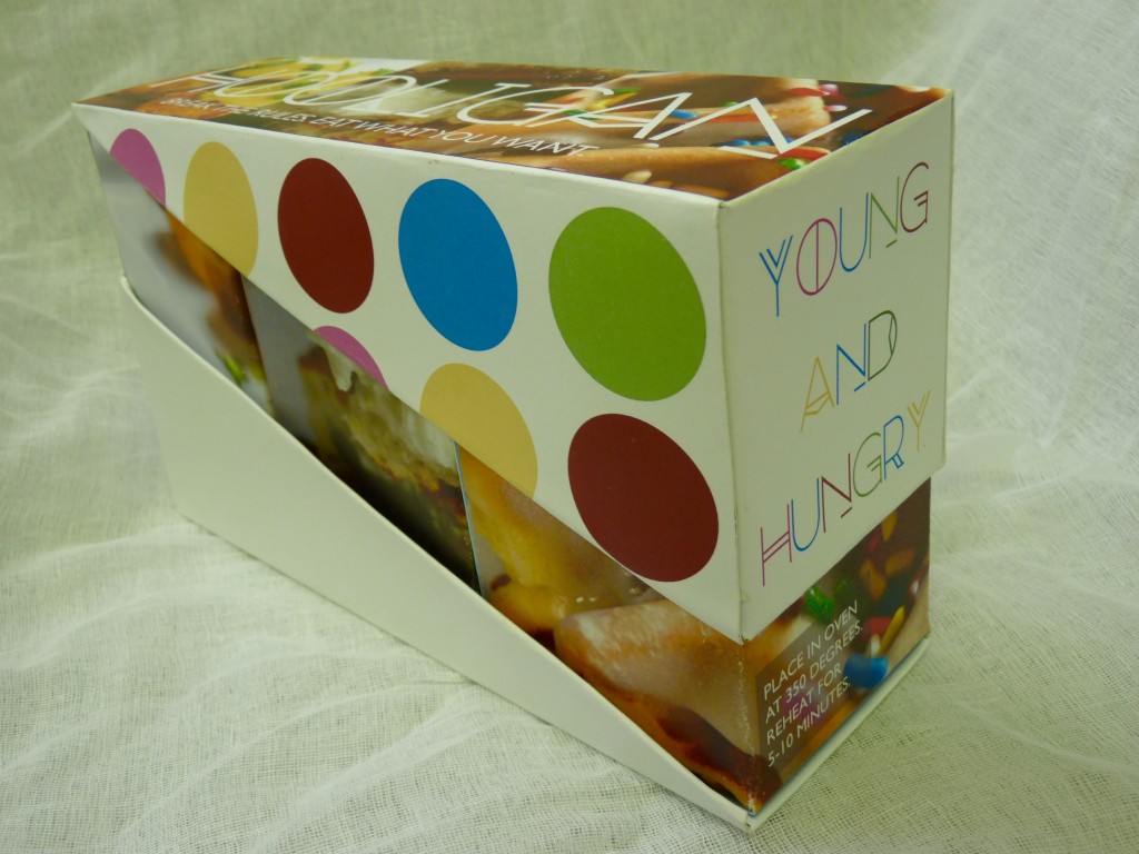
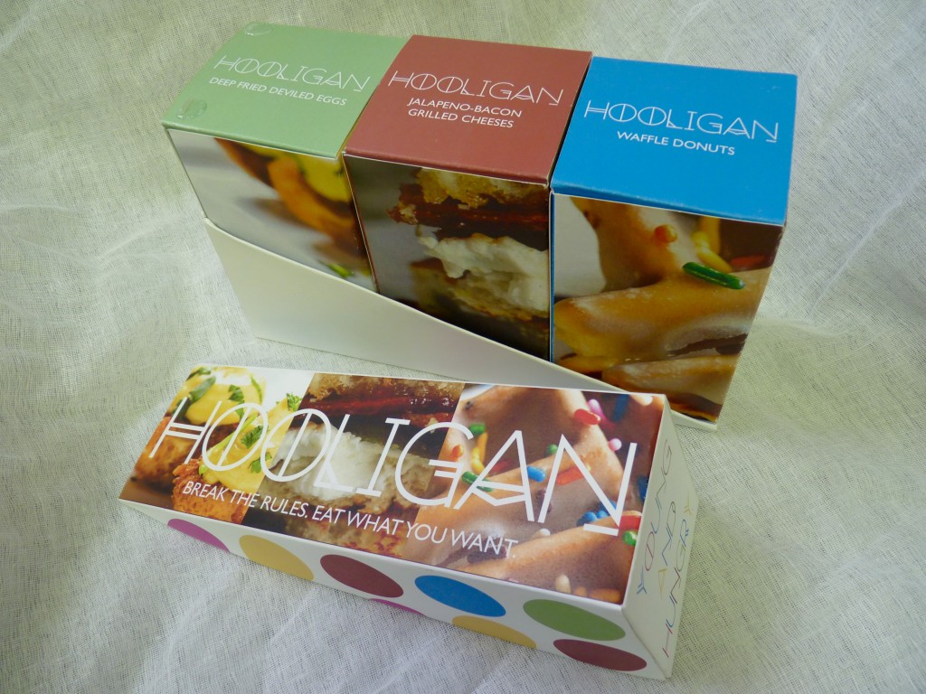
Alexis_PackagingA new brand. specializing in luxury handmade cakes, including alcohol infused cupcakes (heck yes!) No store front. Most transactions primarily carried out via  their website or a smart phone app. The only physical  touchpoint experience between brand and consumer will be the packaging when the product arrives in the mail or is delivered.

Deliverables_ Brand mark. Smart phone app. Packaging.

Here are some of the solutions

Continue reading “Branding a specialist cake company with no physical presence (Art 306)”

Poster Series Challenge

wheelsotime1


Draw a designer out of the hat. Draw a local company, attraction or organization out of the hat. Present a series of posters that both promotes the latter as a success story in the region and encourages other businesses to consider relocating to Peoria, but in the style of the selected designer (without ripping off any particular piece/body of their work). Always a challenge. Always fun to see the outcomes. Here are a few to share 🙂


Continue reading “Poster Series Challenge”