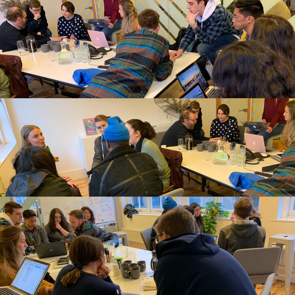
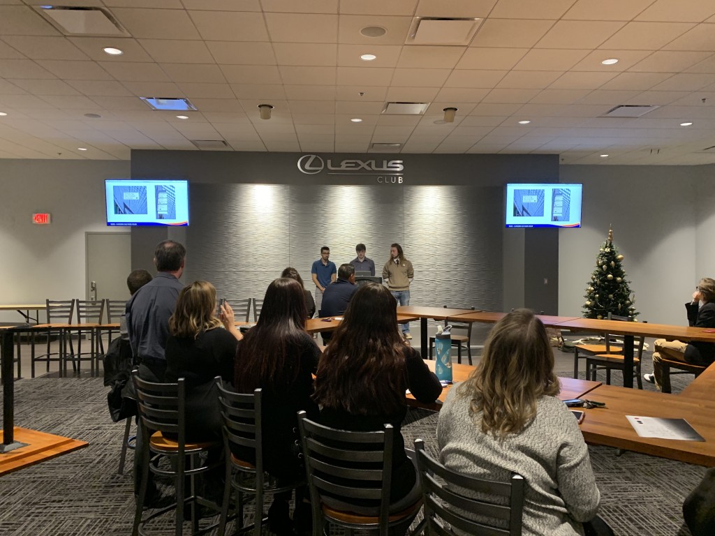
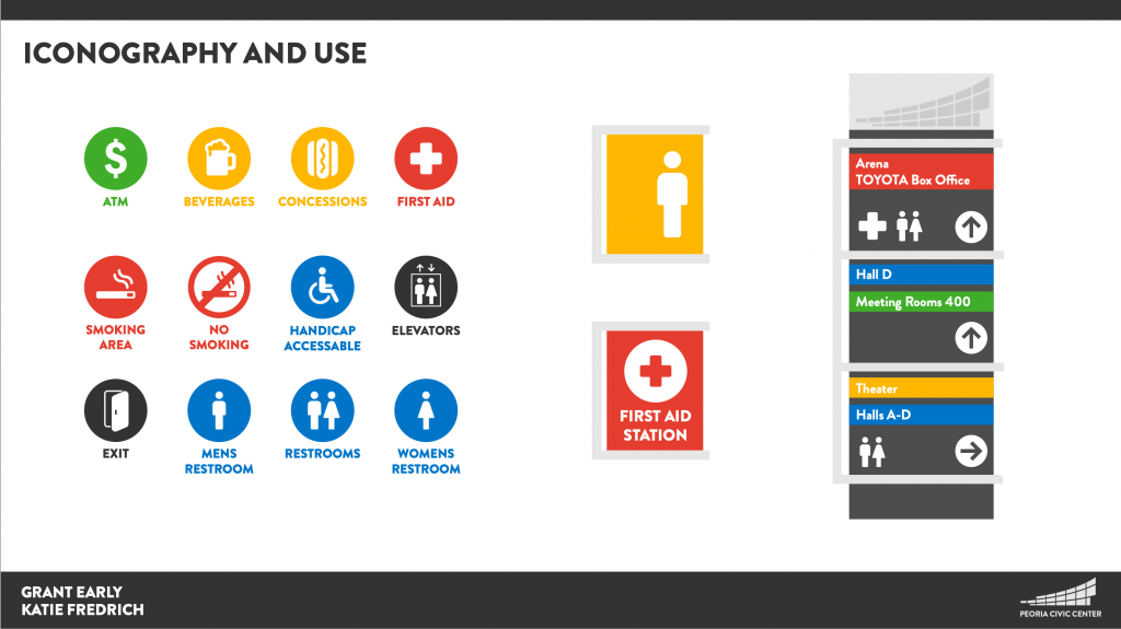
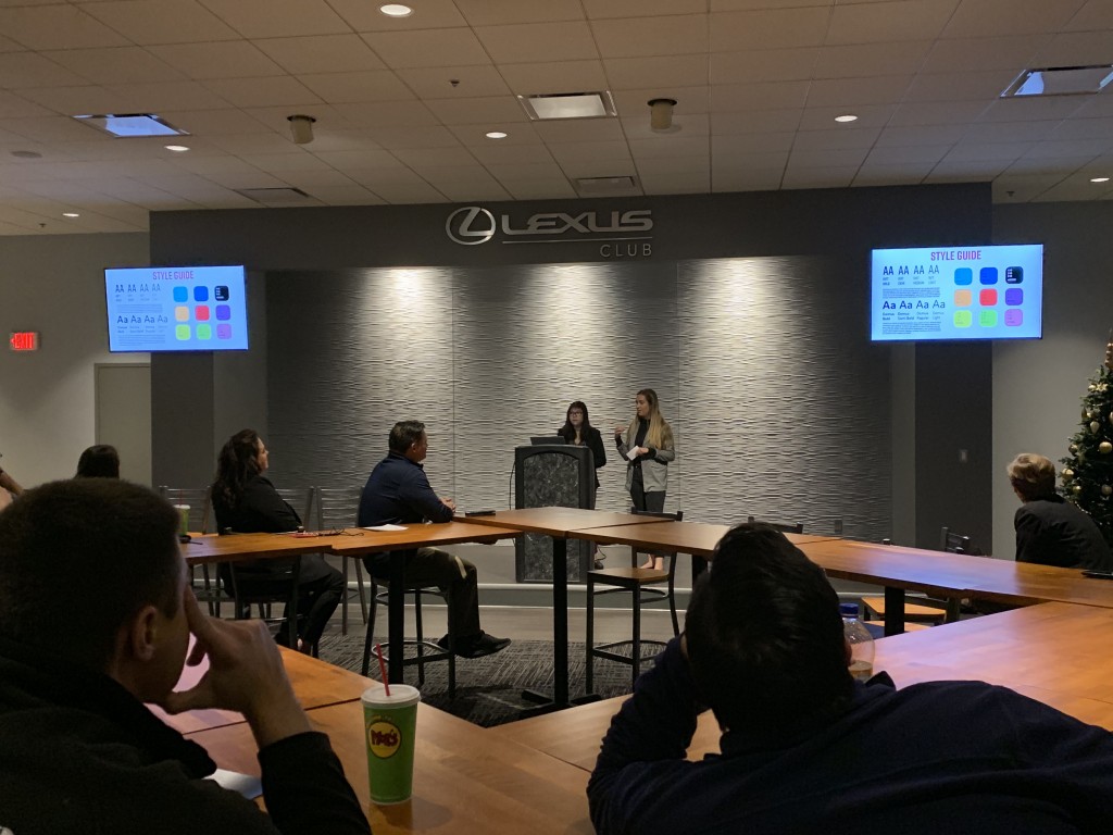
Dead Man’s Cell Phone

I love the progression an idea takes. This is the initial direction I was going with on the latest theatre production promotional piece…


And this is the end piece. Miles apart in style, but similar art direction, and a great process between the two.

‘Experiential Learning’ Visit Day

Another successful summer visit day with a really great group of (potential) students interested in Drawing, Graphic Design and Art Education. While the parents went off to discuss the boring financial stuff, the students got to get their hands dirty with some very cool prints, thanks to Print-maker extraordinaire – Oscar Gillespie!

Hope we get to see them all again as incoming 2018 Freshmen.

2017-18 Theatre Season

Great fun designing the main theatre promotional piece for the upcoming season, using elements from two of last seasons hugely successful productions – Mr Burns and These Shining Lives.

Branding the Peoria ‘Whiskey District’

The goal of this exciting final team project was to create an identity icon that pays tribute to the history of the Peoria whiskey distilleries while presenting a nod to the spirited and reinvented future. The new brand mark will be used to visually communicate the boundaries, parameters and personality of the defined Whiskey District to Peoria and surrounding area citizens & visitors to the area.
Each of the five student teams gave a 15-20 minute presentation of their brand strategy, including a brand mark, and a variety of key touchpoints connecting the brand with the target audience(s).
All teams presented very well with a variety of creative thought process, and five very strong brand marks – great job by a great group of students. Thank you for a fun semester.
Here are an assortment from each brand campaign…

Continue reading “Branding the Peoria ‘Whiskey District’”

Gourmet Single Serving Food Packaging

“The biggest thing we’re noticing in America’s pantries is that there doesn’t seem to be a target demographic for single-serve packaging. Everyone is using them to some degree. Empty nesters. Single adults. Even families, the supposed raison d’etre for large sized multi-serve package designs.

Single serve packaging is fulfilling an unmet need to manage waste and to acknowledge our increasingly individualistic eating patterns in a highly fragmented, fickle culture of eaters who think that every day is a good day to try something new in the world of food.”

So, the challenge was to select a meal that consisted of at least three items and required little or no prep time, could be eaten anywhere, but was leaning more towards gourmet quality than fast food. The packaging had to be secure, environmentally considerate, but unique in its look (yet still stackable). Here are a few of the students solutions to this fun packaging brief.

Continue reading “Gourmet Single Serving Food Packaging”