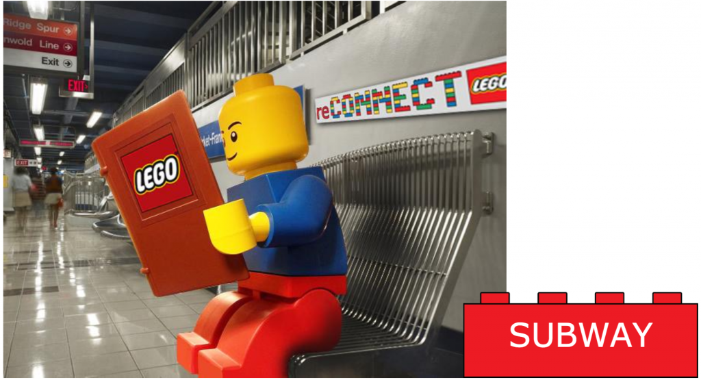
Final Project of the Semester


After a pretty busy semester,  I wanted a conceptual brief to round off the ‘Designing for a Brand Experience’ course. In other words, more focus on taking a chance and pushing beyond the obvious.

In this case, it involved one of the food industries fastest growing options – the single serving meal. Not the fast food, unhealthy ‘grab-n-go’ but quality food combinations that could grace a restaurant table. The emphasis was on the package design itself (the 3D element if you like). Obviously, the surface graphics/branding was important too, but I was really pushing for my students to ‘play’ with the form. Did it protect, the contents? This had to be their choice of three food items that made up their particular single serving. Was it easy to carry away? And would it stand out visually from the rest of the competition on the shelves (unique shape, interesting graphics, strong brand presence etc.)?

Varying levels of success, but from my own point of view I would rather grade up for the more adventurous attempts.

Here is probably my favorite, followed by the best of the rest…

P1010908 P1010910

Continue reading “Final Project of the Semester”

Almost good to go…

So after several weeks of cutting, gouging… and procrastinating, it’s finally time to print up my linocut piece (just as well, because I have to get the framed finished version to the gallery this week!). I’m really excited to see how it comes out as there’s quite a lot of detail in there.

The work is based on a quote by Matthijs Van Boxsel :

“Seen clearly, life without hope is hell,
but Hell without fear is a fairground attraction

Watch this space for the finished piece!

Linomontage

Rickee Rockets – A Steampunk Coffee Cooperative

ExteriorWonderful branding opportunity. A client in Southern Illinois was looking at developing a business venture that centered around a coffee house, but was more focused on a center for possible entrepreneurial ventures,  potential collaborations, co operatives, collectives, conversation… and coffee.

The client emphasized a keenness to pursue a Steampunk theme direction (or alternatively a 1960’s feel).

Here are the presentations from the three students who connected most closely to the clients vision, plus the one of the ‘best of the rest. But all the students did really well.

Continue reading “Rickee Rockets – A Steampunk Coffee Cooperative”

Pick a Company. Pick a Designer

Always a fun project. Pick a company, organization or attraction in the area and create a series of four posters to highlight them and promote the region as a good place to relocate your business. The students pick their company out of a ‘hat’, and then also have to pick a designer out of the said hat too.

The catch to the brief is that while they have to promote their company – it has to be in the style of their designer!

Here are some of the results:

ParksSoccerFinal_MadisonDunawy
Peoria Park District. In the style of Jay Ryan/The Bird Machine.

Continue reading “Pick a Company. Pick a Designer”

Working on a new print piece

Invited to show a piece in a group show in early summer. I didn’t want to submit any thing old, but I also have a lot of pieces to prepare and frame for my solo exhibit also coming up in late August, so I decided to create one new composition (24″ wide x 9″ tall) based on an interesting quote I came across that really resonated with me….

“Seen clearly, life without hope is Hell, but Hell without fear is a fairground attraction”

By Matthijs Van Boxsel.

Only just started to cut and gouge, so a long way to go yet, but should be a cool piece when it’s printed out (black and white).

I’ll keep adding images to this post as it progresses.

File Apr 06, 10 17 55 AM Photo Apr 14, 7 46 38 PM Photo Apr 21, 11 13 06 PM