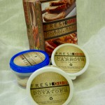
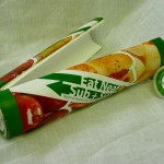
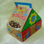
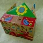
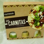
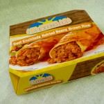
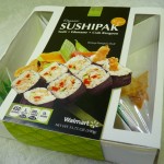
After a pretty busy semester, I wanted a conceptual brief to round off the ‘Designing for a Brand Experience’ course. In other words, more focus on taking a chance and pushing beyond the obvious.
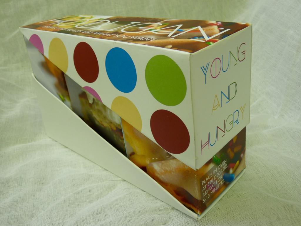
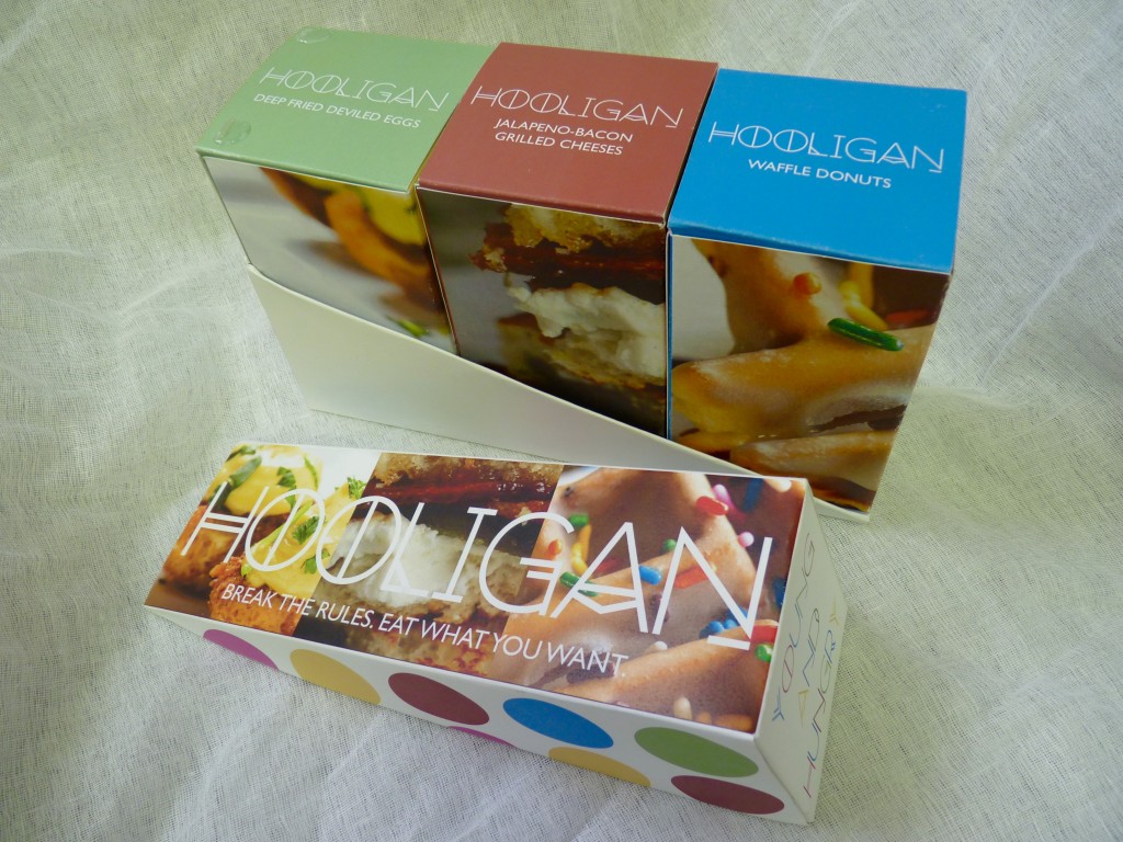
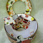
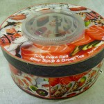
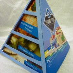
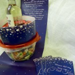
In this case, it involved one of the food industries fastest growing options – the single serving meal. Not the fast food, unhealthy ‘grab-n-go’ but quality food combinations that could grace a restaurant table. The emphasis was on the package design itself (the 3D element if you like). Obviously, the surface graphics/branding was important too, but I was really pushing for my students to ‘play’ with the form. Did it protect, the contents? This had to be their choice of three food items that made up their particular single serving. Was it easy to carry away? And would it stand out visually from the rest of the competition on the shelves (unique shape, interesting graphics, strong brand presence etc.)?
Varying levels of success, but from my own point of view I would rather grade up for the more adventurous attempts.
Here is probably my favorite, followed by the best of the rest…
