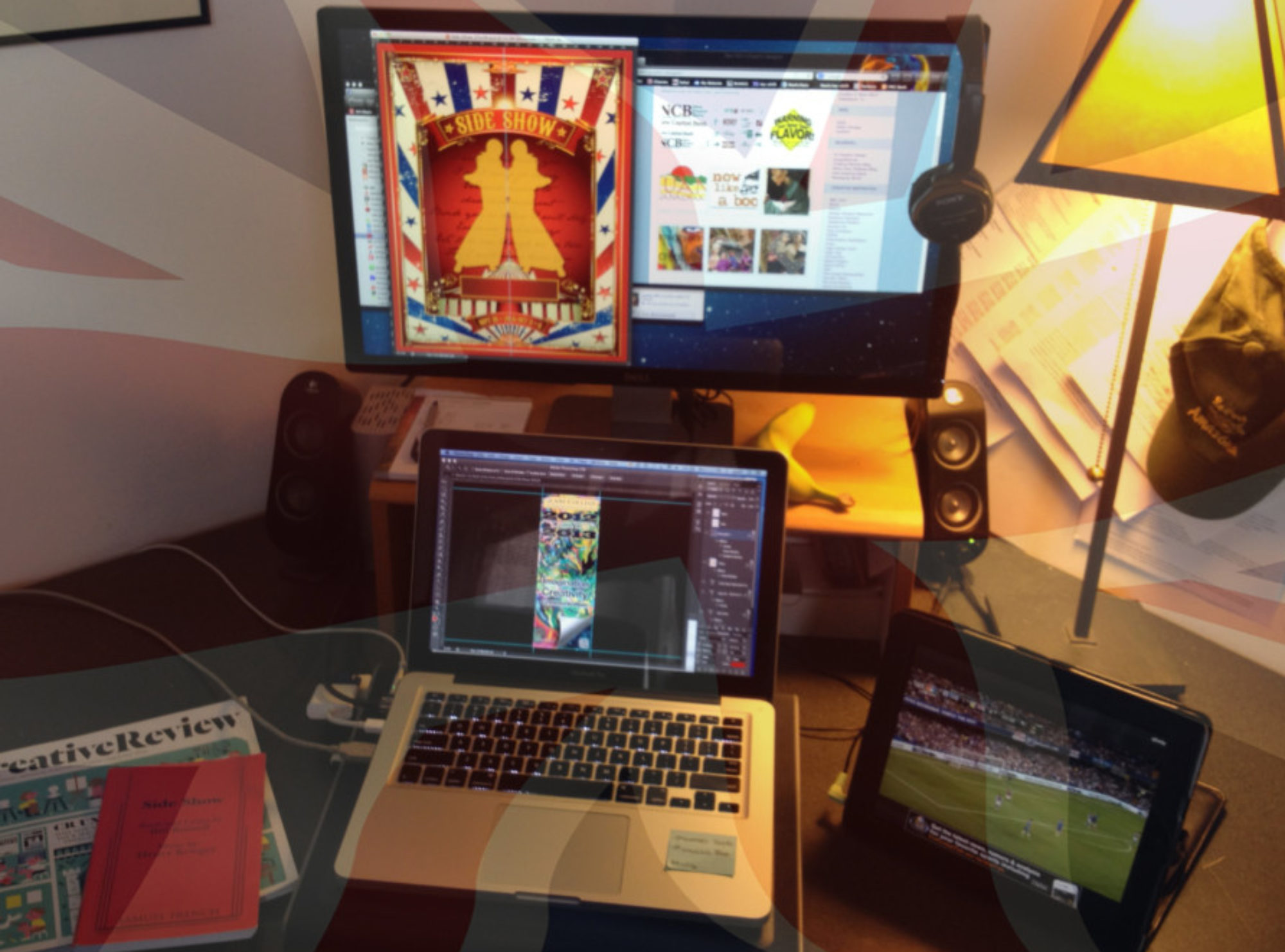

Final production of the 2015-16 season. Already excited for the challenges that the next theatre season will bring.
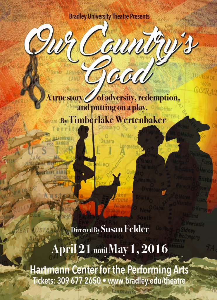
Final production of the 2015-16 season. Already excited for the challenges that the next theatre season will bring.
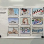
To commemorate the 100th Anniversary of the National Park Service, the United States Postal Service (USPS) will be issuing a horizontal strip of four se-tenant stamps (a philatelic term describing an attached pair, strip or block of stamps that differ in design, color or denomination), and through the Citizens’ Stamp Advisory Committee (CSAC), you have been commissioned to design them.
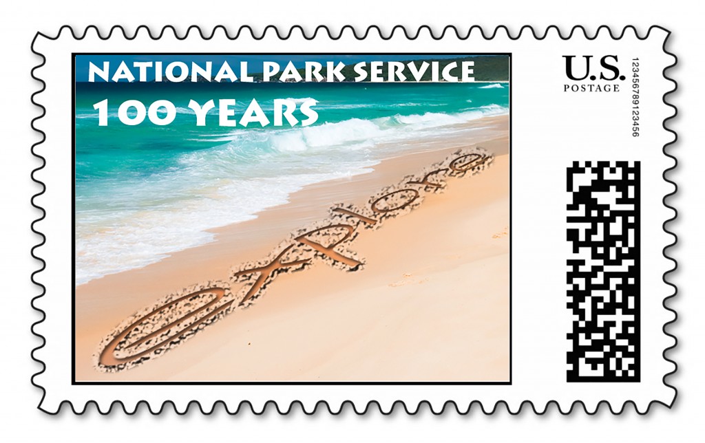
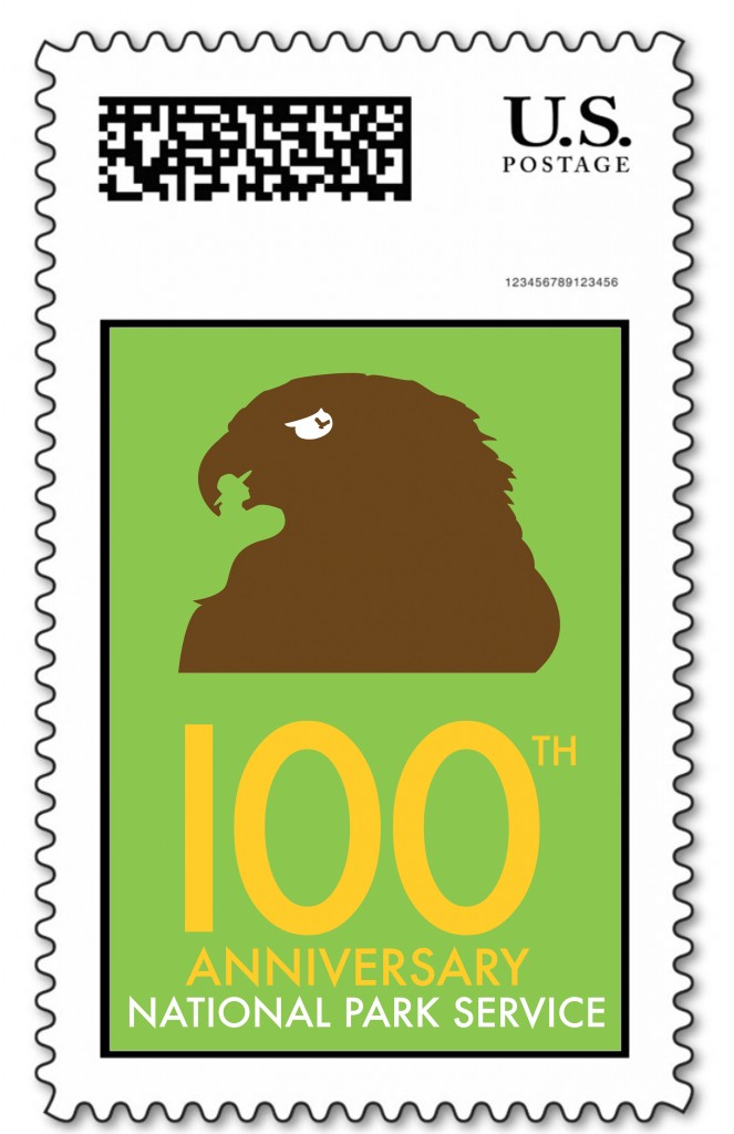
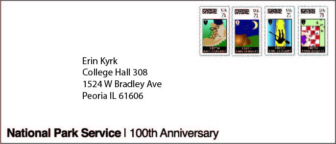
Brief: To design unique and dynamic concepts for the FOUR stamp series, and to additionally present them on a First Day edition envelope. However, as is the way with Art 206 – You do, however, have a BIG challenge….
You have to design your stamps set entirely based around the style of the designer you have ‘drawn out of the hat’. How do you come up with original, non-cliché imagery celebrating this anniversary and promoting the NPS, while at the same time visually retaining the style, approach, and possibly color palette and font range of your designer?
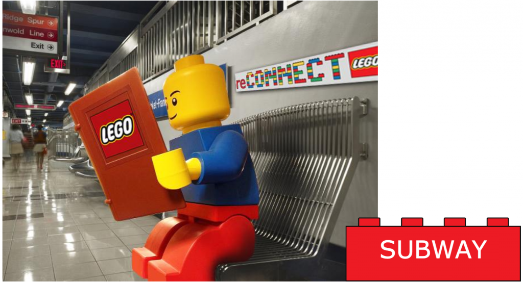
The Creative Challenge (Thank you D&AD): To create a campaign for the LEGO Brand that distinguishes LEGO from all the other construction toys in the toy market by highlighting the benefits and points of difference of LEGO rather than the detriments of our competitors.
The campaign should encompass the LEGO brand values and take advantage of LEGO’s heritage and strong brand equity within the US.
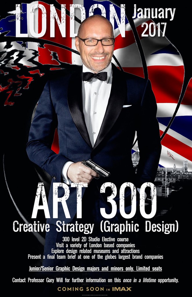
Go to the Bradley Study Abroad page for more information.
Congratulations to those students who have registered for this opportunity of a lifetime course, in one of the world’s most exciting cities.
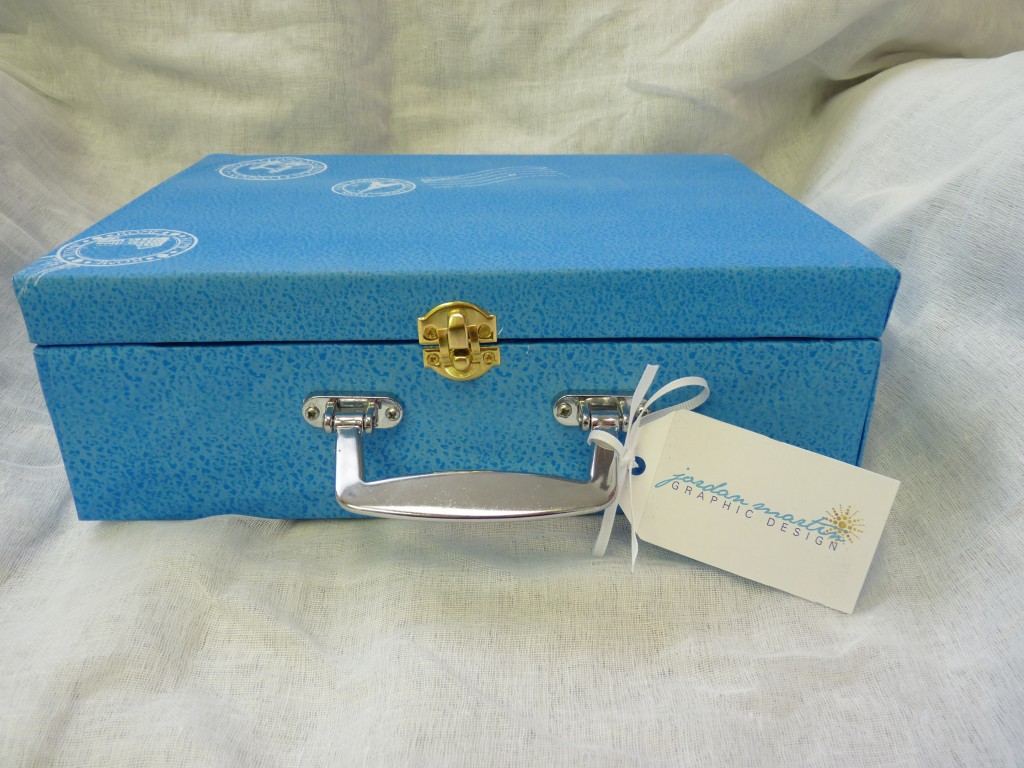
A communication/information design piece that goes beyond the standard resume/cover letter.
One of the ongoing debates regarding student self-promotional literature is, without doubt the role of the printed resume piece versus an electronic version.
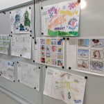
Always a good exercise in raising the level of execution and creativity. Choose 12 from 28 ‘problems’ and come up with the strongest, least cliché visual solutions, to a level of execution high enough to get it across to others.
While a fun assignment – the purpose of it is to ensure students push their creative thought process further than the obvious, while at the same time being able to present/sell it at a (pre-computer) level their potential client, creative director etc. can understand.
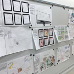
Product: Present your ART 305 creative process journey for the previous three projects) in a beautiful, original editorial design piece.
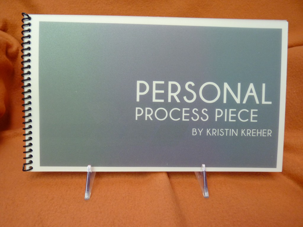
Requirements: Return to your previous three Art 305 projects and narrate the process you used to create them (yep, that lack of process has come back to bite you now!) through a unique and personal editorial design piece. This is not a simple brochure, but a very personal insight into your journey from brief to finished piece with the previous three Art 305 projects. Present the stages of your thought process for all three projects. Include text from your evaluation reports to back up the images and help visually/verbally explain your creative ‘journey’.
Last brief with this particular group of students. Been a pleasure teaching them over the past two years or so.
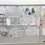
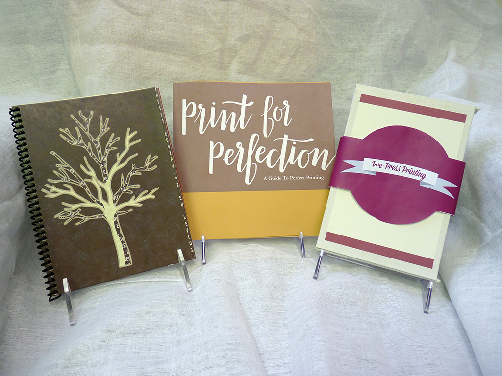
Working in teams, the objective was to create a pre-press ‘quick guide’ quality give away piece at a printing trade show that would give an accurate, easy to understand overview of pre press, file preparation, paper, printing tips and techniques etc.
Here are the three final pieces…
…followed by more examples of each one: