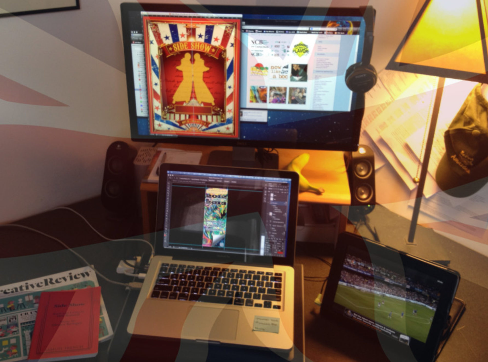
It was nice to be teaching Editorial Design again after being away from it for a few years. The magazine assignment is always a good one to demonstrate grids, unique use of type, and art direction of imagery.
Each student was required to demonstrate a title/masthead, cover, image heavy, opening story spread, and two text heavy spreads. Unfortunately, we didn’t have the time to develop the digital version of the magazine. Here is a selection of the more successful results.
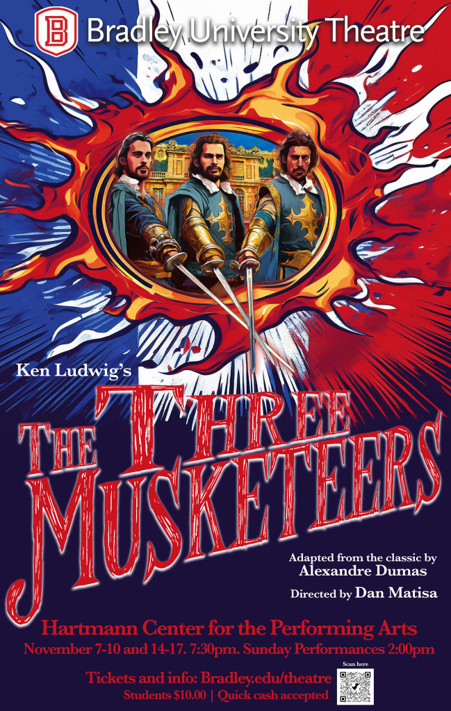
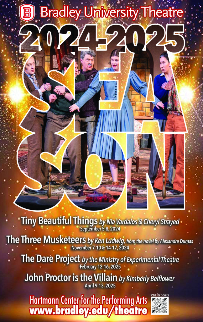
Adapted from the classic by Alexandre Dumas Directed by Dan Matisa with thrilling fight choreography by BU Theatre alum Justin Verstraete.
November 7-10 and 14-17, 2024 in the Meyer Jacobs Theatre
From the acclaimed comic master Ken Ludwig (Lend Me a Tenor, Crazy for You, Moon Over Buffalo), this adaptation, rendered afresh with Ludwig’s hilarious, over-the-top style, is based on the timeless swashbuckler by Alexandre Dumas. It’s a tale of heroism, treachery, close escapes, and above all, honor.
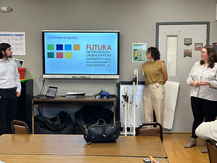
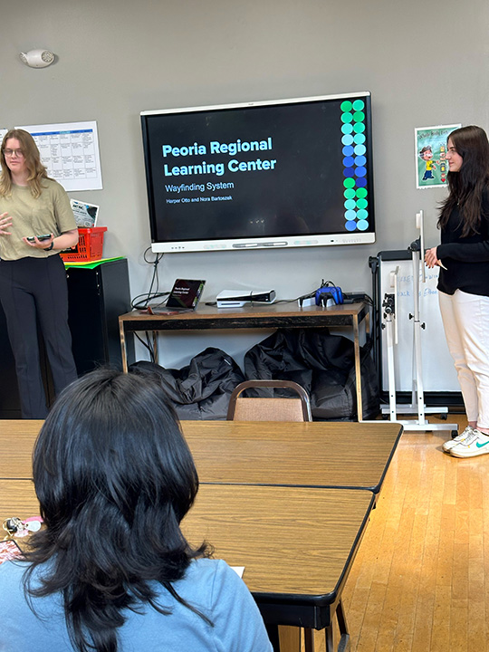
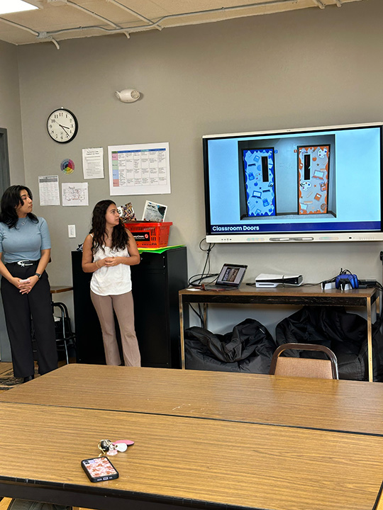
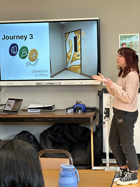
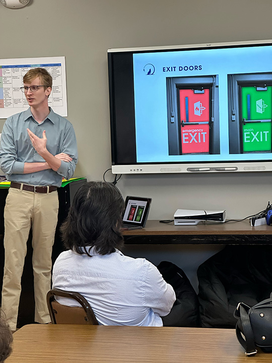
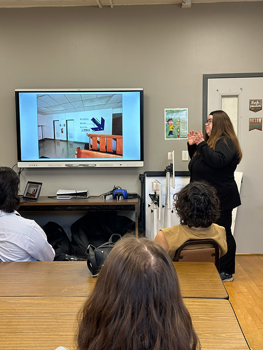
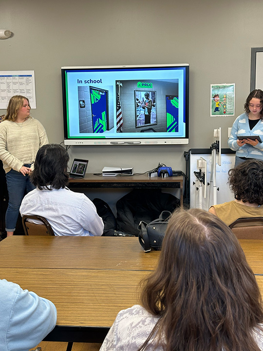
A wonderful opportunity for the students to work on a wayfinding ‘challenge’.
Peoria Regional Learning Center was looking for a simple but effective signage system to navigate from the parking lot, into the building, through to classrooms, kitchen, reading room and assorted administration and utility spaces, while creating a vibrant learning environment.
Great job by all seven student teams, and a big thank you to Teresa Von Rohr and her colleagues for giving us the opportunity.
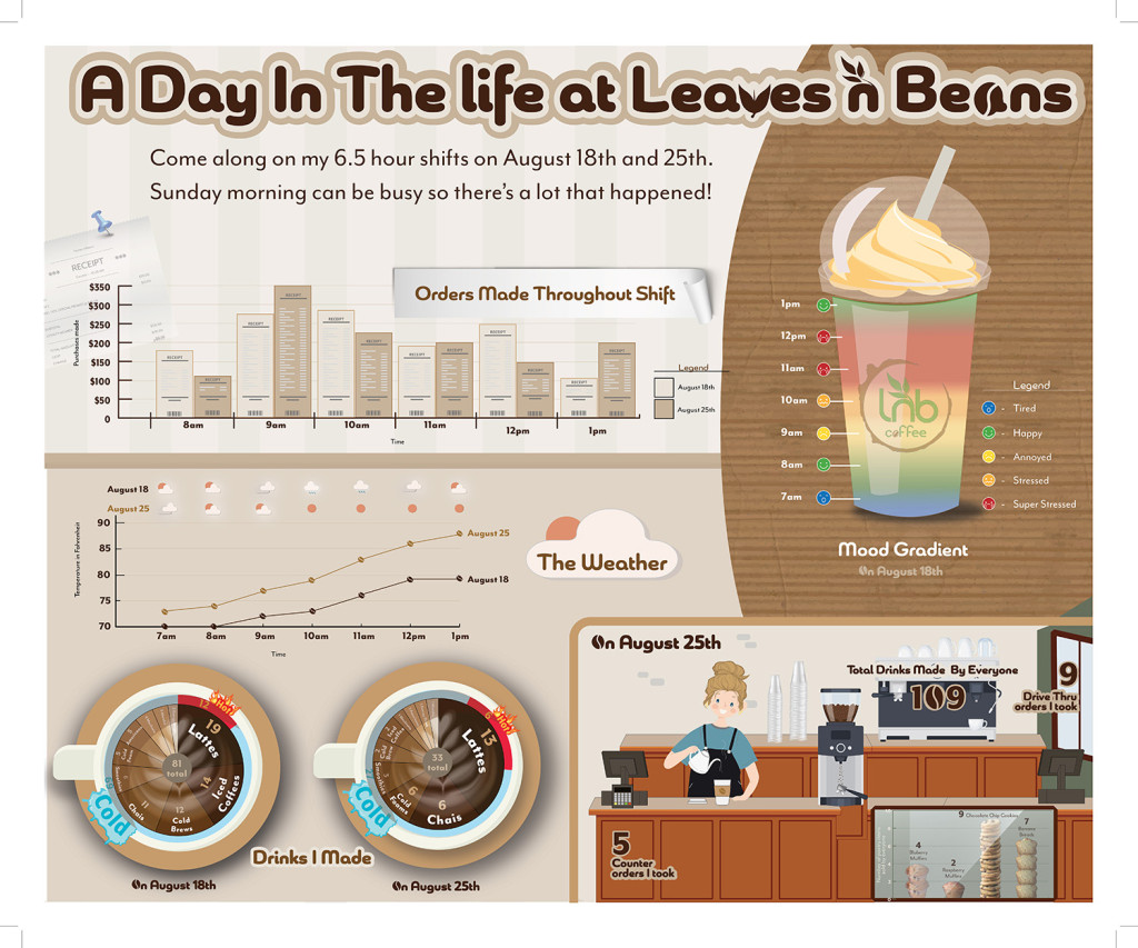
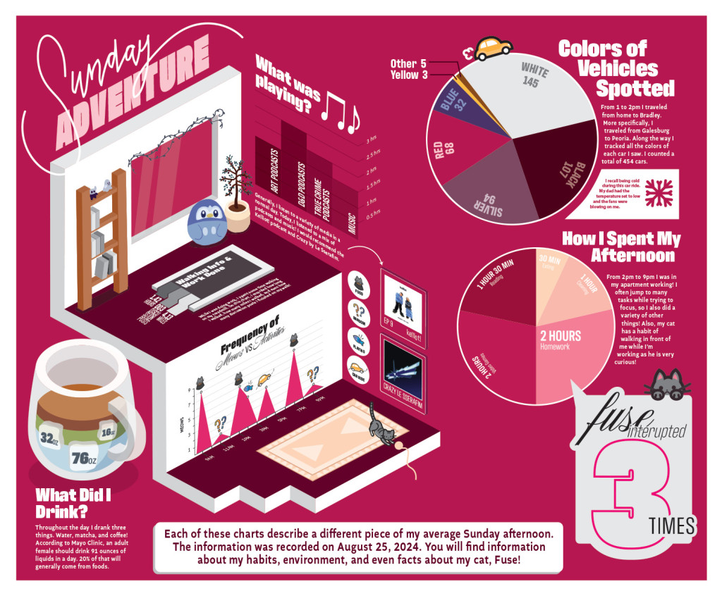
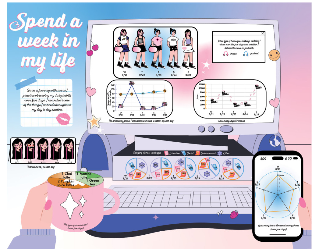
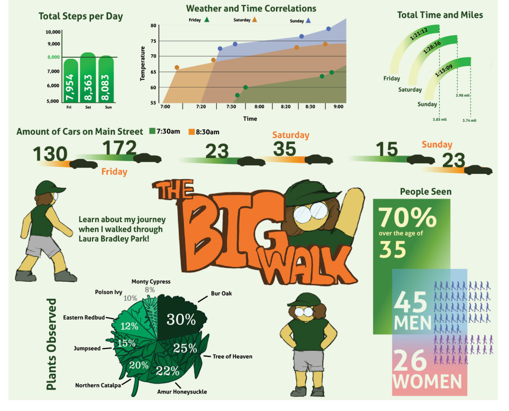
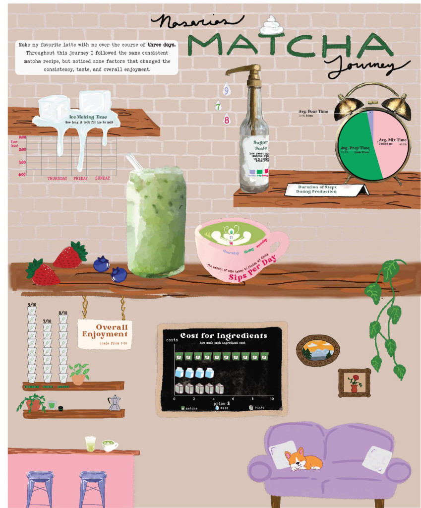
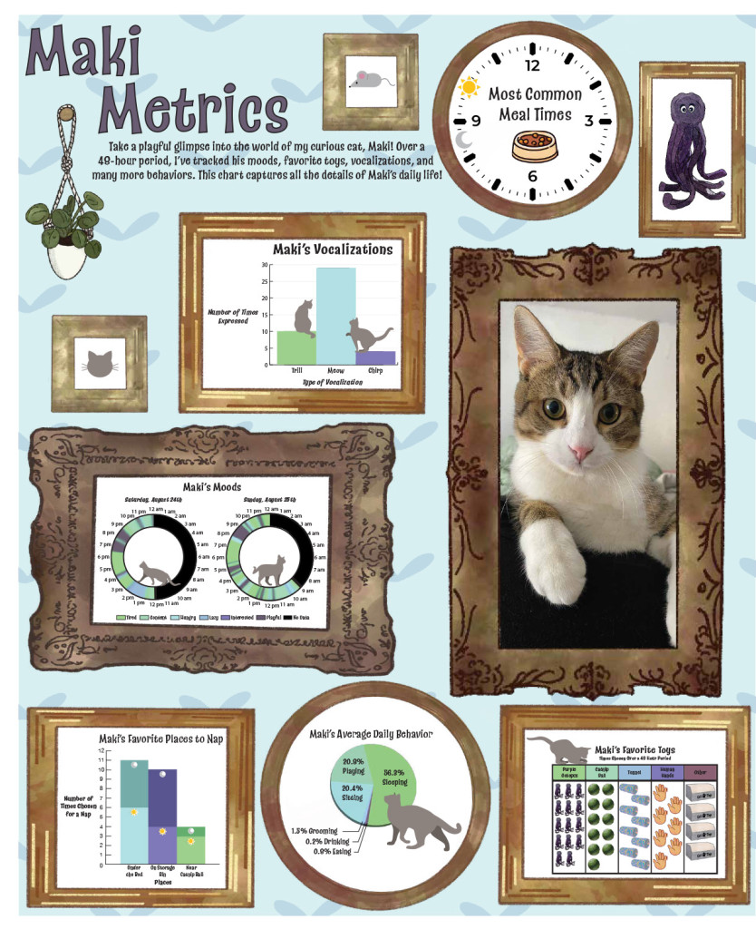
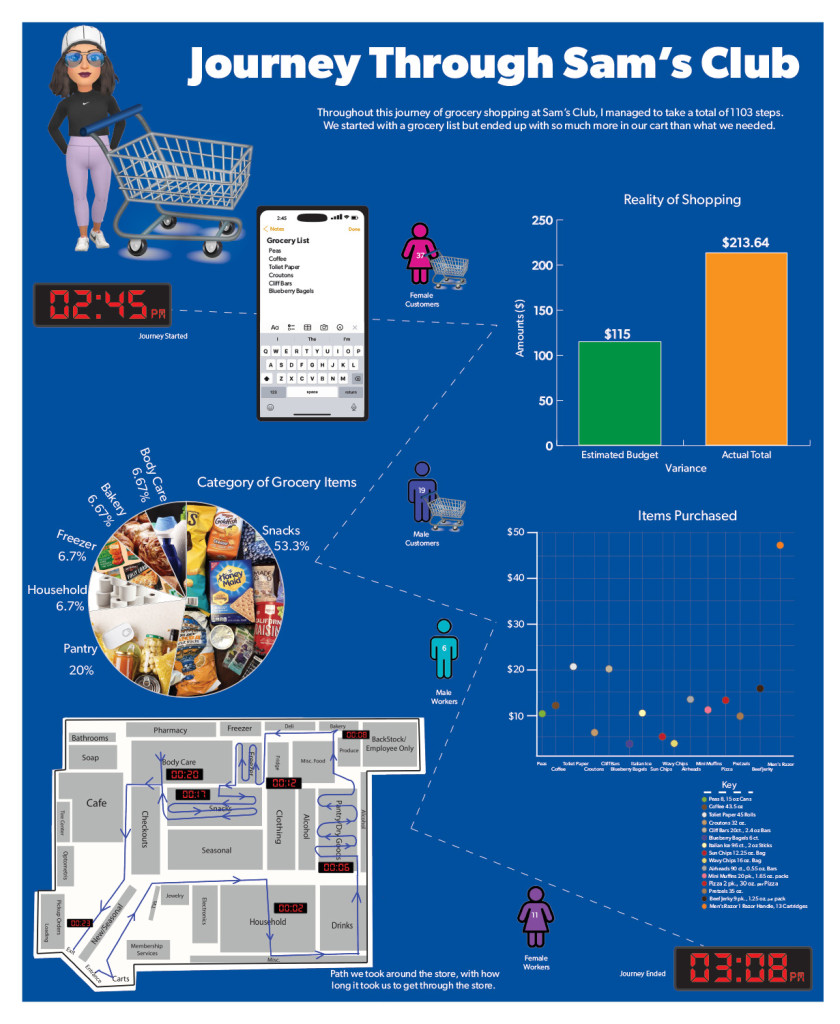
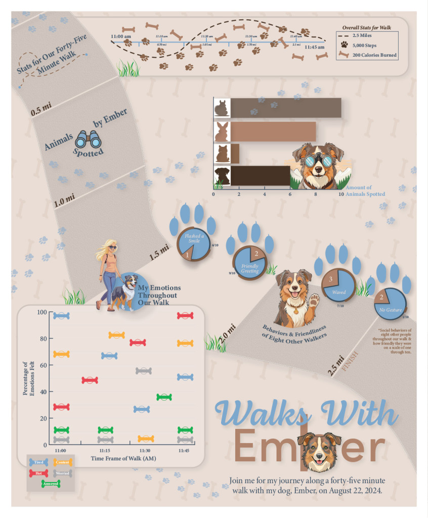
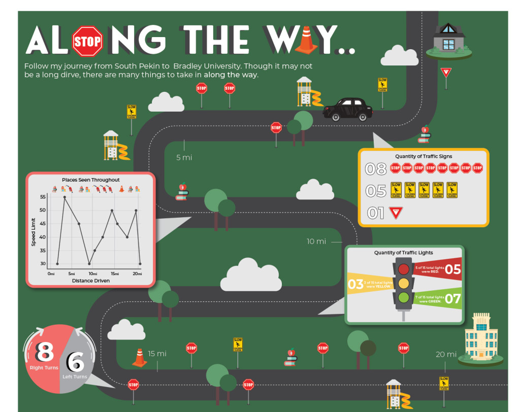
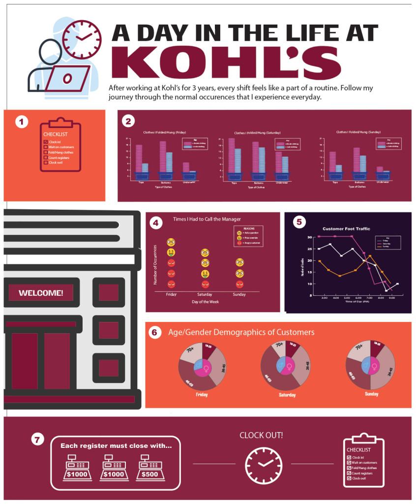
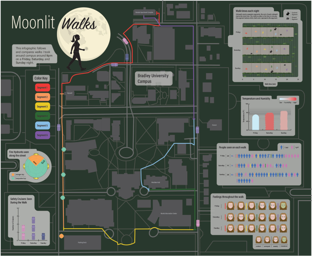
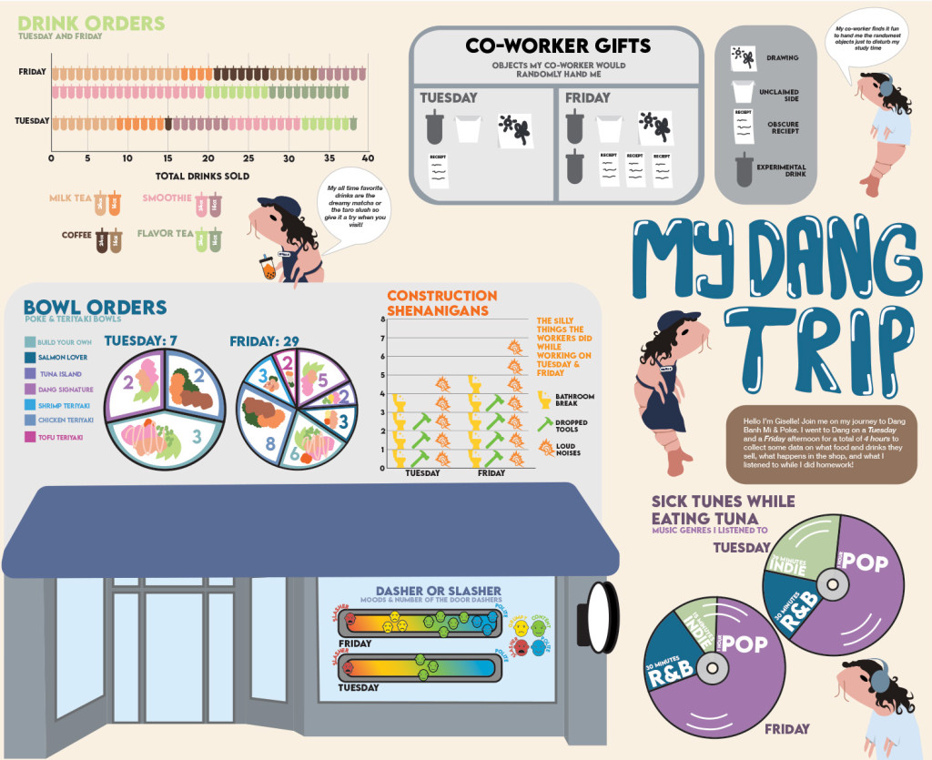
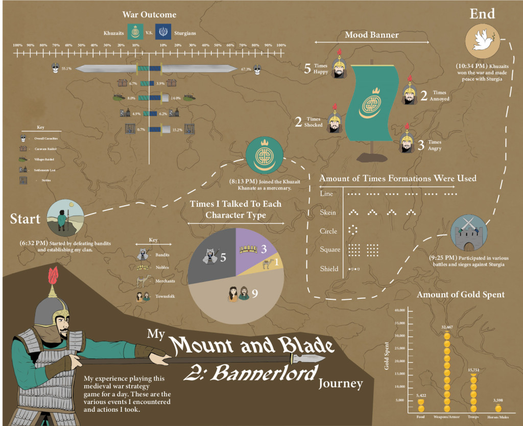
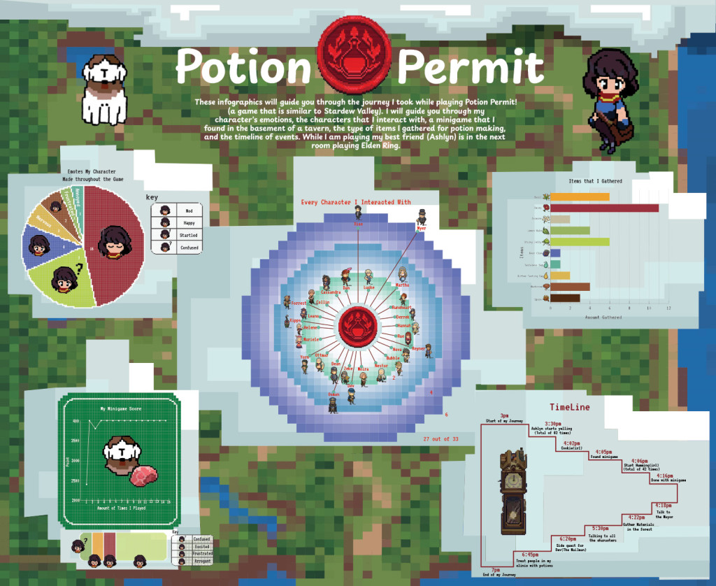
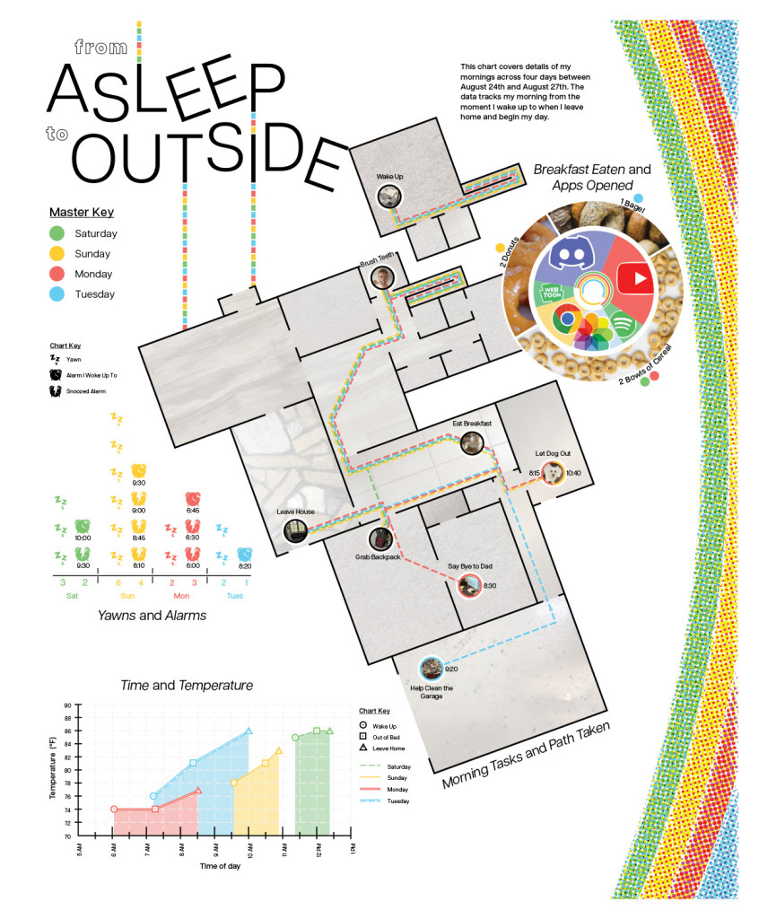
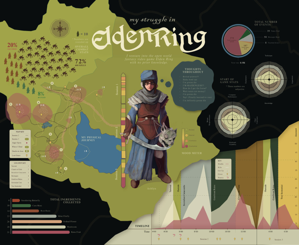
Pick a ‘journey’ you make frequently/repeatedly. Document as much data and observations as possible during the period of time your own personal journey takes, recording both quantitative and qualitative observations. These can be the obvious ones such as the number of cars passing you on your journey, to harder to quantify observations such as the different choices of music you select on your journey. It is a personal journey that may include non-tangible narrative information (what were you thinking at certain points of the trip, moods, sounds etc?) alongside more obvious, measurable data points, such as time, distance etc. Consider temperature variations, periods of time, speed, pace, direction etc.
From your research and body of data – create a wallchart (22″ x 18″ plus an additional 1/2″ white border all around. Portrait or Landscape). Make it a compositional piece, include additional data sets, a logo-title (not simply in Helvetica – ‘design’ the title), and a small introductory block of body text. This should be a coherent piece that clearly, and accurately, visually communicates a large amount of qualitative and quantitative information and data about your personal journey. It should have some elements of your ‘personality’ in it, after all – it is all about you.
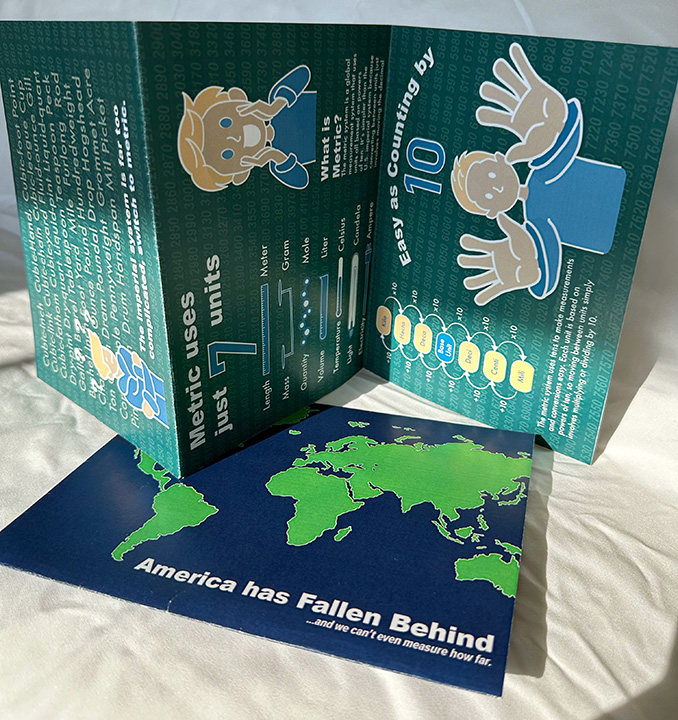
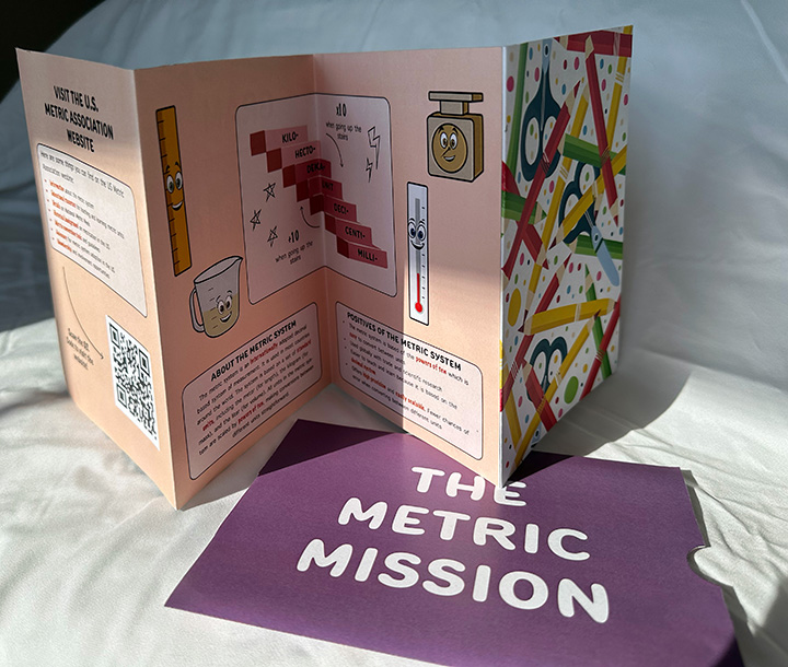
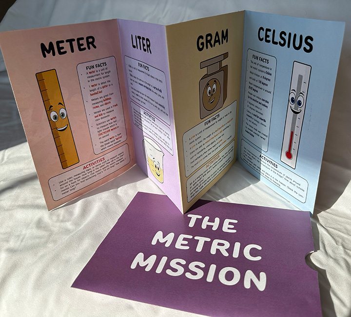
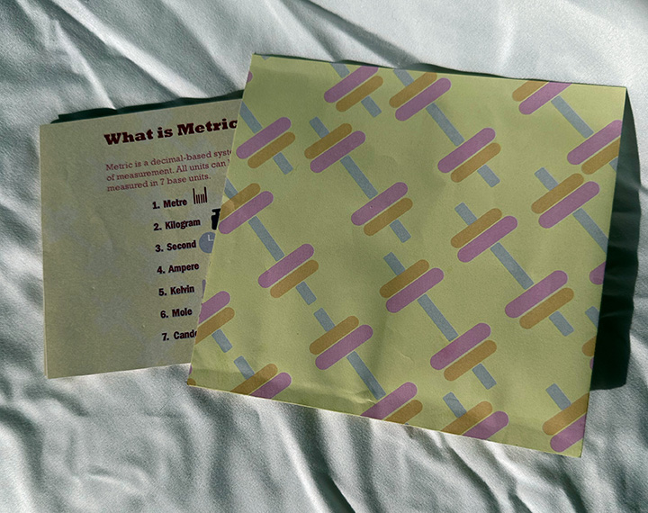
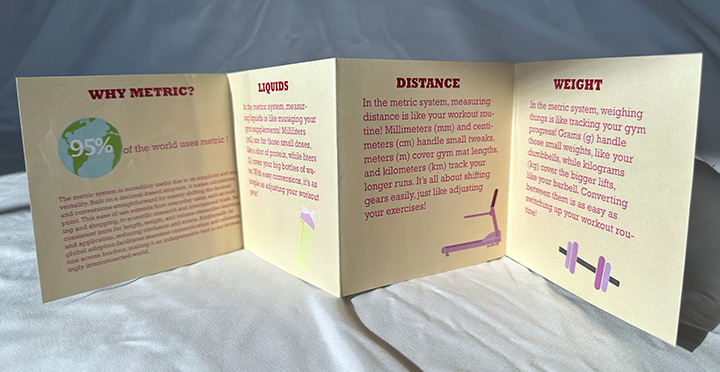
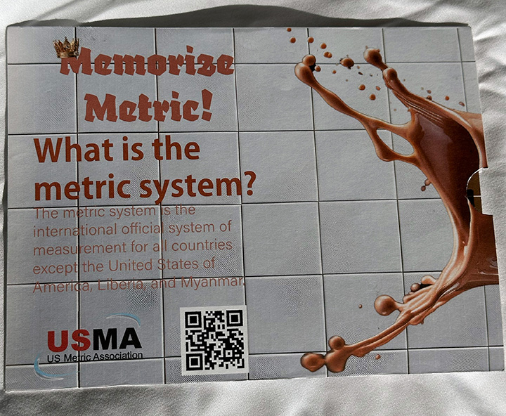
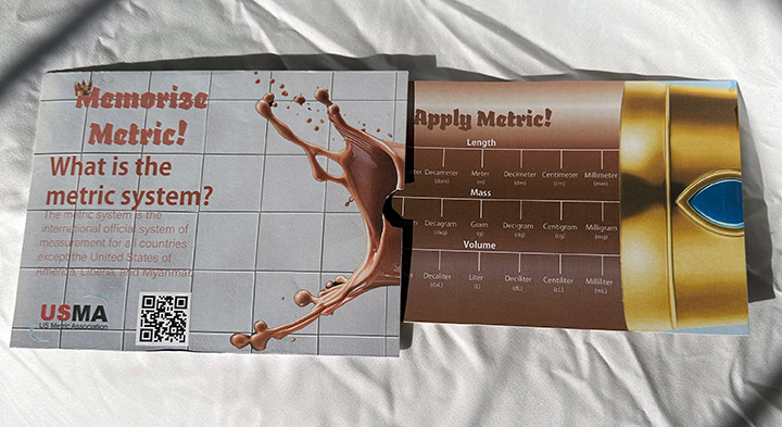
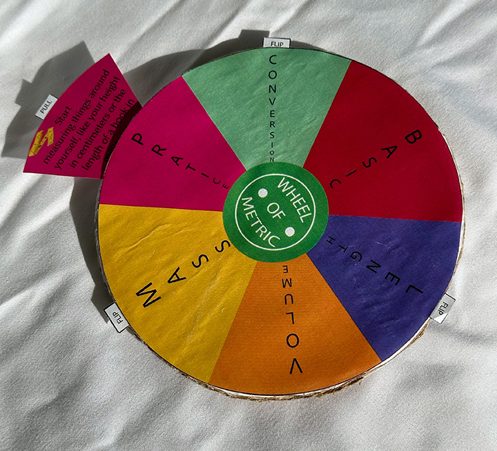
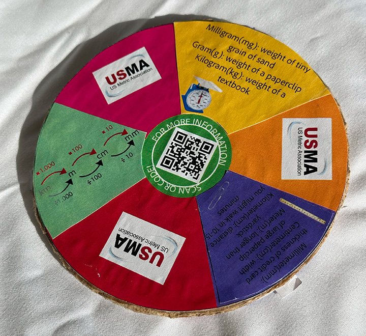
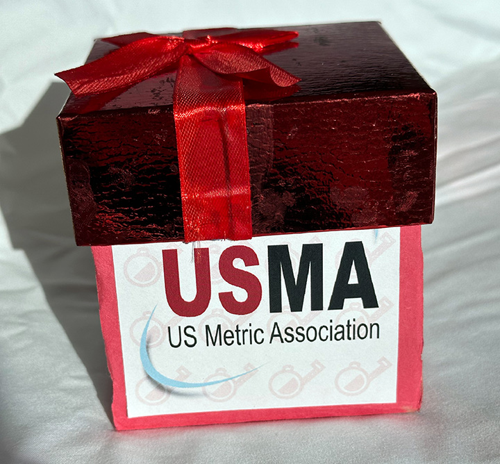
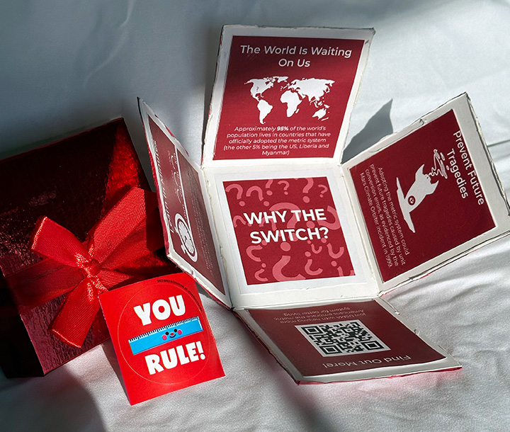
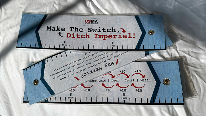
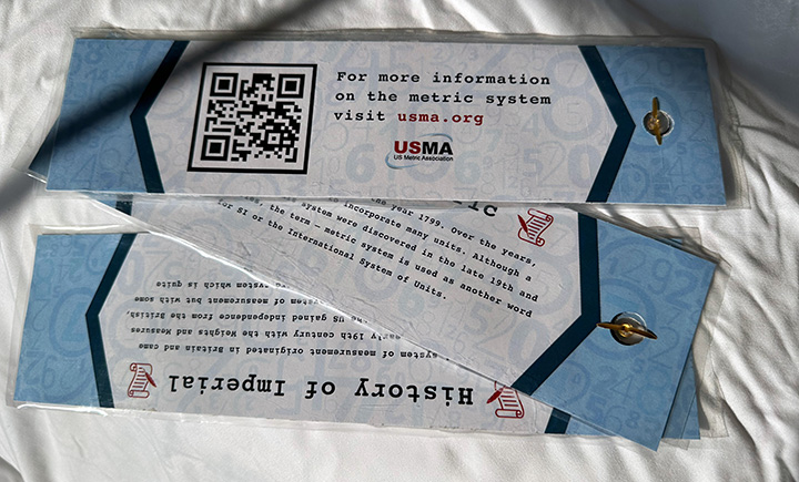
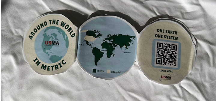
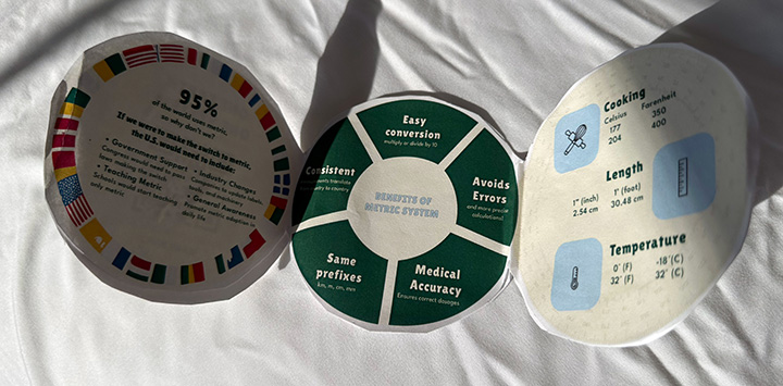
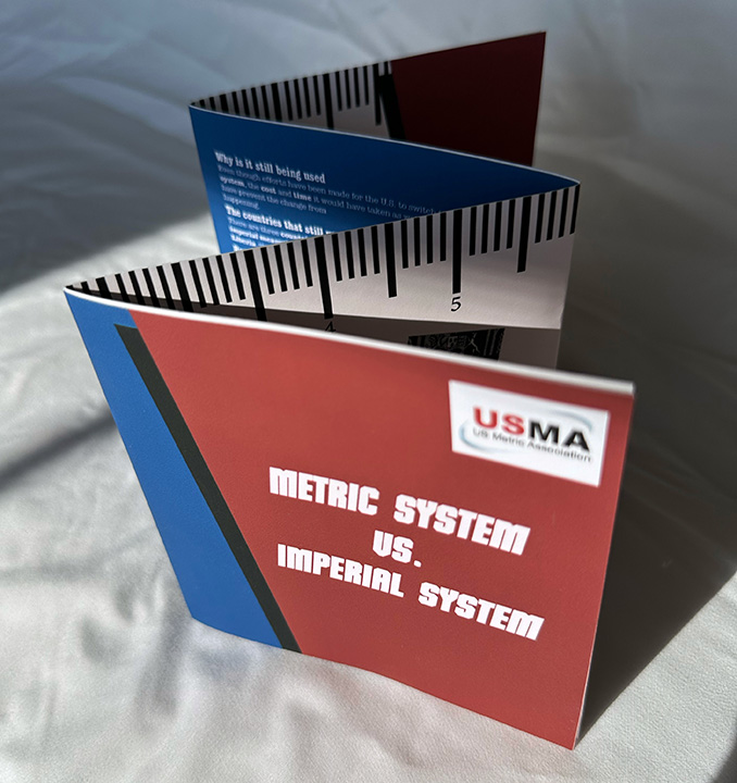
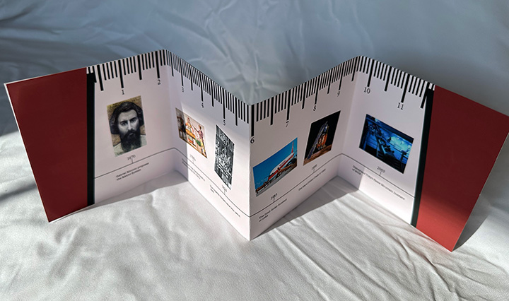
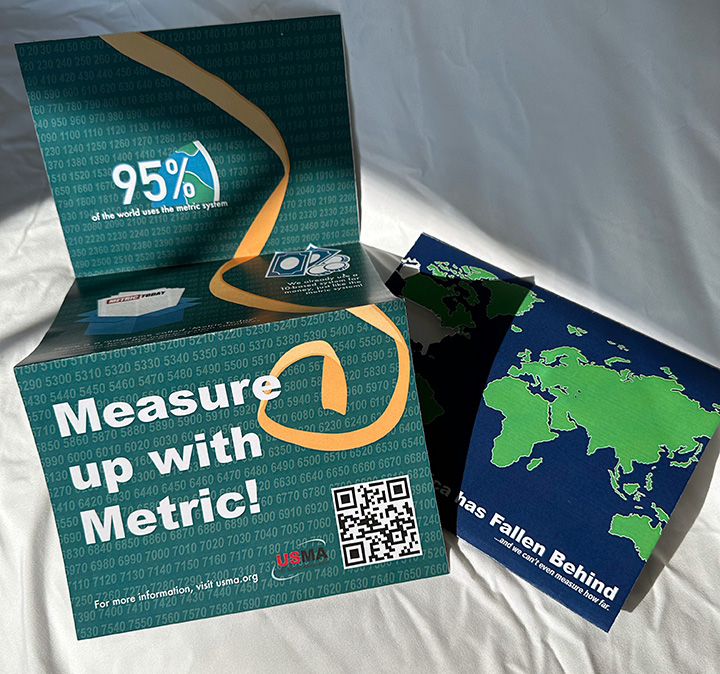
A nice introduction to Editorial Design. This was to create a direct mail piece to the general public or a more specific age range that would educate, inform, and entertain the recipient sufficiently for them to want to know more about the metric system by going to the QR code (which would take them to the USMA website.)
Side note: Countries that do not use the metric system:
It is often stated that only three countries in the world—the United States, Liberia, and Myanmar—do not use the metric system. However, this belief is incorrect. In truth, every country in the world uses the metric system to some extent. However, a few countries, including not only the United States, Liberia, and Myanmar, but also Canada, and the United Kingdom, have not yet converted 100% to metric. These countries instead use mixed systems in which metric units are either used alongside or replaced by another measurement system (typically the British Imperial system).
Best submissions will be featured in ‘Metric Today’, also at the US Metric Association booth at the Southern Arizona Regional Science Fair.
First up for the amazing Bradley University Theatre 2024-25 Season:
Based on the best-selling book by Cheryl Strayed (Wild) and brilliantly adapted for the stage by Nia Vardalos (“My Big Fat Greek Wedding”), the first production for the 24-25 season – Tiny Beautiful Things is a thought provoking play about reaching when you’re stuck, healing when you’re broken, and finding comfort in shared humanity.
In this interpretation of Strayed’s real-life experience as online advice columnist “Sugar,” the lines between digital and real life are blurred as she contends with the demands of constant connectedness with her readers who are navigating grief, love, and forgiveness.
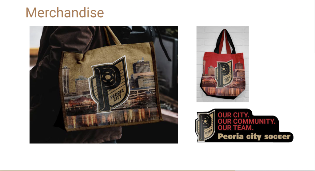
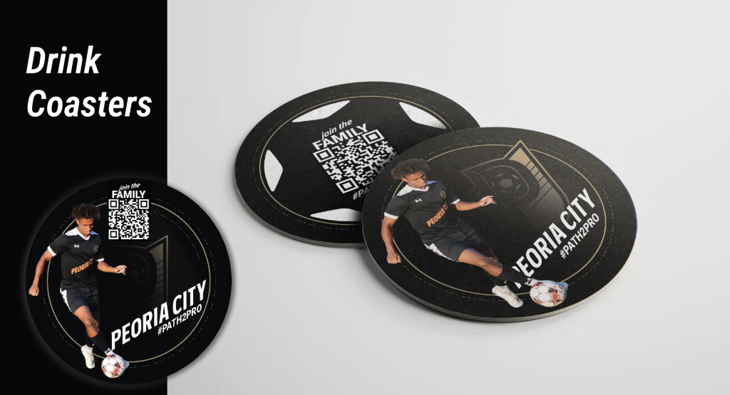
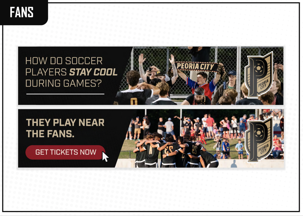
A fun challenge for the final brief of the semester. How do you generate that ‘buzz’ about Peoria City Soccer? Can you develop a creative brand strategy that starts local but spreads to a much wider audience.