An old favorite brand project to create a ‘gourmet’ quality single serving meal, with minimal to no preparation. After the previous ‘slick’ 2D brand presentation decks – this one is a fun change of direction challenge!

An old favorite brand project to create a ‘gourmet’ quality single serving meal, with minimal to no preparation. After the previous ‘slick’ 2D brand presentation decks – this one is a fun change of direction challenge!
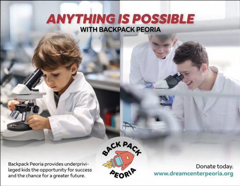
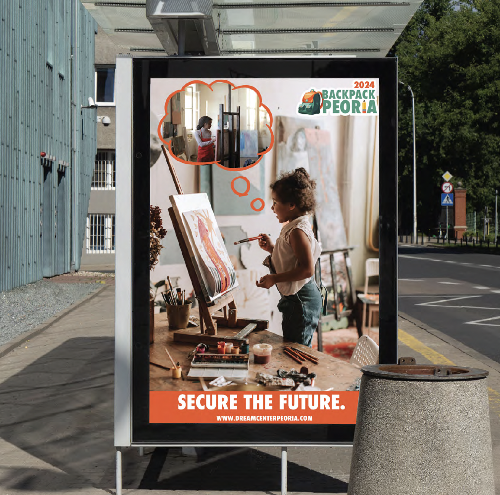
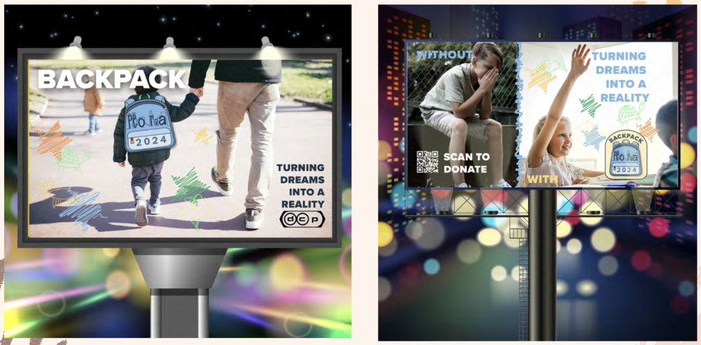
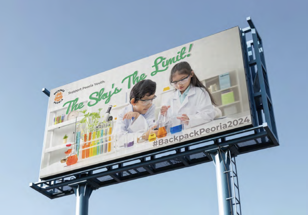
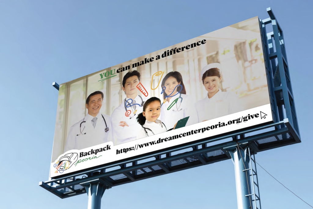
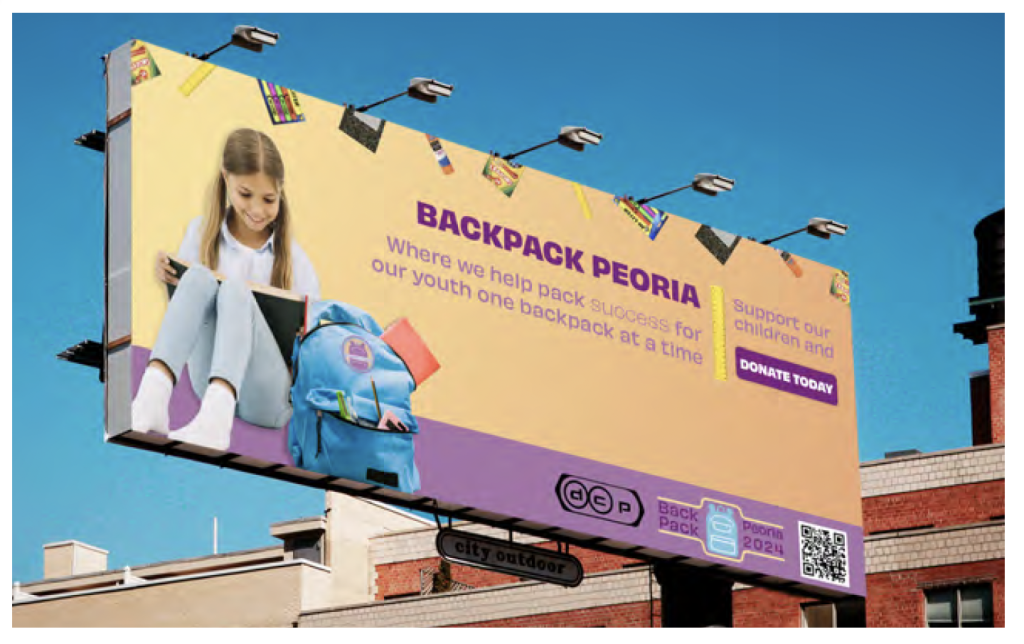
The aim of this campaign is to help create a promotional/awareness ‘buzz’ to potential donors:
The event costs around $42,000. DCP purchase all the bags and supplies, uniform cards and others, supplies and event cost’s. So they need to create a promotion focused on getting help financially.
It also requires a logo/brand mark for Backpack Peoria (2024) to work in conjunction with the DCP parent logo. Tone of voice should be fun, positive, and empowering.
Audience: Potential donors through promoting the event via the most appropriate touch points that connect and engage your audience with Back Pack Peoria.

Great challenge for two reasons:
1) Although it’s ‘Men On Boats’, the cast is all female, so it needs some ‘hints’ towards the gender juxtaposition.
2) At the request of the director/client – can you do it in a Cubism style!
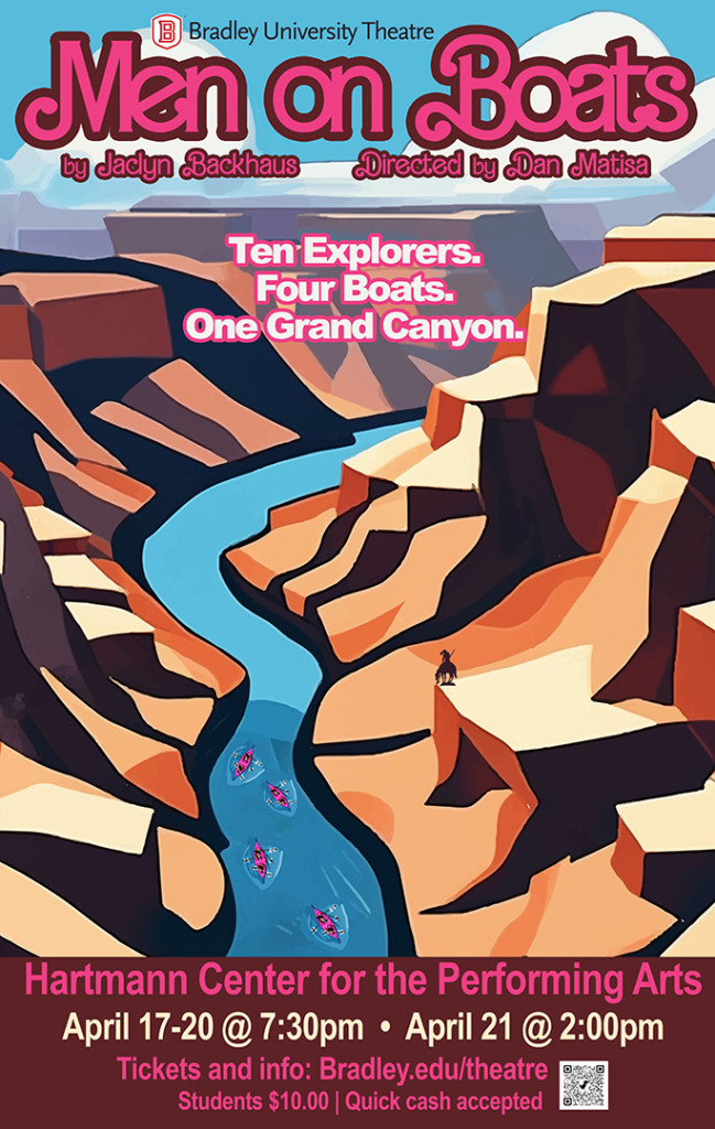
Ten explorers. Four boats. One Grand Canyon. A raucous adventure and the true(ish) story of an 1869 expedition by the one-armed captain John Wesley Powell and a crew of eccentric volunteers who set out to chart the course of the Colorado River. This mad, gender-bent comedy from one of our most acclaimed playwrights is, in the words of New York Magazine, “marvelously destabilizing both as history and theater,” and “biting satire when sent up by women.”
In collaboration with Jones Knowles Ritchie (JKR) and D&AD London.
A good first ‘dip’ into Brand Experience/Activation for the junior graphic design students. Making them appreciate the necessity for researching their audience, developing a solid ‘big idea’, and understanding the need for engagement between the audience and the brand via appropriate touch points.
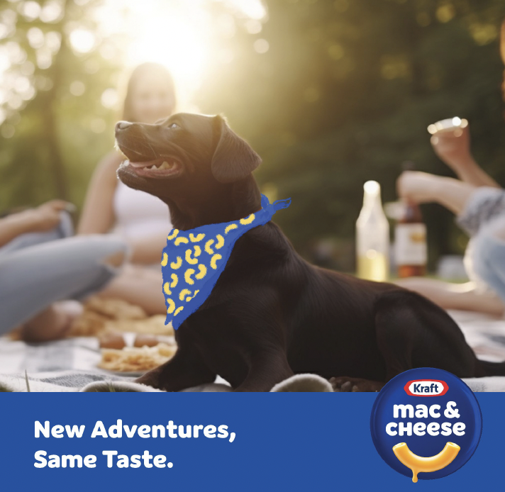
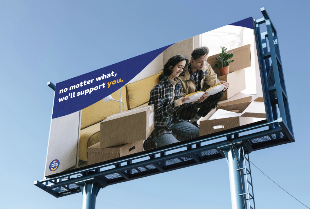
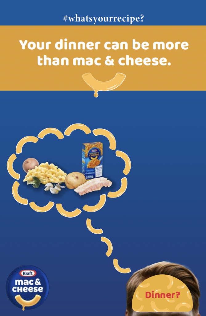
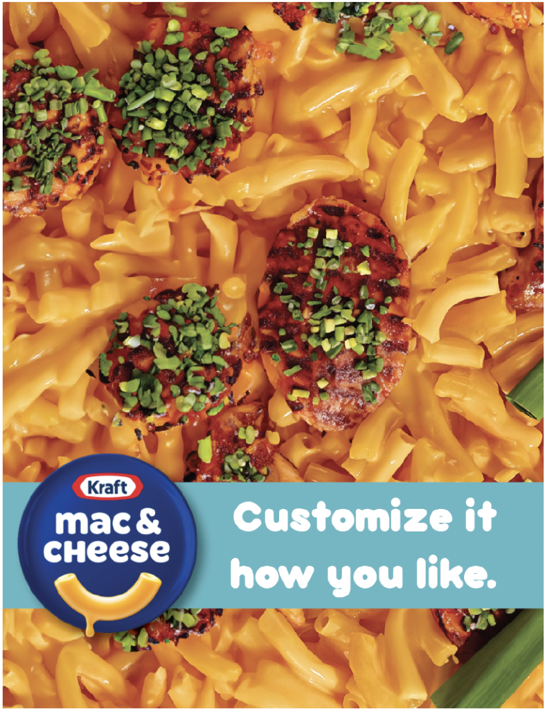
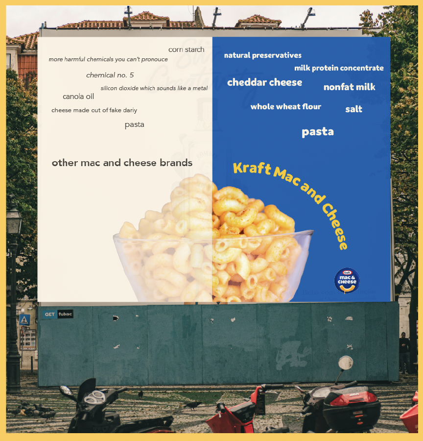
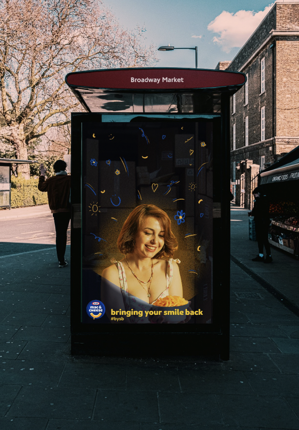
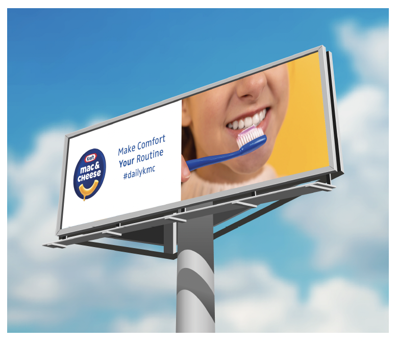
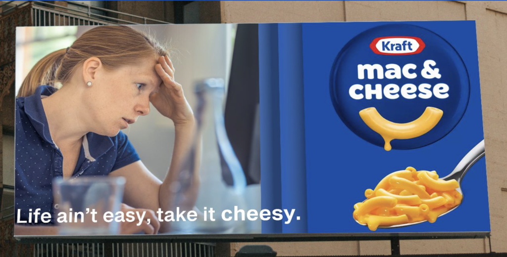
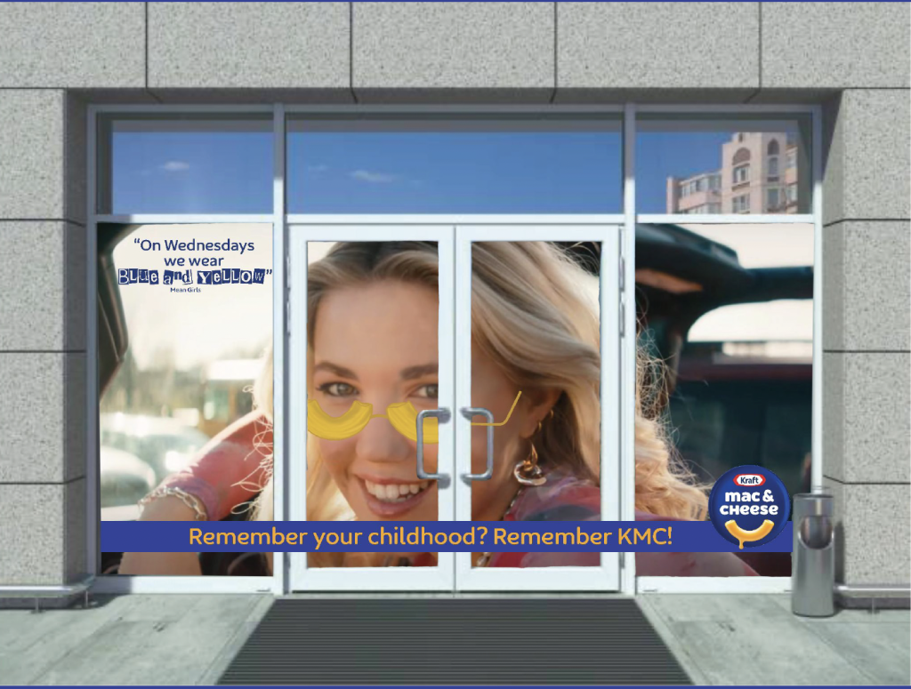
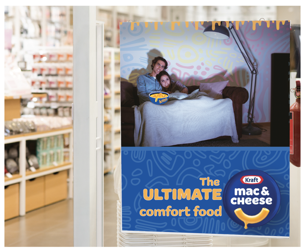
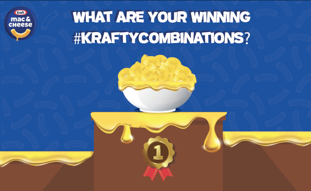
Over the last couple years, people have been buying less kraft mac and cheese; they’re buying private label mac & cheese because it costs less, buying new mac & cheese brands they haven’t seen before, or are stopping buying it all together, in favour of different categories, like ramen.
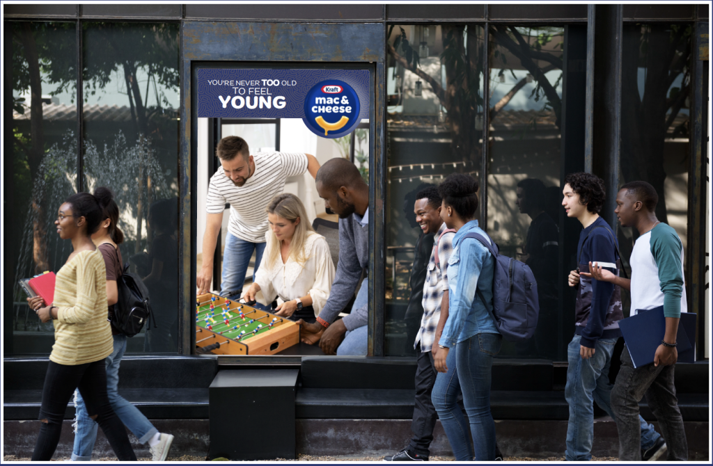
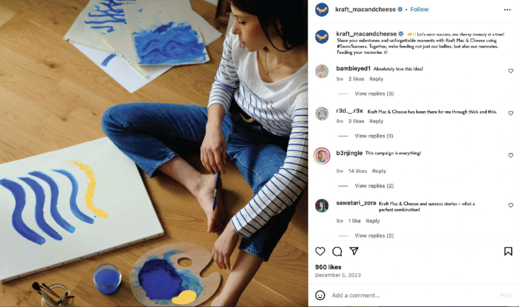
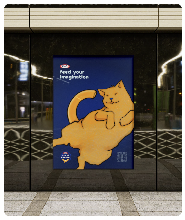
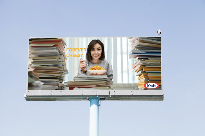
To continue growing, KMC must connect with a younger and more diverse audience. These consumers have a deep emotional connection to KMC that started in childhood, but that more than anything, today, they see it as a kids’ food brand. Show this audience that KMC is as relevant and exciting for them today as it was when they were kids.
Create a *brand activation that speaks to older Gen Zs and younger Millennials by connecting to what they care about in culture, and showing them that KMC is there for them whenever they need some reassuring comfort.

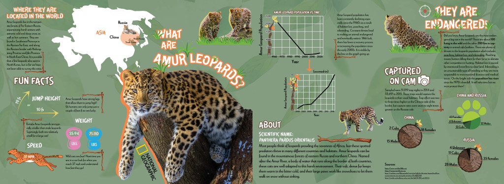
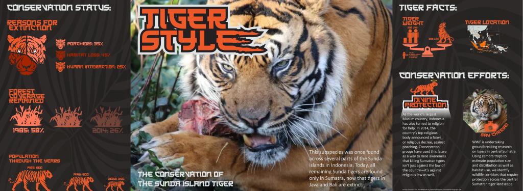
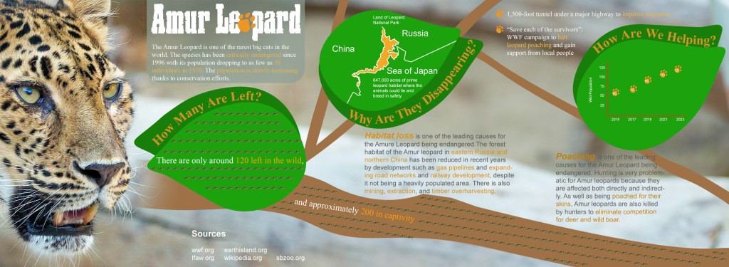
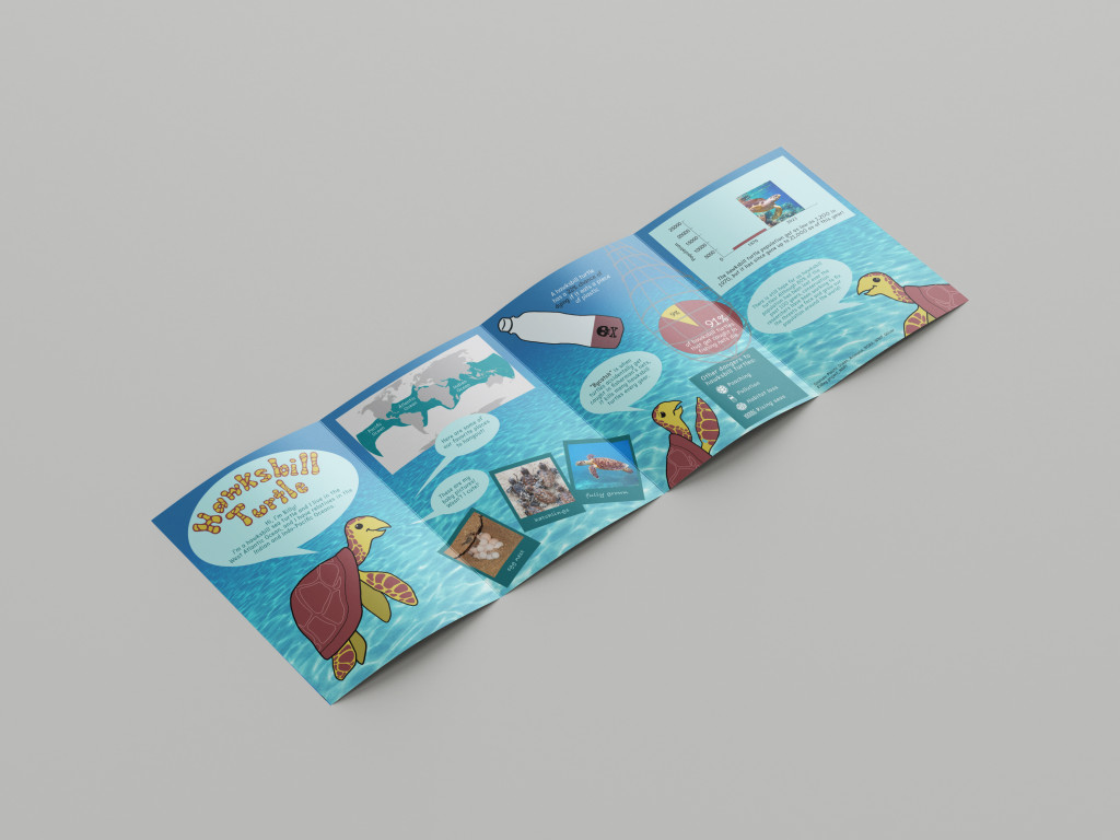
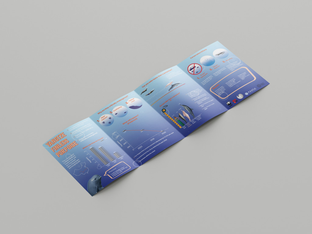
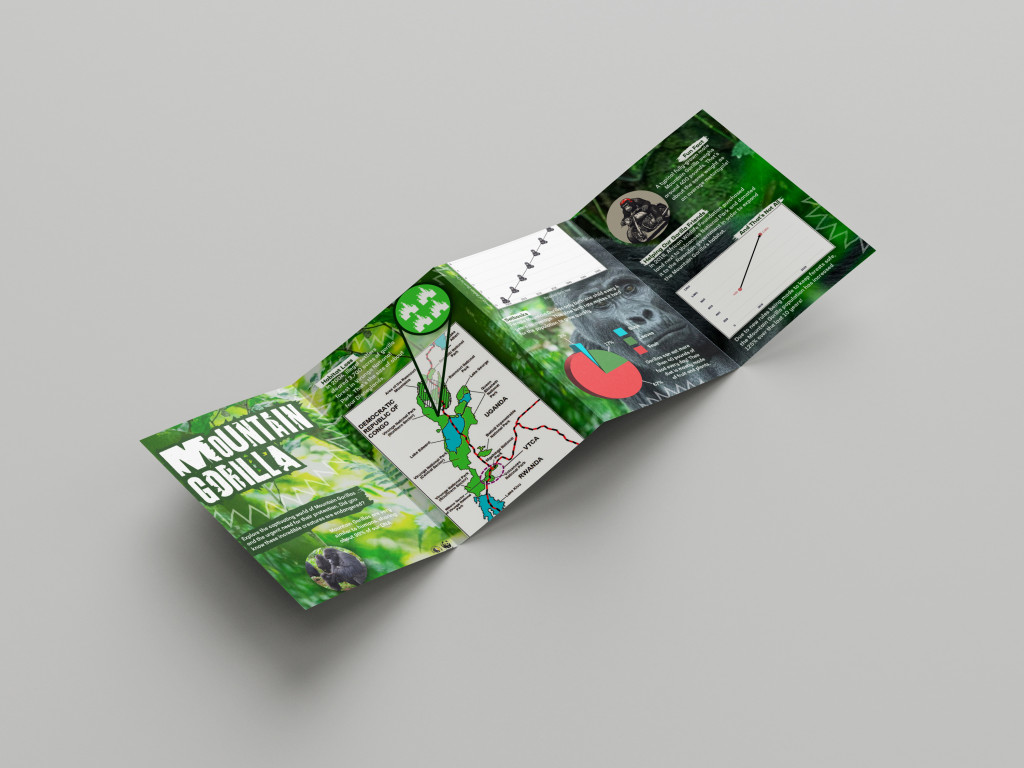
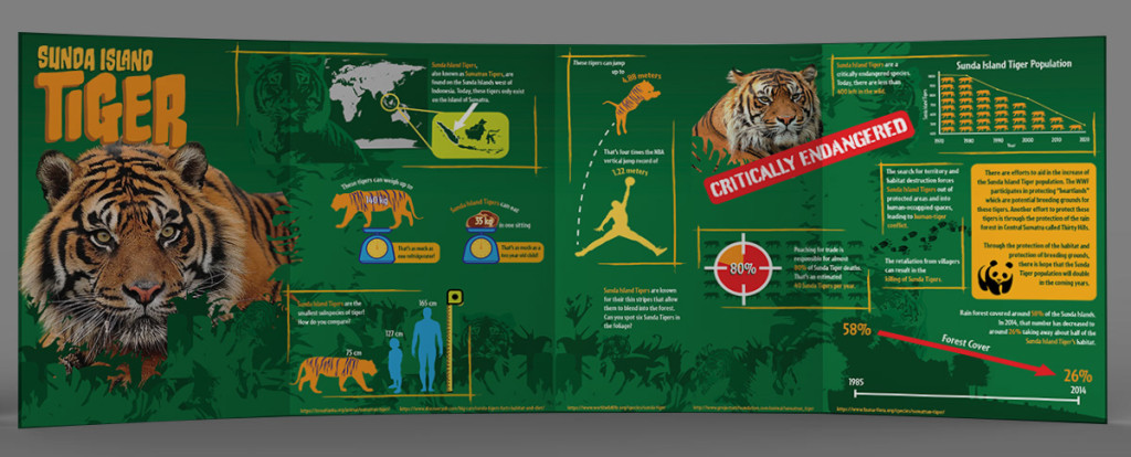
With the emphasis on the information, facts and data still at the forefront of this assignment, the aim was to create an engaging and informative center spread gate fold within the National Geographic Kids magazine (6-14 age group).
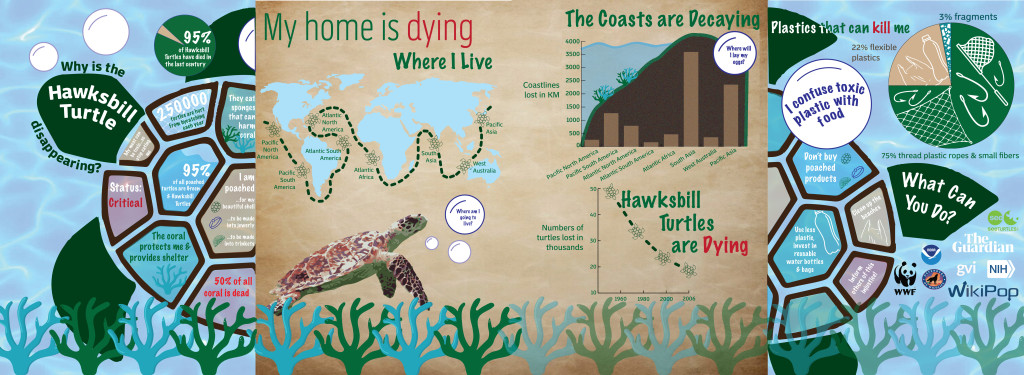

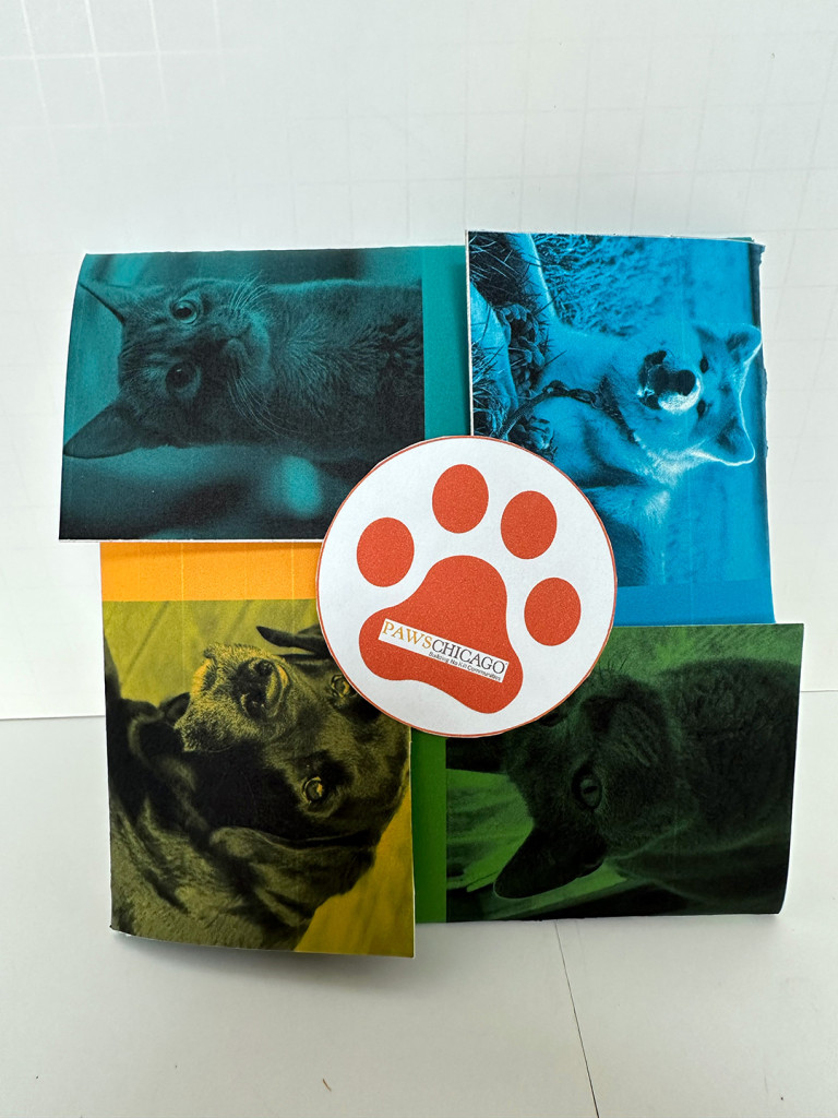
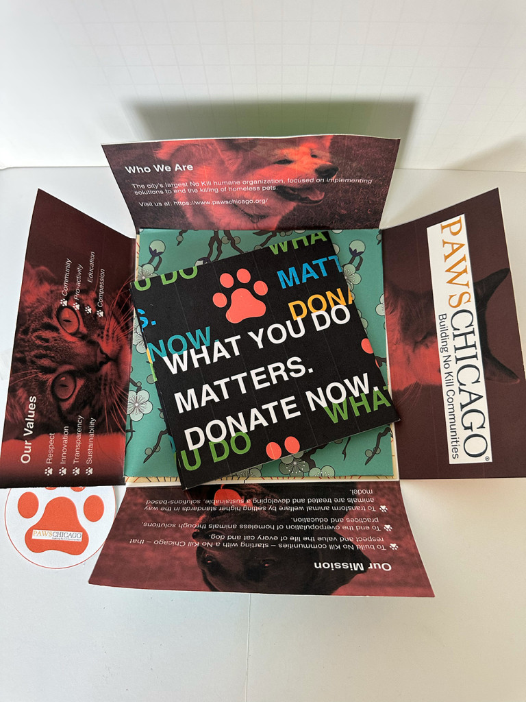
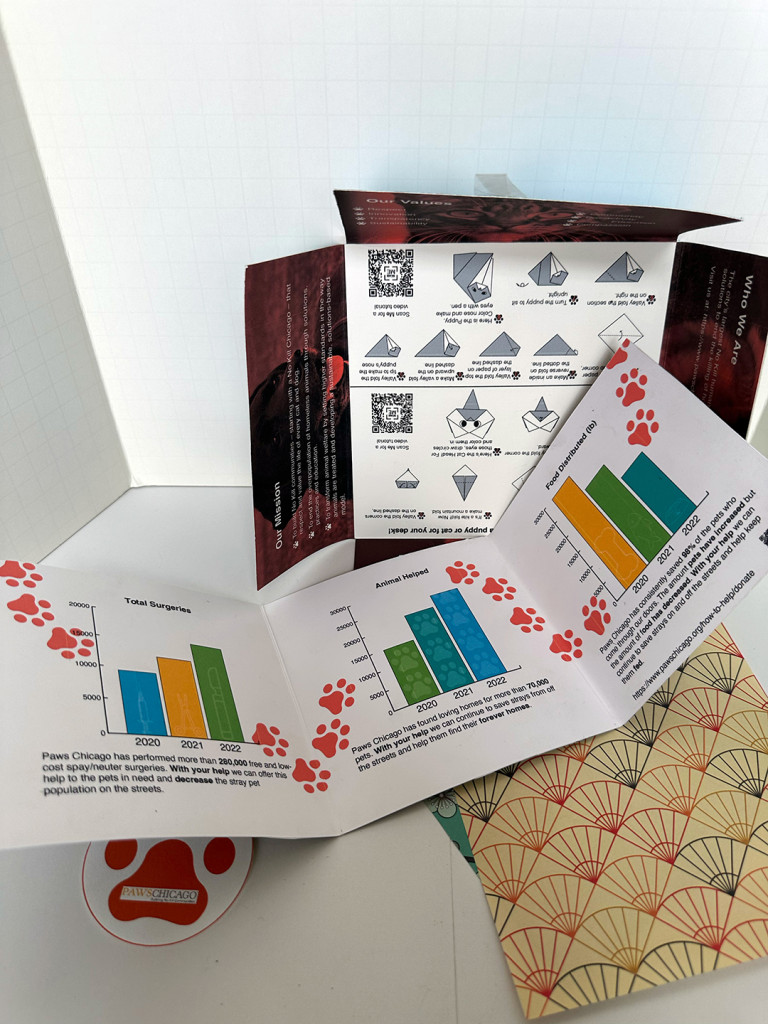
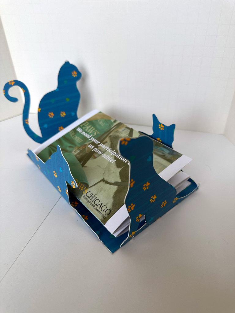
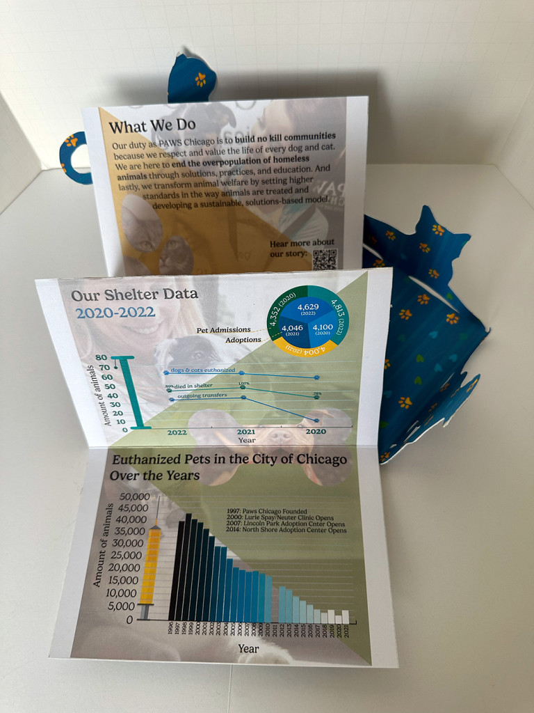
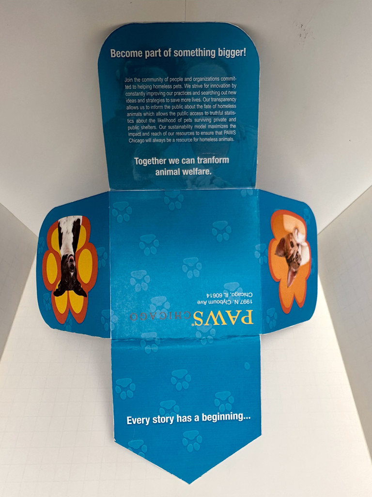
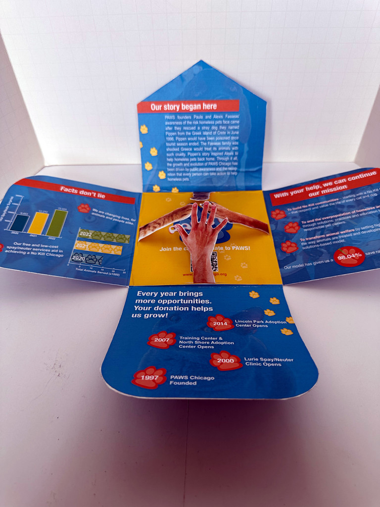
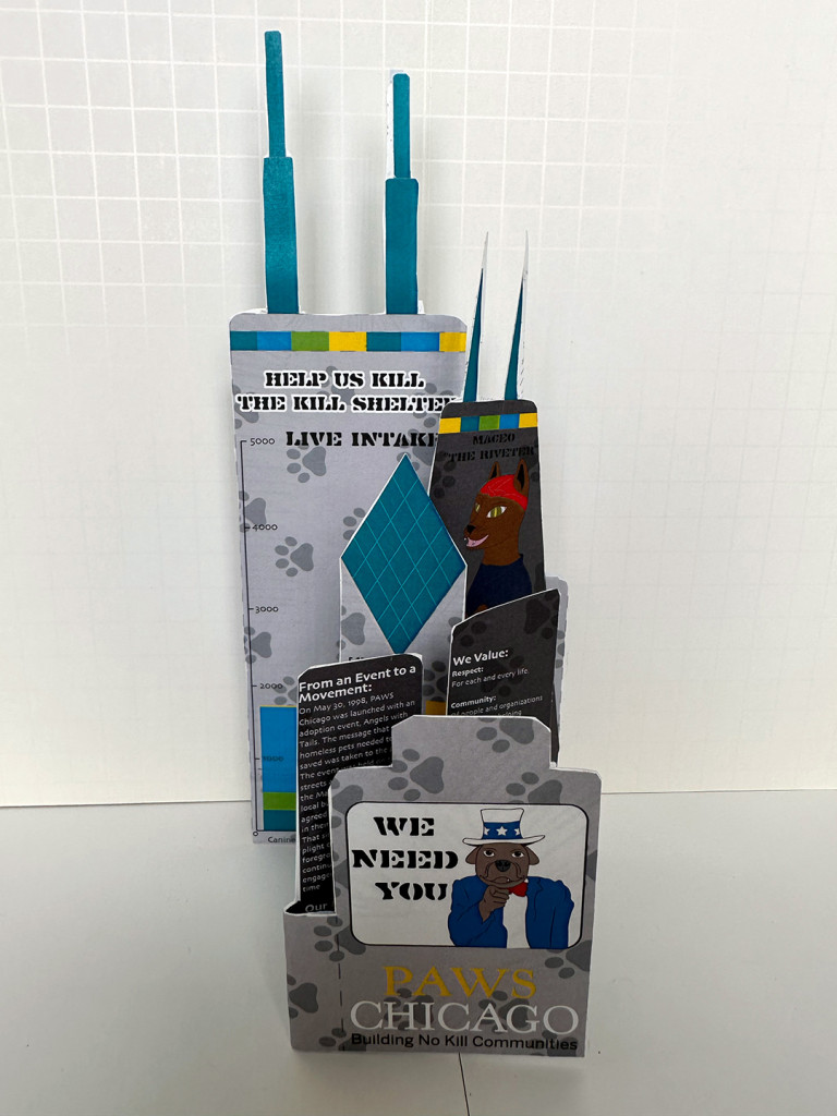
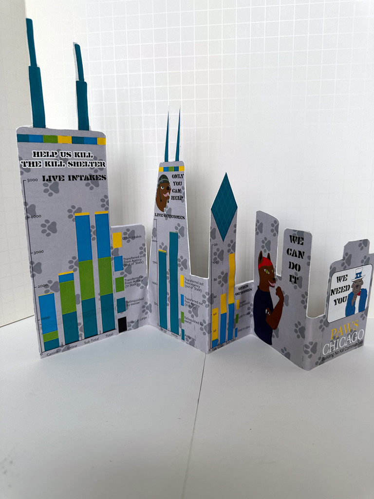
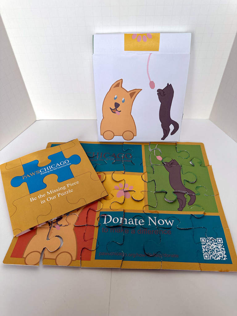
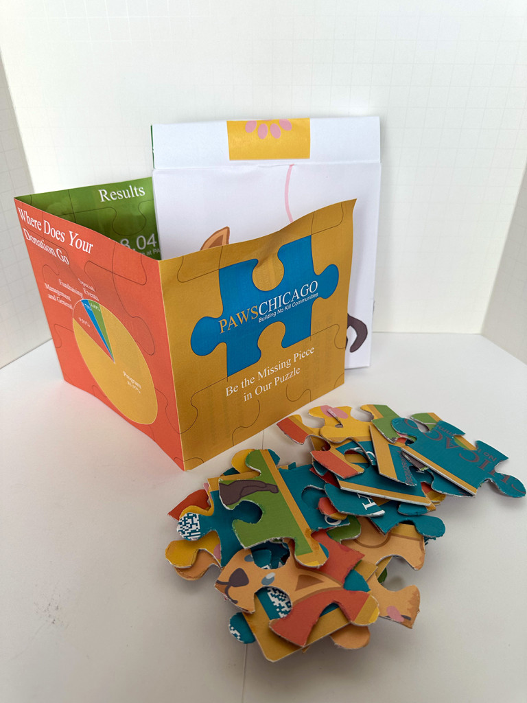
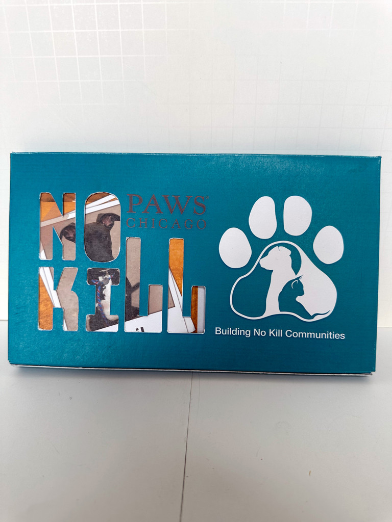
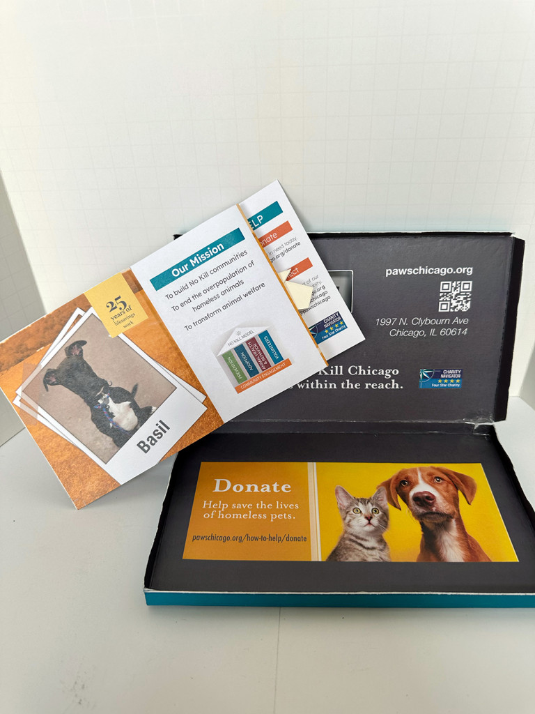
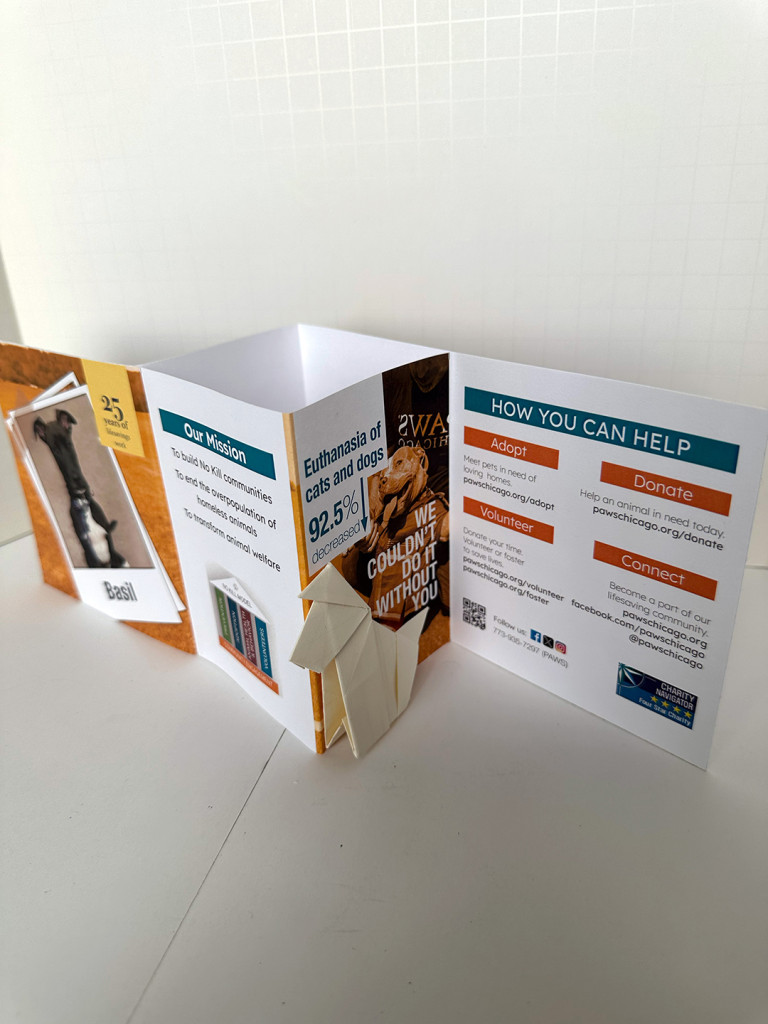
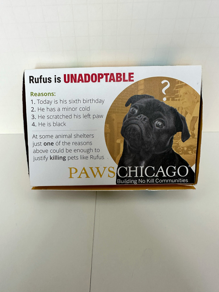
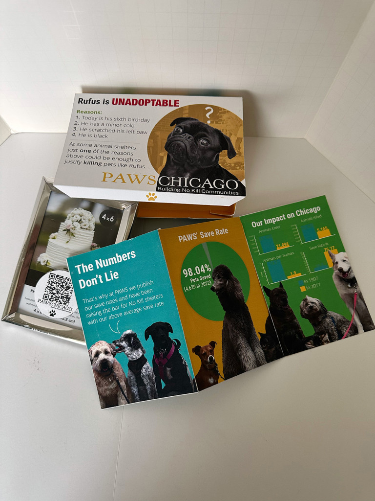
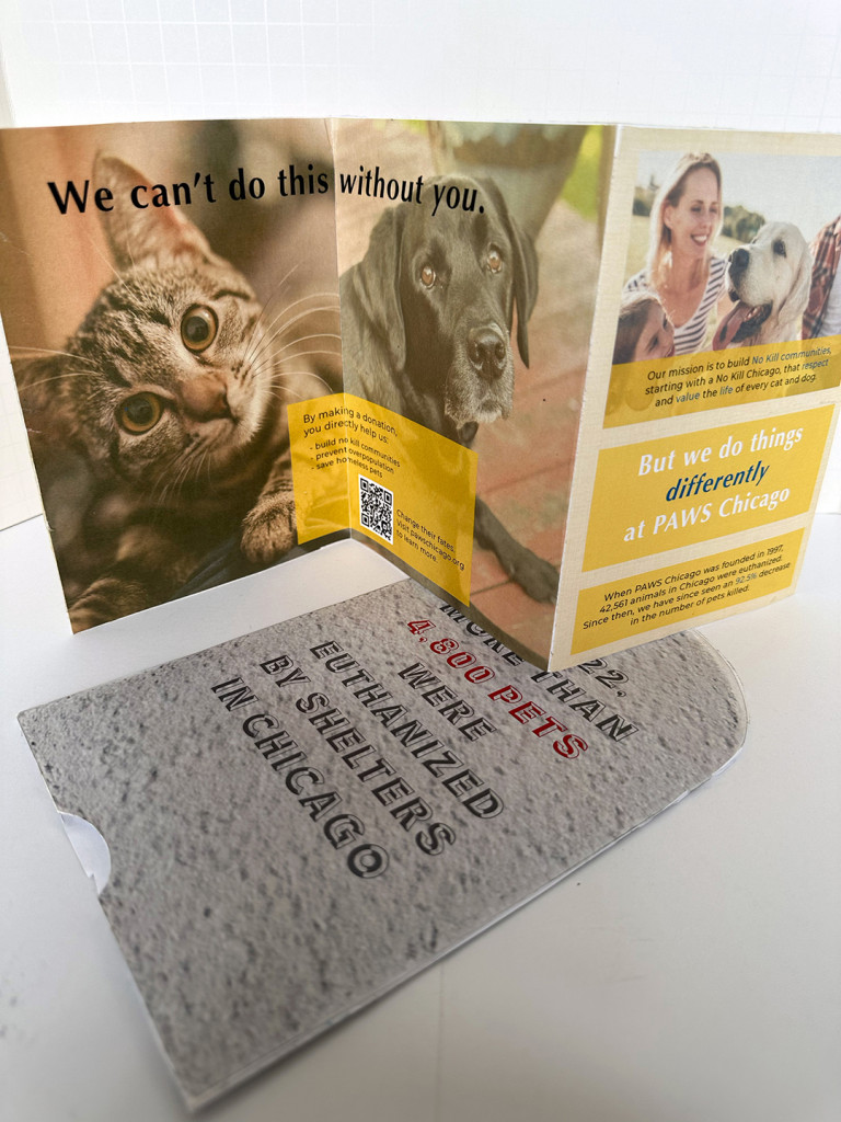
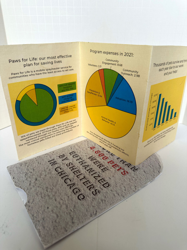
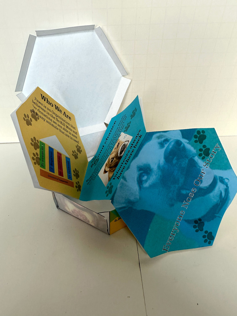
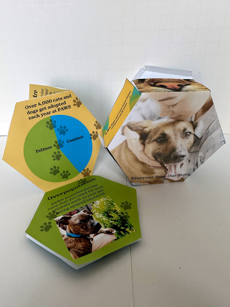
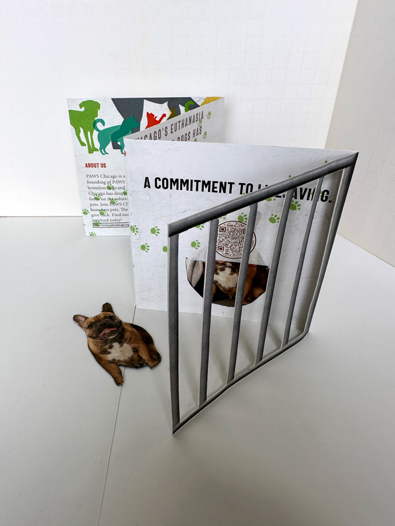
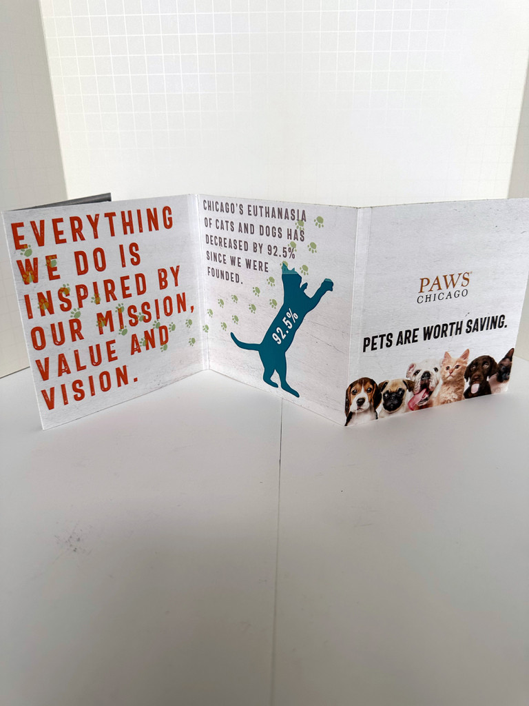
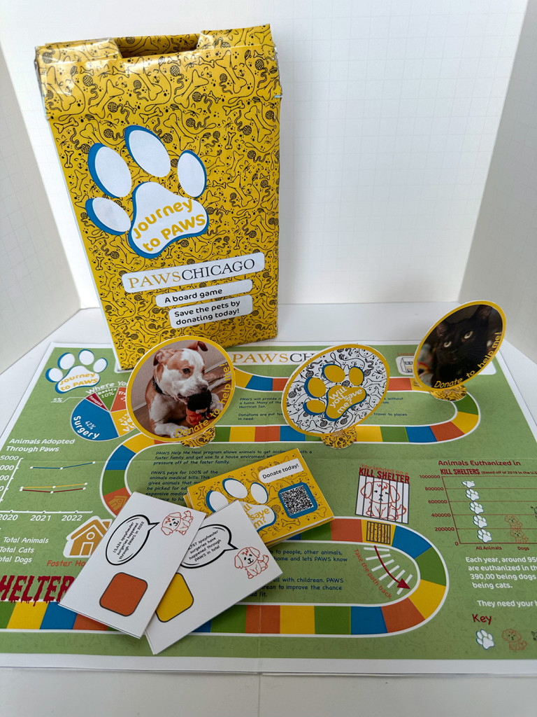
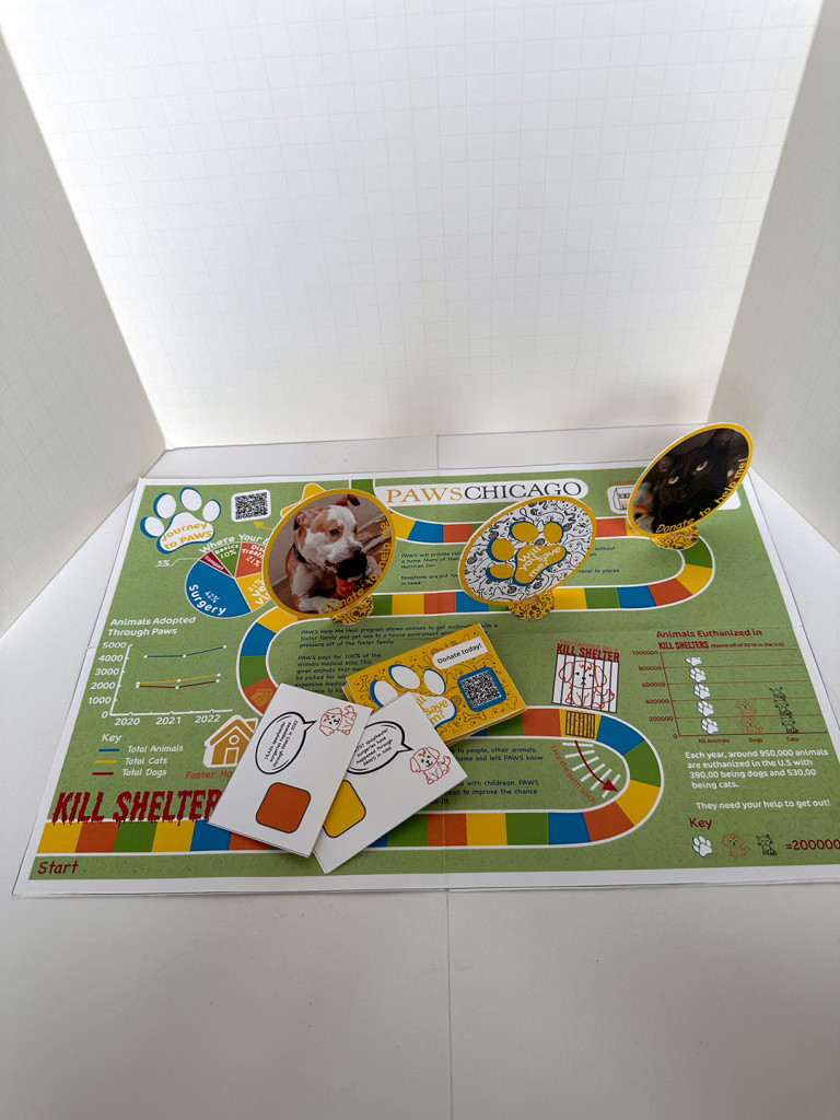
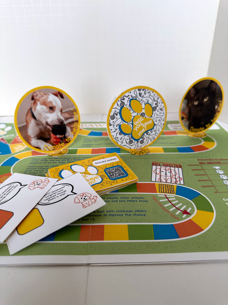
While still keeping with a focus on information design, and the presentation of data, statistics and other information, this brief required the students to create B2B pieces for the PAWs no-kill shelter based in Chicago. The aim was to promote awareness of the organization to Chicago corporations and companes with the aim for them to donate.
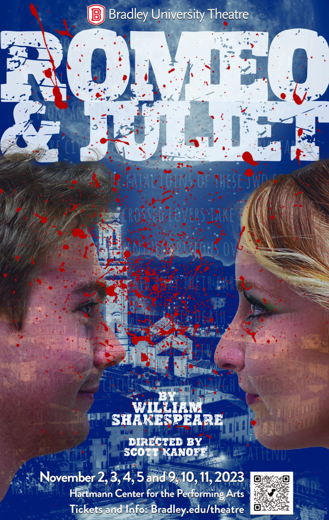
by William Shakespeare
Directed by Scott Kanoff
Performances November 2-5 and 9-11, 2023
What can we say? It’s the greatest love story of all, and there’s never been a better time for an immersion in the timeless poetry, passion, light and shadow that Shakespeare’s classic offers. Amid endless distractions, generational anxiety, and a deeply divided community, two young lovers risk all for something pure and true.
The more popular themes are typically the most difficult to create artwork for. We decided to go down a photographic route with this one, featuring the actual actors playing the lead characters. The idea reflects a love story, with reference to Verona and the night sky, but loaded with undertones of angst and death.
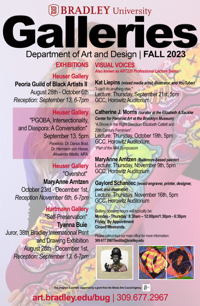
Even though it’s still 100 degrees outside, the fall ’23 semester is underway.
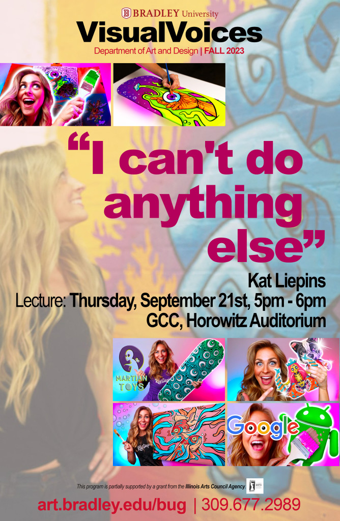
Here is the main gallery poster, outlining all the wonderful exhibitions and Visual Voices we have coming up this semester.
And here is the first of our prestigious Visual Voices lectures in the Fall 23 Series….