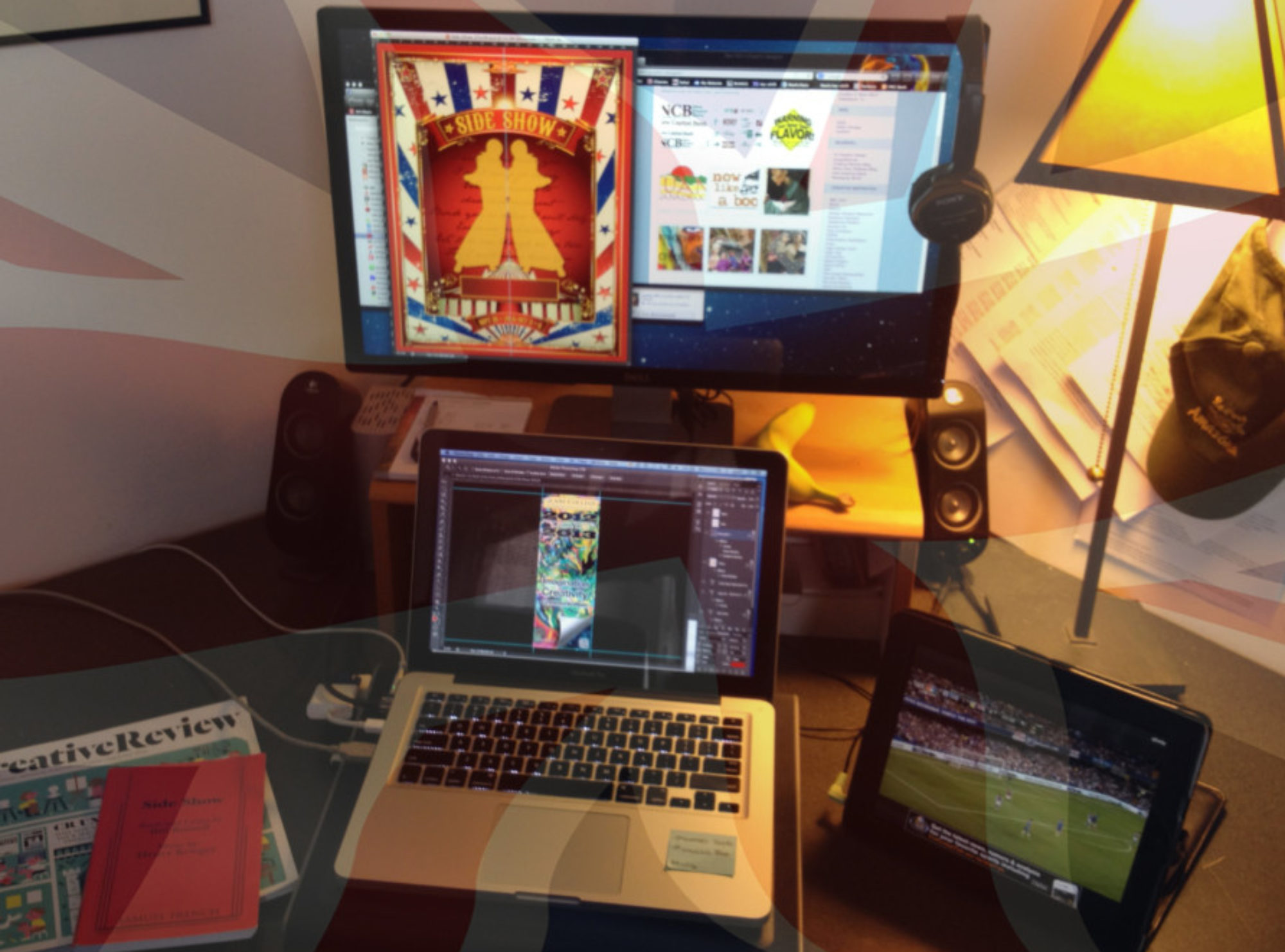
The 2016-17 Season of wonderful plays is going out with a good old Shakespeare masterpiece – Twelfth Night. This particular rendition is set around the early twentieth century, in New Orleans. With these two ‘prompts’ and some good discussions between myself and the director, here is the promotional piece we arrived at. Playful interaction between words from the script itself, Mardi-Gras, and Feste, the Jester. With just a subtle ‘nod’ to the era through the surrounding border.
Peoria Historical Society Branding Project
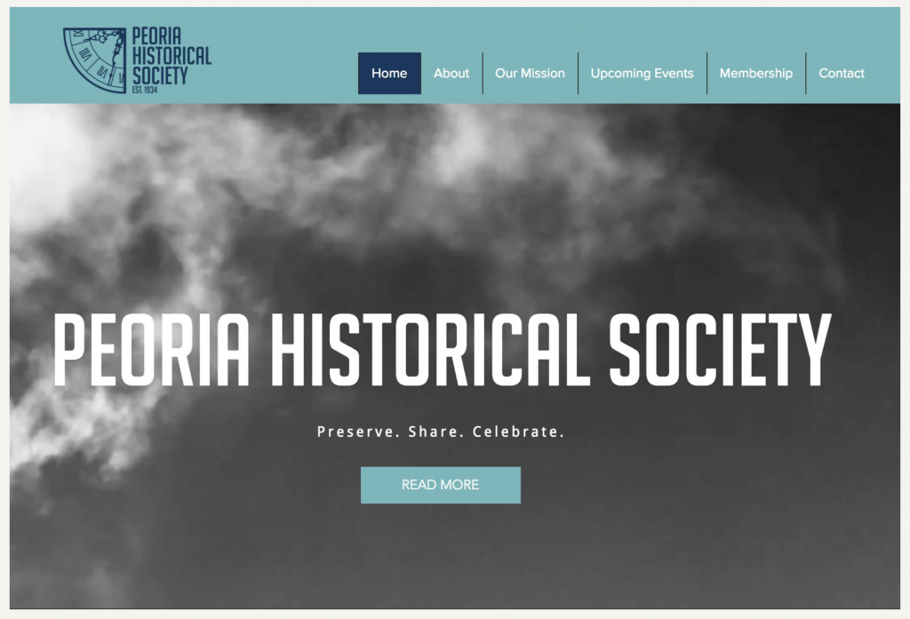
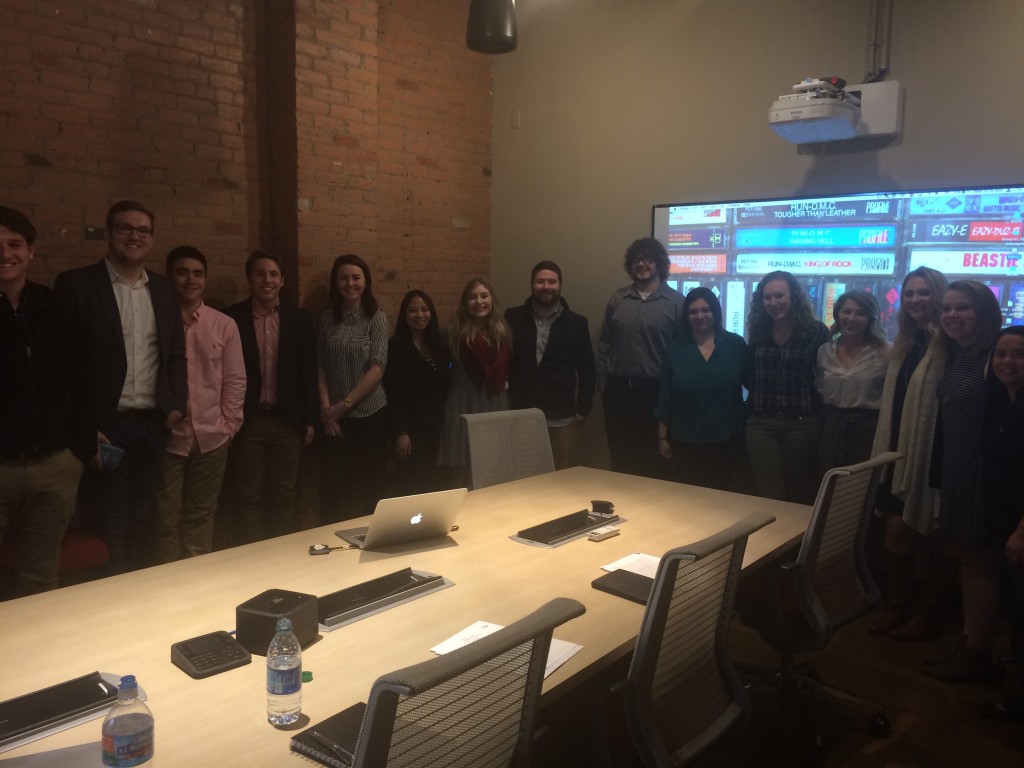
To compliment the new brand mark for the society, (designed by Taylor Ackerman, a Bradley University Graphic Design alum, now setting the design world alight at the Simantel Group), the students, working in small teams, were invited to 1. apply the new brand identity across a range of key touch points, and 2. also consider a launch campaign strategy to promote awareness of the organization to a new, younger, demographic while retaining the loyalty of existing members.
Continue reading “Peoria Historical Society Branding Project”
THE MAN WITH KALEIDOSCOPE EYES: ALAN ALDRIDGE
Alan Aldridge was a celebrated English graphic designer, artist and illustrator. He created the cover art for Who’s second album A Quick One. Moreover, he held the position of an art director at Penguin Books. His densely-packed illustration revitalized the paperback publisher’s business and culminated in skyrocketing sales.
Continue reading “THE MAN WITH KALEIDOSCOPE EYES: ALAN ALDRIDGE”
The Resumé Experience
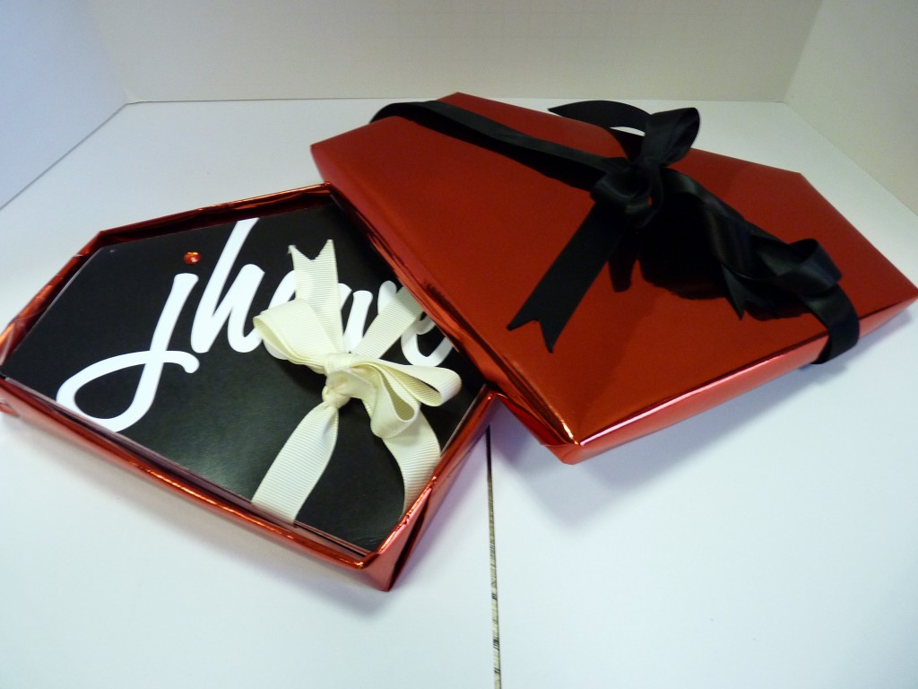
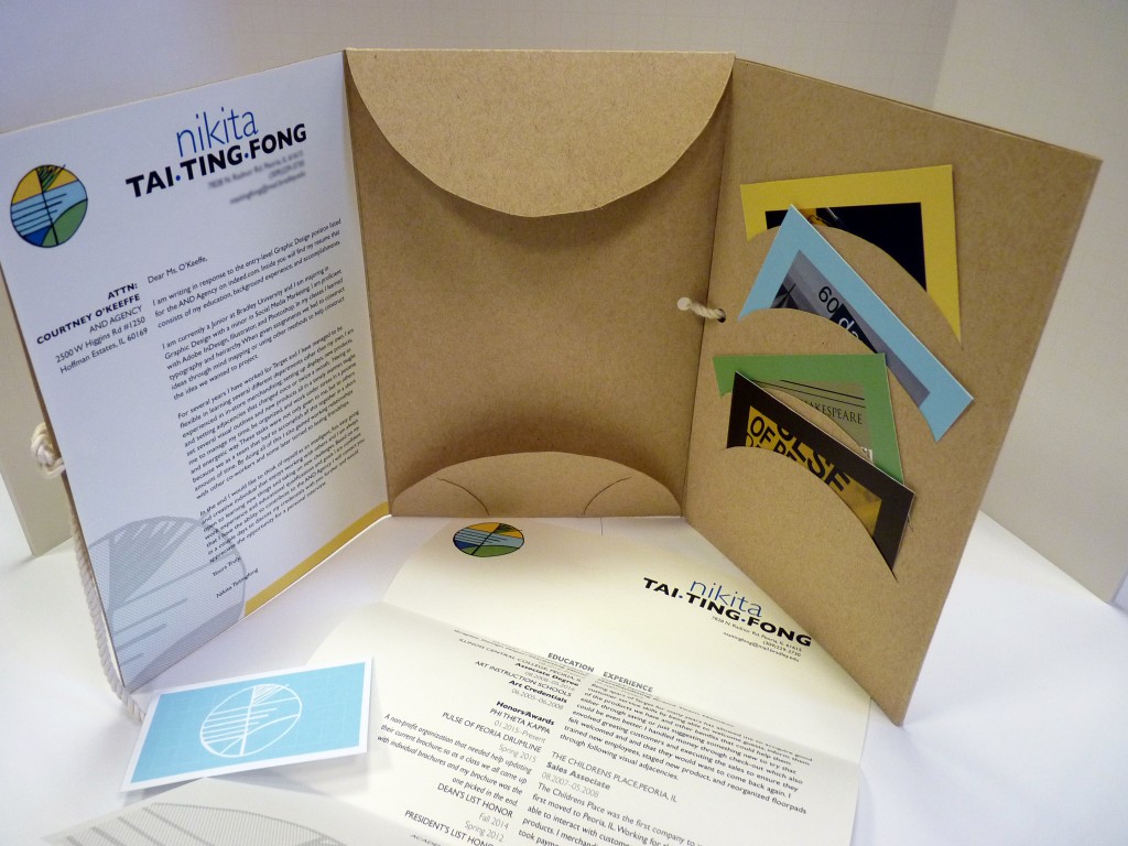
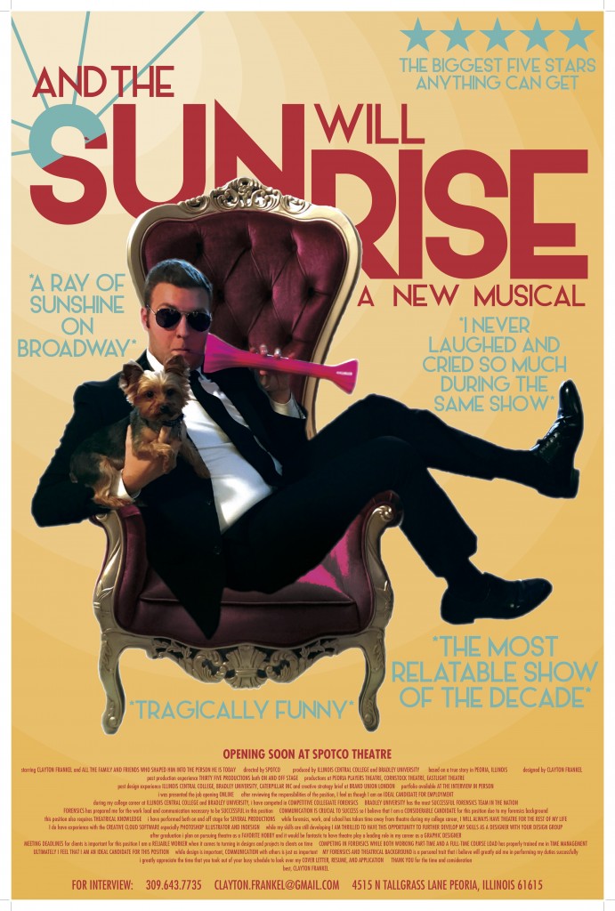
I’m a big fan of our junior graphic design students designing a resumé package, (cover letter, resumé, work ‘teasers’), aimed at one specific person at one specific company. Leap frogging HR – land something so wonderfully crafted on the desk of the Creative Director/Studio Manager that they can’t help but respond. Here are a few of this years wonderfully varied results with hopefully a good few heading out for possible summer and fall internship positions as we speak:
These Shining Lives
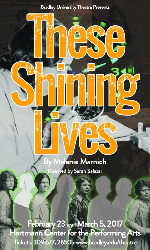
The first of the Spring season of productions for the Bradley University Theatre Department is the harrowing, but empowering ‘These Shining Lives’. A play written by Melanie Marnich. Based on the true story of four women who worked in a watch factory in Ottawa, Illinois, the play dramatizes the danger women faced in the workforce in the 1920s, and the lack of concern by companies for protecting the health of its employees.
Narrated by one of the workers, Catherine Donohue, These Shining Lives shows women getting a chance for a well-paying job in the 1920s and early 1930s, which was uncharacteristic for the time in the United States. The job, which seems easy enough to the four main characters, is painting the hour markings onto different sized watch dials using a radium compound which glows in the dark. Radium Dial, the company that hires the women to do the painting, tells them that there is no evidence that radium is harmful, and even has health benefits. After a few years, the workers notice that their hands start glowing in the dark, but assume that it is just from the radium powder that is used to paint the faces. The ladies develop ailments, including jaw infections and bone pain, but several local doctors tell them that all they need is aspirin, which of course does not help. After years of search, they find a doctor who is willing to put his name on the line and diagnose the women with radium poisoning. This in turn helps the four main characters decide to file a lawsuit against Radium Dial. An attorney, Leonard J. Grossman, agrees to take the case for free with Donohue as the lead plaintiff. They win, but Donohue succumbs to radium’s effects. The real Catherine Donohue died on July 27, 1938, shortly after testifying before the Illinois Industrial Commission.
As always, a challenging, but extremely enjoyable piece to work on. The visuals for the production needed to show the obvious elements of radium and time, but also emphasize the collaborative strength and empathy of the women characters involved.
Here are some initial ideas followed by the final poster piece…
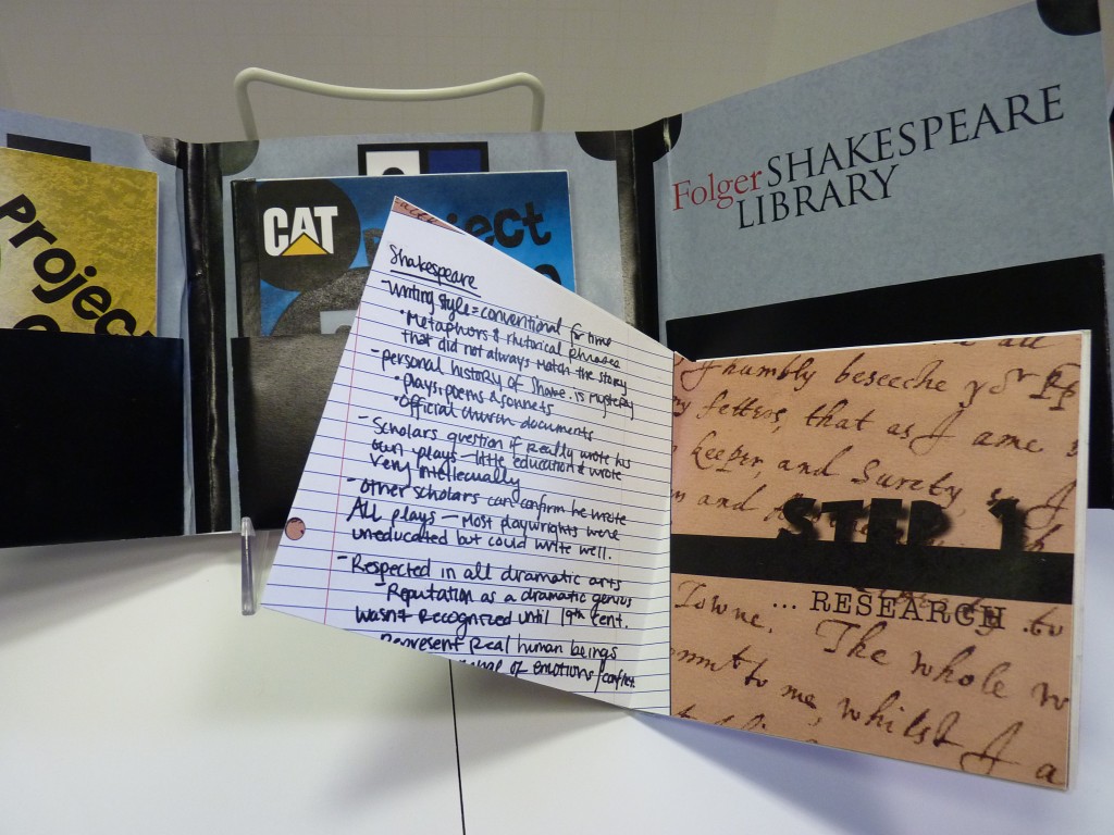
Creative ‘Journey’ Process Book
Always an interesting final project for the Editorial Design students. Essentially, take all your creative process for the first three assignments of the course and use them as the content for this, final project. Display your process in a clear, sequential way, while at the same time ensuring you are presenting it as a ‘Personal’ creative journey. If the students have worked hard throughout the semester, with an abundance of ideas, from sketch to computer, then this is a really nice Editorial Design assignment to conclude the semester with – however, if they have very little thought process from their previous projects… then it gets tricky!
And here is a selection of finished Creative Process pieces:
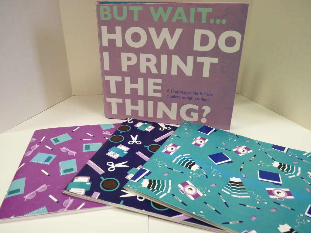
Pre Press Piece
Create a keepsake piece that is both a strong editorial piece and also presents a variety of pre-press steps and processes in a clearly defined and accurate way. This guide should be the ‘go to’ for any up and coming design student or young professional designer who needs to know the correct way to set up files, convert to cmyk, select paper etc.
The students worked in teams of three. Here are examples from all three finished pieces:
Library Wayfinding System
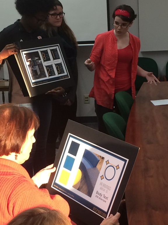
A wonderful opportunity to work on (potentially) a real life Information Design project. In this case, the senior students had to work in teams to create a complete way finding/signage system as part of the library ongoing renovation. Initial research, including walk-throughs and a thorough understanding of the environment and foot traffic was imperative. The deadline presentations were in front of several ‘clients’ and the hopeful outcome will be the development of selected student team concepts through to the final implementation of the system throughout the library.
Here is the complete presentation from one of the teams The other two teams were equally wonderful – just not enough room to include all of them!:
