
Great start to the day – I knew I needed to be up and about with plenty of time to get on the tour bus, so obviously I set my alarm. Unfortunately those wonderful iPhone people made it so I can specify particular days of the week for my alarm to go off. In my slightly travel fatigued mental state I set it just fine, but didn’t notice that it was for weekdays only – as a result, bus left at 8:30am, Gary woke at 8:35am. Peachy! 45 minutes later, dressed, coffee picked up (well duh!) and a taxi ride to Westminster Abbey – and I reunited with my students. Bad start but all well in the end. As always, a really enjoyable tour – never gets tiring, so much history.
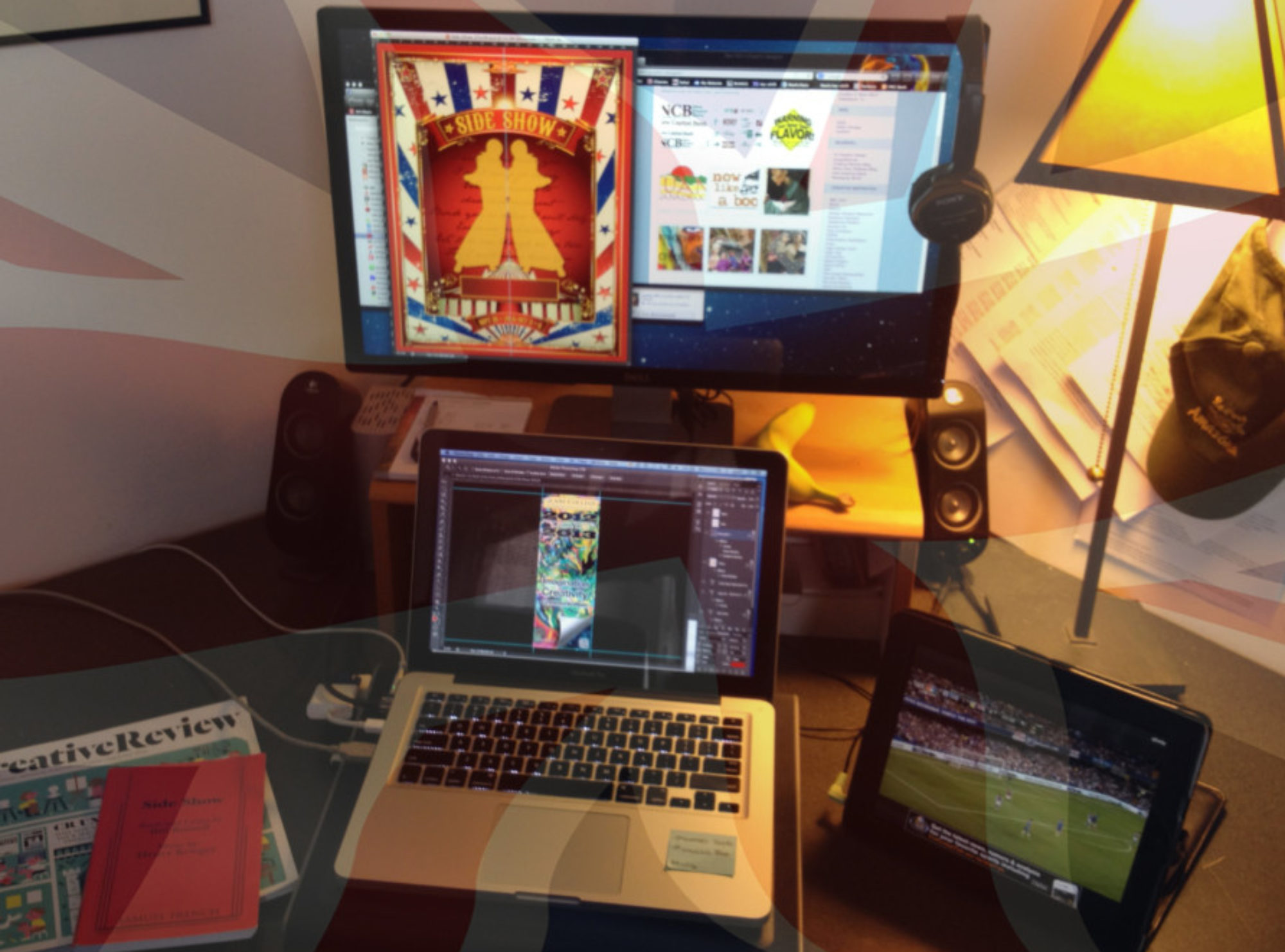
No time to take it easy when we returned to the hotel. I had to get to the room we would be using as a classroom and set up my equipment. Time to put the iPad mini/palm projector to the test! After a little improvisation with the room layout and ten minutes to spare – I was good to go. Time to get serious and deliver.