 My senior students latest brief was to work on a really cool information design project. While graphic integrity and accuracy of the data/information was still their primary aim – the objectives were to select an endangered animal and present it’s ‘case’ through a visual representation (wallchart). Some really nice deliverables that didn’t lose site of the importance of presenting the facts and statistical content clearly and accurately:
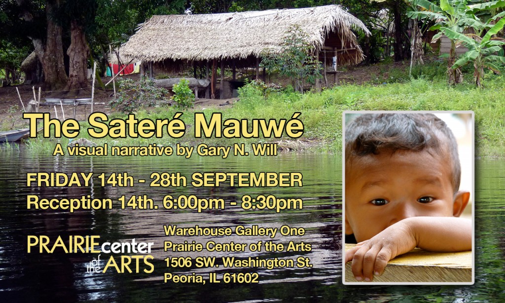
The Sateré Mauwé – 14th September
Select the ‘Photographer’ tab at the top of this website to see all the images from the exhibition.
Wayfinding System Presentation
Wayfinding System
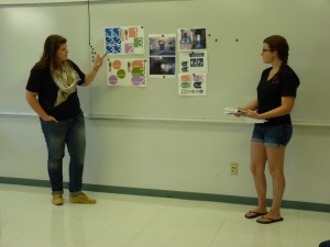 Brief: Complete presentation of wayfinding system.
Background: Riverside was able to purchase the former Shrine Theatre (the place where people ‘played in Peoria’ until the 80’s when the Peoria Civic Center was built) for only $550,000! The historic Peoria landmark with seating for close to 1,500 would now become the face of Riverside Community Church in downtown Peoria. With the help of volunteers, the building was transformed from a performance theatre into a place where people could connect with others and most importantly, connect with God.
Editorial Design/Brief #1 Initial Critique
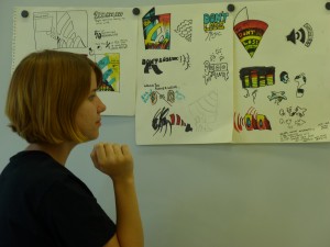 Client: U.S. National Association of the Deaf.
Product: Newspaper insert/stand alone brochure piece to encourage young people to think about hearing protection. As an insert in the weekend newspaper and also handed out at assorted music festivals and gigs.
The campaign line is ‘DON’T LOSE THE MUSIC’
Continue reading “Editorial Design/Brief #1 Initial Critique”
Summer Session/Methods & Process
 A nice group of students for my summer session of Art 206 Methods and Process. Essentially the same course syllabus as the spring semester version but with absolutely no time for the students to actually consider process for any of the projects!
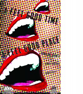
Never the less, some nice pieces came out of the course. Here are a selection from the poster project where each student is assigned a regional company/attraction/organization, then has to create a series of posters promoting it as well as attracting outside companies to relocate to the region – however, each student also has to create in the style of an assigned designer (ranging from famous to less well known).
Sunday Market/last full day in Manaus
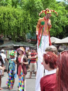 And so the last full day has come around. It has been an amazing adventure, but another day of this humidity would be hard on this British boy!
Headed to the Sunday Street market after breakfast. I had a little money and needed to use it carefully to buy some gifts for my homies. The market was cool, so many stalls with beautiful local products. I wish I had a lot more money to be able to buy more, although not sure how much would fit in my case. We spent a couple all morning strolling around shopping and taking a few more photographs, then it was lunch time. We found a nice Italian themed restaurant and relaxed with some good food and very welcome cokes. After lunch some of the team grabbed an ice cream before we all headed back to the hotel to relax and shower before the Church service tonight at 6pm.
Back in civilization (and wifi!)
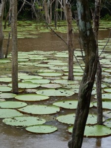 Quite a ride for the final quarter of the boat journey home. We seemed to stop and start a lot until the captain finally pulled into the side of the river for a few hours. Once we started up again we definitely hit the roughest waves. Instead of the gentle sway our hammocks were being thrown from side to side. Several of us had support poles next to us and were slamming into them repeatedly. I figured out a way to wrap my toes around one to stop from rocking – it worked but not before my left calf had taken a battering. As night turned into morning, most of us were up and drinking our first coffee around 5:30 am. The scenery kept getting a little more industrial the closer to Manaus we got.
