Always fun working on Theatre stuff! In this case, the annual promotional poster. Here is some of the thought process followed by the final version.
Always fun working on Theatre stuff! In this case, the annual promotional poster. Here is some of the thought process followed by the final version.
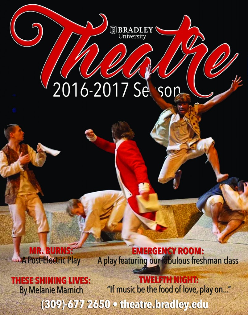
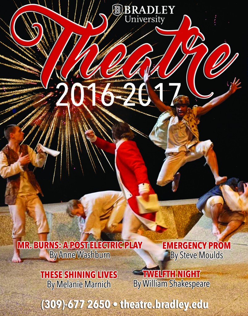
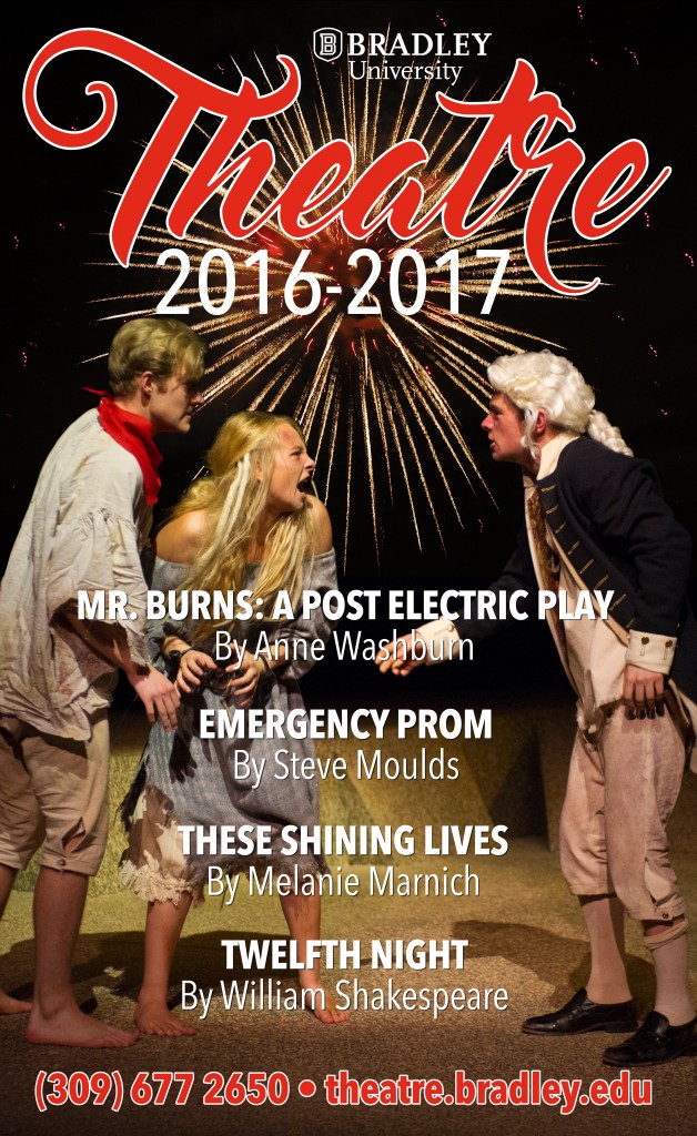
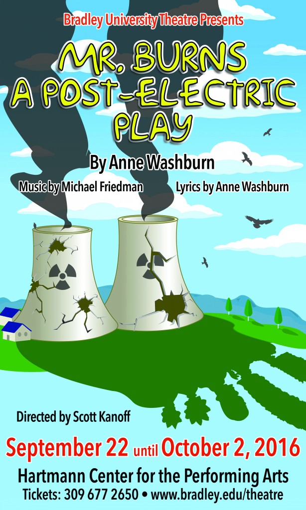
So nothing like starting the new season of theatre productions with a challenge! Totally about America’s most famous tv family, but without directly showing them.
Here is the brief plot: Shortly after an unspecified apocalyptic event, a group of survivors gather together and begin to attempt to recount the episode “Cape Feare” of the television show The Simpsons. The second act picks up with the same group seven years later, who have now formed a theatrical troupe that specializes in performing Simpsons episodes, with commercials and all. The final act is set an additional 75 years in the future. The same episode of the Simpsons, now a familiar mythos, has been reworked into a musical pageant, with the story, characters, and morals repurposed to fit the artistic and dramatic needs of a culture still reeling from destruction of civilization and the near-extinction of humanity decades earlier.
Some of my creative process:
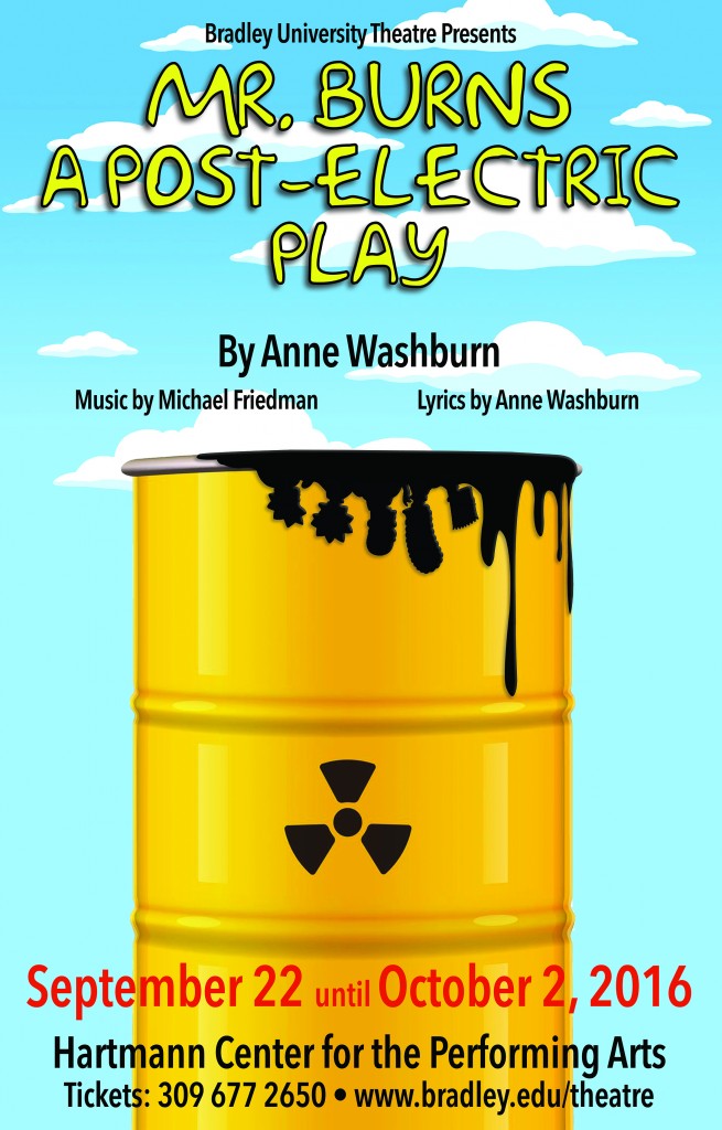
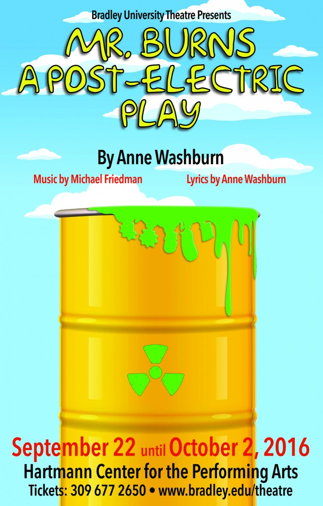
And here is the final design for Mr Burns: A Post-Electric Play:
Brief: Create a promotional campaign for a five night film festival titled ‘Celluloid Chicago’ at The Apollo Theater, Peoria, IL 61604.
Objectives: The Apollo Theater will be launching it’s 2016 fall/winter season with a five night Celebration of movies filmed in Chicago. Admission per night is $10 for two movies, or $40 for a full festival pass. It is your challenge to promote the festival across a variety of media. Although it is a film festival, the emphasis is on the fact that they were all filmed in/around the city of Chicago – this should come across at the forefront of your creative thinking – NOT the attributes of each movie shown at the festival.
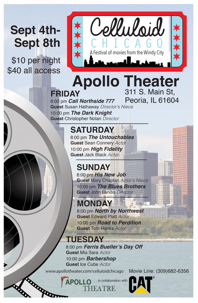
1. Logotype/Brand: ‘Celluloid Chicago’ and a subheading ‘A festival of movies from the windy city’.
2. The Promotional Poster: 17″ x 11″ portrait, full color poster.
3. Microsite link page off the main Apollo Theater website
4. Private Screening Invitation: this should be a real collectible keepsake aimed at a limited number of influential ‘special guests’ invited to the pre-public screening a few nights before the festival officially opens to the public.
Good fun final brief. Continuing the Art 206 mission of presenting problems and avoiding cliché design solutions. Here is a selection of student projects from the brief:
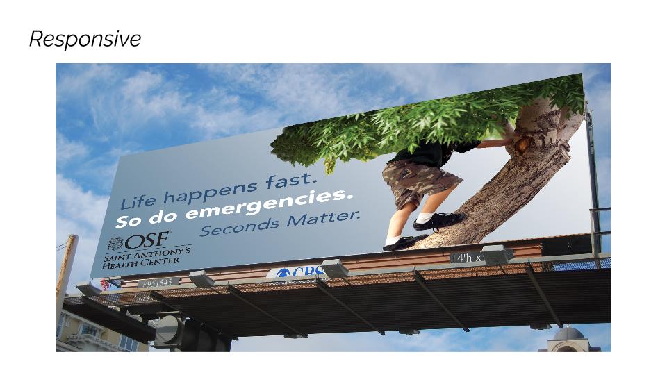
Final team brief of the semester had the students pitching against each other for a regional ER department. They had to take into consideration the equity of an already existing campaign direction and also the faith based element of this particular client. All were good deadline campaign presentations with the one below coming out as the winning team based on their overall campaign ‘spread’ as well as their actual presentation skills on the day.
Thank you so much Jim and Rachel for setting the brief and offering your time to sit in on the presentations.
Continue reading “Promotion/Awareness campaign for ER department”
Background: c/o The Hartman Group.
There was a time not long ago that “value” in packaged foods meant larger bags, larger containers, larger trays, larger bottles and the infamously larger cups found at McDonald’s, Dunkin’ Donuts and 7-Eleven. Bigger has always just seemed better in this land of rising opportunity.
Slowly, though, we’ve noticed that manufacturers, especially in highly perishable packaged foods, have caught on to the fact that consumers increasingly seem willing to spend more per volume in order to get multi-packs of single-serve sizes. And they may even avoid existing multi-serving packages that generally offer an even lower price per unit volume.
What seems irrationally wasteful from a purely price per unit volume analysis has become an intermediary, optimal “value” option to consumers from a broad array of backgrounds. The added value in single-serve multipacks is grounded in the user experience of these products: when, where and how they are eaten.
The biggest thing we’re noticing in America’s pantries is that there doesn’t seem to be a target demographic for single-serve packaging. Everyone is using them to some degree. Empty nesters. Single adults. Even families, the supposed raison d’etre for large sized multi-serve package designs.
Single serve packaging is fulfilling an unmet need to manage waste and to acknowledge our increasingly individualistic eating patterns in a highly fragmented, fickle culture of eaters who think that every day is a good day to try something new in the world of food.
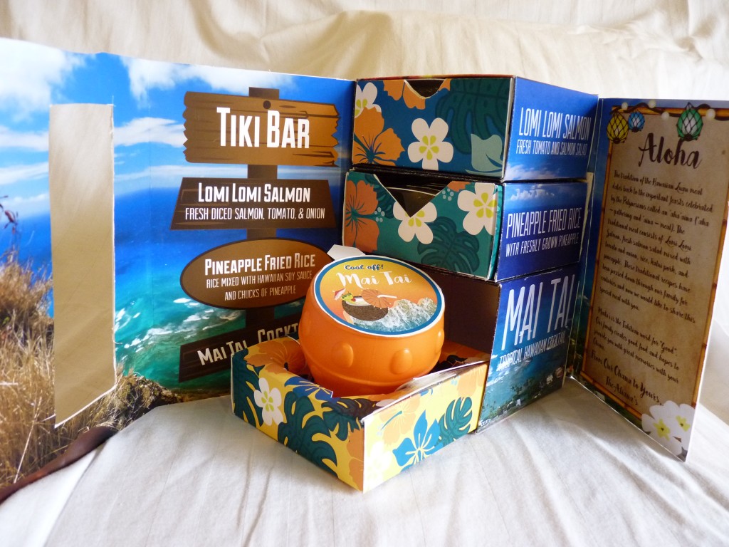
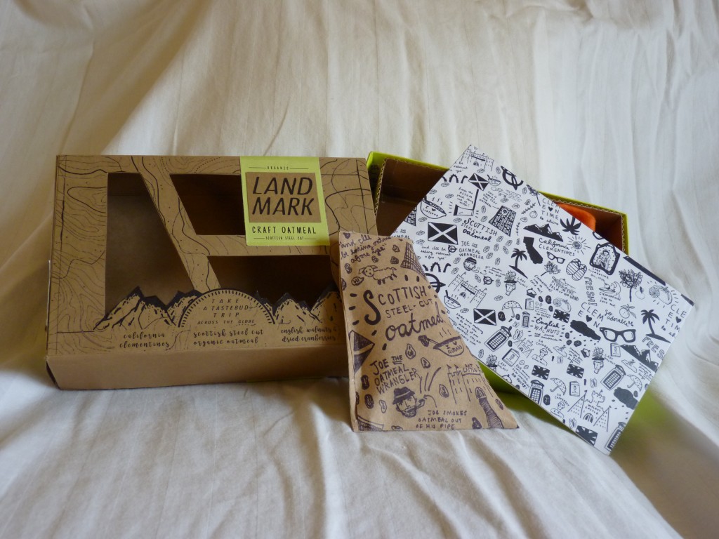
As always – here are the students solutions to a challenging, but fun, brief.
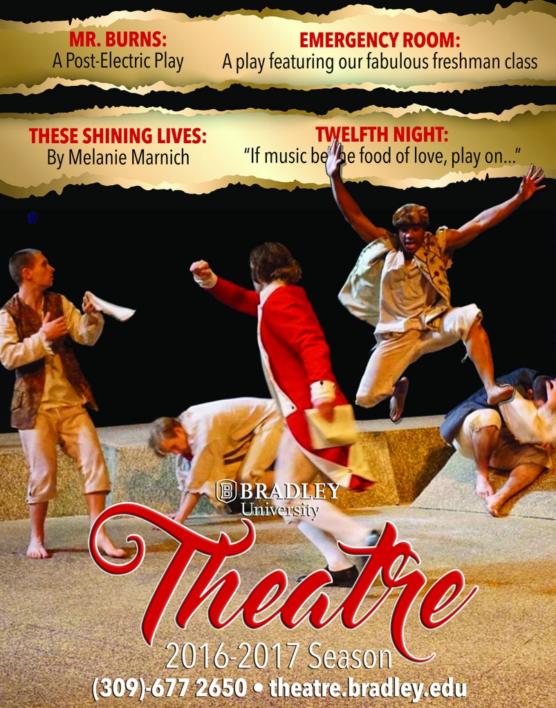
Final production of the 2015-16 season. Already excited for the challenges that the next theatre season will bring.
To commemorate the 100th Anniversary of the National Park Service, the United States Postal Service (USPS) will be issuing a horizontal strip of four se-tenant stamps (a philatelic term describing an attached pair, strip or block of stamps that differ in design, color or denomination), and through the Citizens’ Stamp Advisory Committee (CSAC), you have been commissioned to design them.
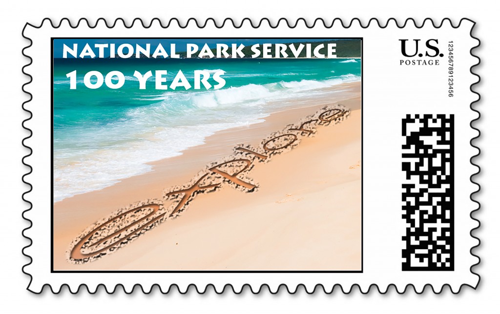
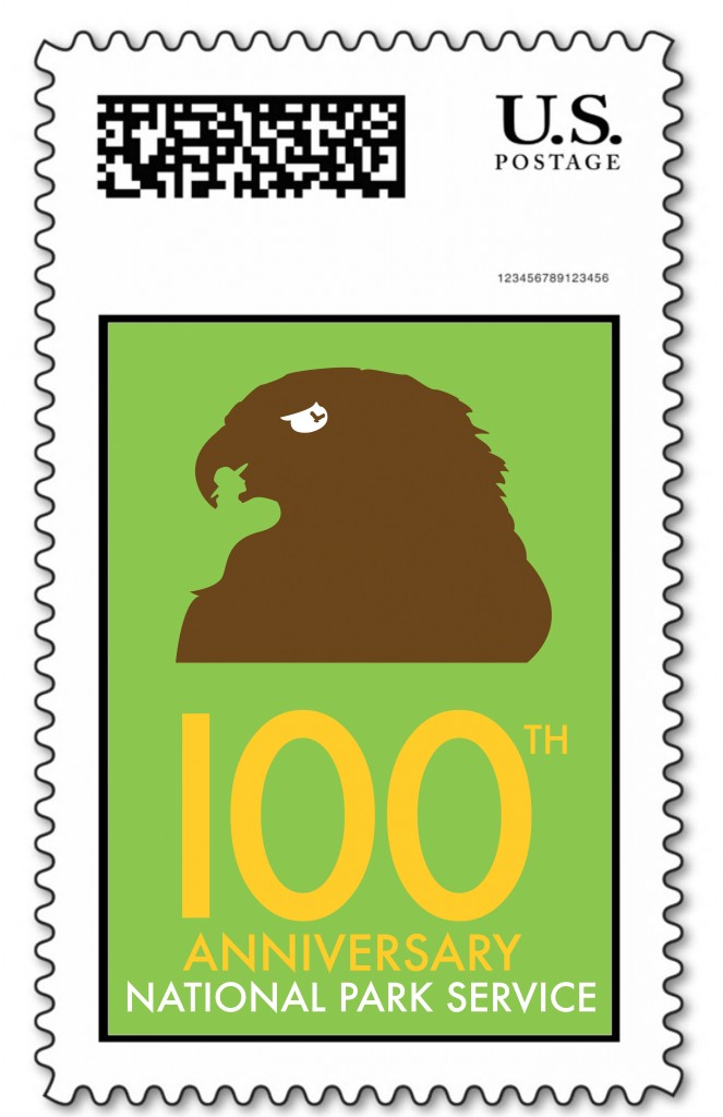
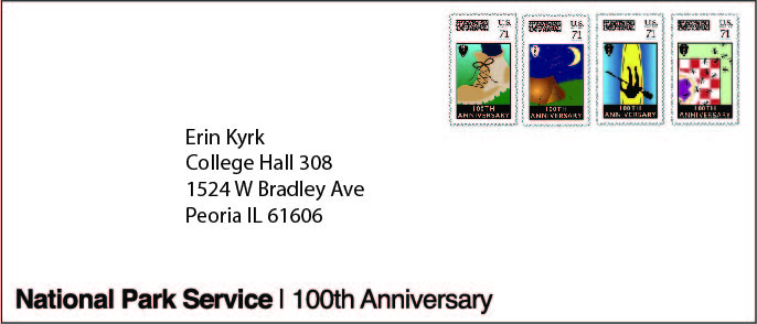
Brief: To design unique and dynamic concepts for the FOUR stamp series, and to additionally present them on a First Day edition envelope. However, as is the way with Art 206 – You do, however, have a BIG challenge….
You have to design your stamps set entirely based around the style of the designer you have ‘drawn out of the hat’. How do you come up with original, non-cliché imagery celebrating this anniversary and promoting the NPS, while at the same time visually retaining the style, approach, and possibly color palette and font range of your designer?
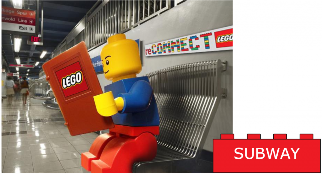
The Creative Challenge (Thank you D&AD): To create a campaign for the LEGO Brand that distinguishes LEGO from all the other construction toys in the toy market by highlighting the benefits and points of difference of LEGO rather than the detriments of our competitors.
The campaign should encompass the LEGO brand values and take advantage of LEGO’s heritage and strong brand equity within the US.