Really great team brief. As usual, the teams were picked out of a hat rather than letting everyone work with their Bff’s!
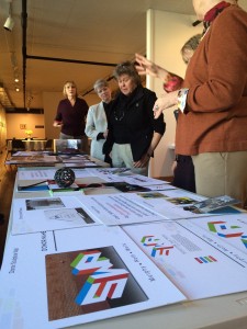
This exciting new arts event/organization coming out of the Warehouse District required a complete branding as well as some thoughts on how to make the target audience(s) aware.
Presentations were held at the organizations headquarters, to a committee – so nothing intimidating for the students!
Overall, everyone did a great job, with some really strong brand ideas. The one suggestion/observation that came out of it was that while the level of work was excellent, the students themselves need to try to inject more passion and enthusiasm into their delivery. I think nerves got the better of many of them. Never the less – a great way to head off into the Spring break.
And congratulations to Erin, Adan and Kaitlyn – the days overall winning team.
Continue reading “Sculpture Walk Peoria”