The final assignment of the semester was a real challenge for the students, as it focused on an area (and language) none of them were familiar with.
Skyward Specialty Insurance operates in the highly competitive specialty insurance market, providing tailored coverage solutions for complex and hard-to-place risks. Unlike standard insurance carriers, Skyward focuses on niche segments where expertise, underwriting precision, and strong relationships matter most. The company distributes its products through a nationwide network of independent insurance agents, making the agent experience just as critical as the policyholder experience. As specialty insurance buyers expect faster service, clearer communication, and more personalized solutions, Skyward must stand out not only for what it sells, but for how it engages. The competitive landscape includes both large national carriers expanding into specialty lines and smaller, highly specialized insurers competing on speed and fl exibility. To grow, Skyward must strengthen its brand experience across every touchpoint—agent, broker, and end customer—ensuring it is seen as knowledgeable, dependable, and easy to do business with. In short: smart coverage, smoother relationships.
Position Skyward as a smart, strategic partner for independent agents. Increase confidence in Skyward’s specialty expertise and problem-solving ability. Encourage agents to think of Skyward earlier when placing complex risks. Build trust that Skyward understands both agent and policyholder needs.
Increase submissions from independent agents. Grow premium in key specialty lines. Increase the number of active producing agents. Strengthen long-term agent relationships and loyalty.
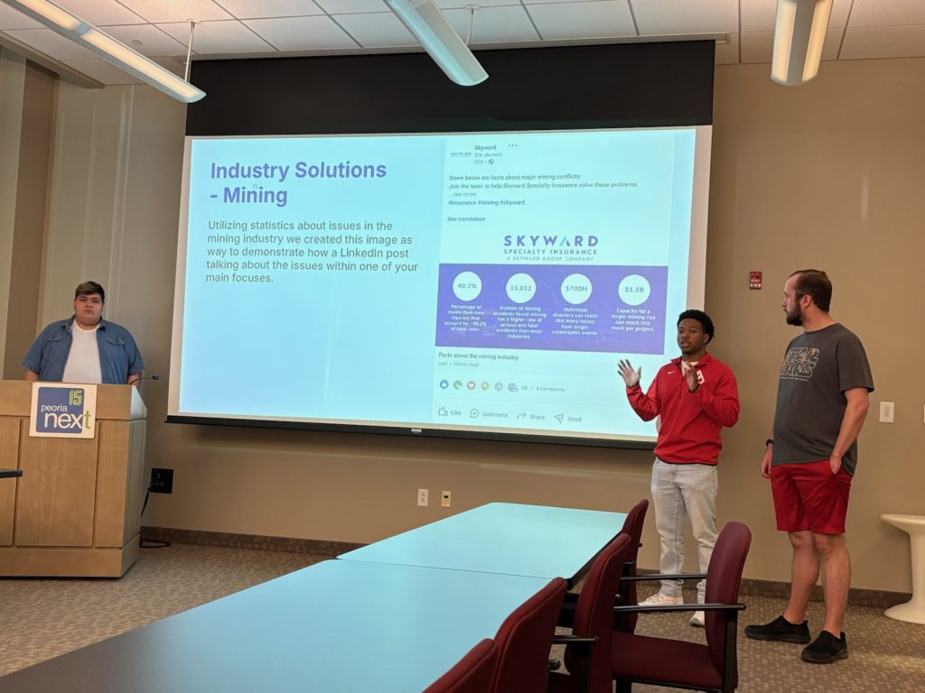
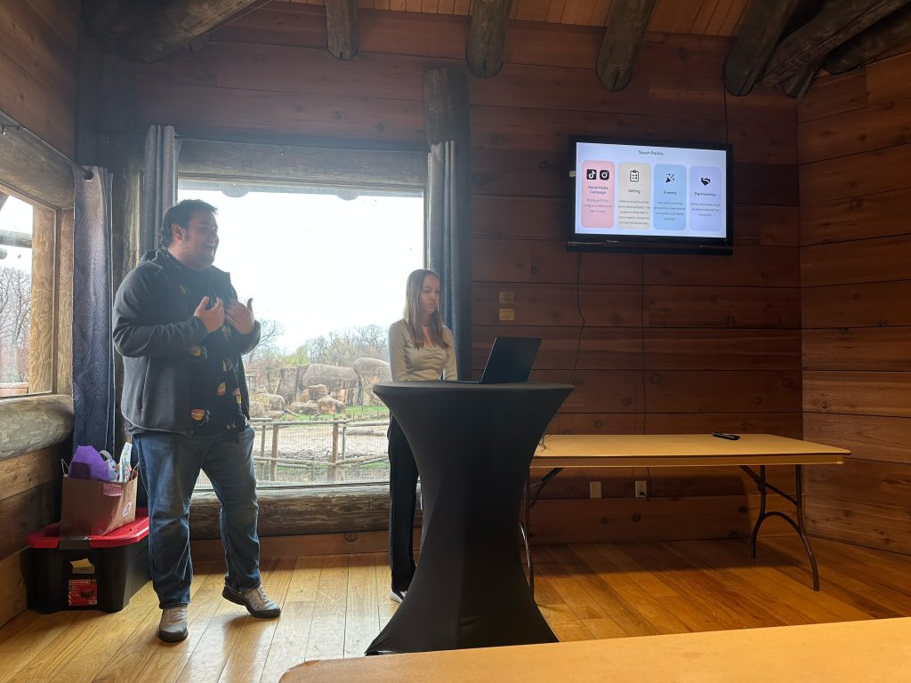
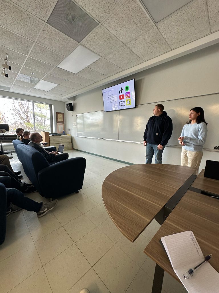
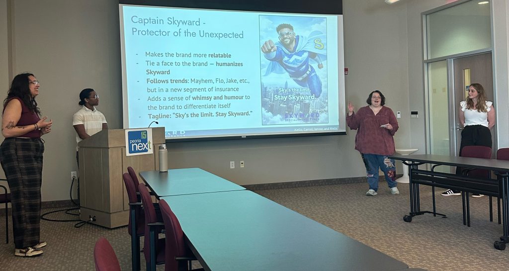
Here are the student teams presentations (click on their photograph to see the full decks):